圣杯布局也就是:左右固定宽度,中间自适应的布局样式
HTML布局:
注意:一定是中间部分写在最上面
<header><h4>header内容</h4></header>
<div class="container">
    <div class="middle"><h4>中间弹性</h4></div>
    <div class="left"><h4>左边栏</h4></div>
    <div class="right"><h4>右边栏</h4></div>
</div>
<footer><h4>内容区</h4></footer>
css样式:
.container{
            height: 200px;
            overflow: hidden;
        }
        .middle{
            width: 100%;
            height: 200px;
            background: mediumaquamarine;
            float: left;
        }
        .left{
            width: 200px;
            height: 200px;
            background: navajowhite;
            float: left;
        }
        .right{
            width: 200px;
            height: 200px;
            background: lightblue;
            float: left;
        }
此时的效果是这样的:
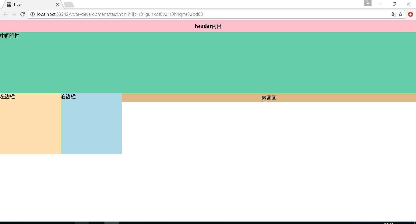
之后再给.container添加样式:
padding: 0 200px;
再给.left添加样式:
margin-left:-100%;
再给.right添加样式:
margin-left:-200px;
此时的效果为:

之后再给.left定位:
position:relation;
left:-200px;
给.right定位:
position:relation;
right:-200px;
此时的效果为:
