<template>
<div class="about">
<!-- <h2>This is an aboutEchart page</h2> -->
<div id="myChart" ref="myChart"></div>
</div>
</template>
<script>
import echarts from '@/common/echarts'
export default {
name:'about',
data(){
return{
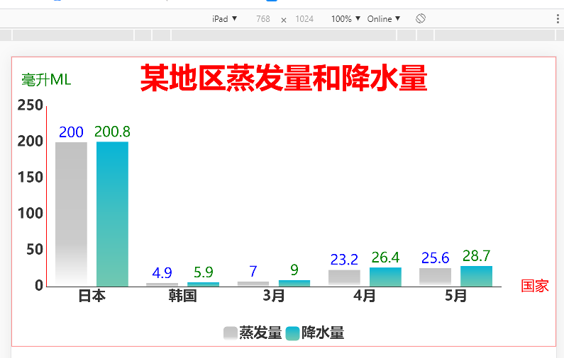
Evaporation:[200.0, 4.9, 7.0, 23.2, 25.6],
Precipitation:[200.8, 5.9, 9.0, 26.4, 28.7],
}
},
mounted () {
// 调用绘制图表的方法
this.draw();
},
methods: {
draw () {
// 实例化echarts对象
//let echarts=require("echarts")
var myChart = echarts.init(this.$refs.myChart)
function remToPx(rem) {
const fontSize = document.documentElement.style.fontSize;
return Math.floor(rem * fontSize.replace('px', ''));
}
// 绘制条形图
myChart.setOption({
title: {
text: '某地区蒸发量和降水量',
// subtext: '纯属虚构',//副标题
x:'center',//水平安放位置,默认为'left',可选为:'center' | 'left' | 'right' | {number}(x坐标,单位px)
y: 'top',//垂直安放位置,默认为top,可选为:'top' | 'bottom' | 'center' | {number}(y坐标,单位px)
textAlign: 'left',//水平对齐方式,默认根据x设置自动调整,可选为: left' | 'right' | 'center
textStyle: {//主标题文本样式{"fontSize": 18,"fontWeight": "bolder","color": "#333"}
// fontFamily: 'Arial, Verdana, sans...',
fontSize: remToPx(0.4),
fontStyle: 'normal',
fontWeight: 'bolder',
"color": "red",
}
},
grid:{ //调节图表的内边距padding
left:'1%',
right:'10%',
top:'15%',
bottom:'15%',
containLabel:true
},
tooltip: { //提示框
show : true,
trigger: 'axis',
// position: [20, 20]
textStyle:{
align:'left',
color:'red',
fontSize:remToPx(0.1),
},
axisPointer:{type:"none"}. //取消鼠标移入x轴辅助线
},
legend: {
data: ['蒸发量', '降水量'],
left: 'center',//图例的离左边位置,可以用像素,可以用百分比,也可以用center,right等
top: remToPx(3.6),//图例离顶部的位置
itemWidth: remToPx(0.2),//图例图标的宽
itemHeight: remToPx(0.2),//图例图标的高
textStyle: {
// color: 'red',//文字的具体的颜色
fontSize: remToPx(0.2),
fontWeight:'bold'
},
selectedMode:false //取消标题点击事件
},
toolbox: {//右上角提示图标
show: true,
feature: {
dataView: {show: true, readOnly: false},
magicType: {show: true, type: ['line', 'bar']},
restore: {show: true},
saveAsImage: {show: true}
}
},
calculable: true,
xAxis: [
{
type: 'category',
name:'国家',
nameLocation:'bottom',
nameTextStyle:{
color:"red",
fontSize:remToPx(0.2),
padding:remToPx(3.4)
},
data: ['日本', '韩国', '3月', '4月', '5月'],
splitLine: {show: false},//去除网格分割线
axisTick: {
show: false, //是否显示多出来的网状线 默认为true
alignWithLabel: true
},
//用于设置x下面的字体
axisLabel:{
show:true, //这里的show用于设置是否显示x轴下的字体 默认为true
interval:0, //可以设置成 0 强制显示所有标签。如果设置为 1,表示『隔一个标签显示一个标签』,如果值为 2,表示隔两个标签显示一个标签,以此类推。
textStyle:{ //textStyle里面写x轴下的字体的样式
color:'#333',
fontSize:remToPx(0.2),
fontWeight: 'bolder',
}
},
axisLine:{
show:true, //这里的show用于设置是否显示x轴那一条线 默认为true
lineStyle:{ //lineStyle里面写x轴那一条线的样式
color:'#333',
2, //轴线的粗细 我写的是2 最小为0,值为0的时候线隐藏
}
}
},
],
yAxis: [
{
type: 'value',
name:'毫升ML',
nameLocation:'top',
nameTextStyle:{
color:"green",
fontSize:remToPx(0.2),
padding:remToPx(1.5)
},
min:0, //y轴的最小值
max:250, //y轴最大值
interval:50, //值之间的间隔
//上面的三个值可以根据自己需求随意设置 不设置时会根据图中的值自动生成相应的值
splitLine:{show:false}, //网状线 默认为true
//用于设置y轴的字体
axisLabel:{
show:true, //这里的show用于设置是否显示y轴下的字体 默认为true
textStyle:{ //textStyle里面写y轴下的字体的样式
color:'#333',
fontSize:remToPx(0.2),
fontWeight: 'bolder',
}
},
//用于设置y轴的那一条线
axisLine:{
show:true, //这里的show用于设置是否显示y轴那一条线 默认为true
lineStyle:{ //lineStyle里面写y轴那一条线的样式
color:'red',
2, //轴线的粗细 我写的是2 最小为0,值为0的时候线隐藏
}
},
axisTick: {
show: false, //是否显示数据网状线 默认为true
alignWithLabel: true
},
}
],
series: [
{
name: '蒸发量',
type: 'bar',
data: this.Evaporation,
itemStyle: {
normal: {
color: new echarts.graphic.LinearGradient(
0, 0, 0, 1,
[
{offset: 0, color: '#c2c2c2'}, //柱图渐变色
{offset: 0.7, color: '#ccc'}, //柱图渐变色
{offset: 1, color: '#fff'}, //柱图渐变色
]
),//设置柱子颜色
label: {
show: true,//柱子上显示值
position: 'top',//值在柱子上方显示
textStyle: {
color: 'blue',//值得颜色
fontSize:remToPx(0.2)
},
lineStyle:{
color:'#000'
}
}
},
},
// barWidth: 150//设置柱子宽度,单位为px
// markPoint: { //气泡
// data: [
// {type: 'max', name: '最大值'},
// {type: 'min', name: '最小值'}
// ]
// },
// markLine: { //添加线
// data: [
// {type: 'average', name: '平均值'}
// ]
// }
},
{
name: '降水量',
type: 'bar',
data: this.Precipitation,
itemStyle: {
normal: {
color: new echarts.graphic.LinearGradient(
0, 0, 0, 1,
[
{offset: 0, color: '#06B5D7'}, //柱图渐变色
{offset: 0.5, color: '#44C0C1'}, //柱图渐变色
{offset: 1, color: '#71C8B1'}, //柱图渐变色
]
),//设置柱子颜色
label: {
show: true,//柱子上显示值
position: 'top',//值在柱子上方显示
textStyle: {
color: 'green',//值得颜色
fontSize:remToPx(0.2)
},
lineStyle:{
color:'#000'
}
}
},
}
}
]
});
}
},
created(){
},
components: {
}
}
</script>
<style scoped>
#myChart {
7.5rem;
height: 4rem;
/* margin: 20px auto; */
border: 1px solid red;
padding-top: 0.1rem;
}
</style>
<template>
<div class="about">
<!-- <h2>This is an aboutEchart page</h2> -->
<div id="myChart" ref="myChart"></div>
</div>
</template>
<script>
import echarts from '@/common/echarts'
export default {
name:'about',
data(){
return{
Evaporation:[200.0, 4.9, 7.0, 23.2, 25.6],
Precipitation:[200.8, 5.9, 9.0, 26.4, 28.7],
}
},
mounted () {
// 调用绘制图表的方法
this.draw();
},
methods: {
draw () {
// 实例化echarts对象
var myChart = echarts.init(this.$refs.myChart)
function remToPx(rem) {
const fontSize = document.documentElement.style.fontSize;
return Math.floor(rem * fontSize.replace('px', ''));
}
// 绘制条形图
myChart.setOption({
title: {
text: '某地区蒸发量和降水量',
// subtext: '纯属虚构',//副标题
x:'center',//水平安放位置,默认为'left',可选为:'center' | 'left' | 'right' | {number}(x坐标,单位px)
y: 'top',//垂直安放位置,默认为top,可选为:'top' | 'bottom' | 'center' | {number}(y坐标,单位px)
textAlign: 'left',//水平对齐方式,默认根据x设置自动调整,可选为: left' | 'right' | 'center
textStyle: {//主标题文本样式{"fontSize": 18,"fontWeight": "bolder","color": "#333"}
// fontFamily: 'Arial, Verdana, sans...',
fontSize: remToPx(0.4),
fontStyle: 'normal',
fontWeight: 'bolder',
"color": "red",
}
},
grid:{ //调节图表的内边距padding
left:'1%',
right:'10%',
top:'15%',
bottom:'15%',
containLabel:true
},
tooltip: { //提示框
show : true,
trigger: 'axis',
// position: [20, 20]
textStyle:{
align:'left',
color:'red',
fontSize:remToPx(0.1),
},
},
legend: {
data: ['蒸发量', '降水量'],
left: 'center',//图例的离左边位置,可以用像素,可以用百分比,也可以用center,right等
top: remToPx(3.6),//图例离顶部的位置
itemWidth: remToPx(0.2),//图例图标的宽
itemHeight: remToPx(0.2),//图例图标的高
textStyle: {
// color: 'red',//文字的具体的颜色
fontSize: remToPx(0.2),
fontWeight:'bold'
}
},
toolbox: {//右上角提示图标
show: true,
feature: {
dataView: {show: true, readOnly: false},
magicType: {show: true, type: ['line', 'bar']},
restore: {show: true},
saveAsImage: {show: true}
}
},
calculable: true,
xAxis: [
{
type: 'category',
name:'国家',
nameLocation:'bottom',
nameTextStyle:{
color:"red",
fontSize:remToPx(0.2),
padding:remToPx(3.4)
},
data: ['日本', '韩国', '3月', '4月', '5月'],
splitLine: {show: false},//去除网格分割线
axisTick: {
show: false, //是否显示多出来的网状线 默认为true
alignWithLabel: true
},
//用于设置x下面的字体
axisLabel:{
show:true, //这里的show用于设置是否显示x轴下的字体 默认为true
interval:0, //可以设置成 0 强制显示所有标签。如果设置为 1,表示『隔一个标签显示一个标签』,如果值为 2,表示隔两个标签显示一个标签,以此类推。
textStyle:{ //textStyle里面写x轴下的字体的样式
color:'#333',
fontSize:remToPx(0.2),
fontWeight: 'bolder',
}
},
axisLine:{
show:true, //这里的show用于设置是否显示x轴那一条线 默认为true
lineStyle:{ //lineStyle里面写x轴那一条线的样式
color:'#333',
2, //轴线的粗细 我写的是2 最小为0,值为0的时候线隐藏
}
}
},
],
yAxis: [
{
type: 'value',
name:'毫升ML',
nameLocation:'top',
nameTextStyle:{
color:"green",
fontSize:remToPx(0.2),
padding:remToPx(1.5)
},
min:0, //y轴的最小值
max:250, //y轴最大值
interval:50, //值之间的间隔
//上面的三个值可以根据自己需求随意设置 不设置时会根据图中的值自动生成相应的值
splitLine:{show:false}, //网状线 默认为true
//用于设置y轴的字体
axisLabel:{
show:true, //这里的show用于设置是否显示y轴下的字体 默认为true
textStyle:{ //textStyle里面写y轴下的字体的样式
color:'#333',
fontSize:remToPx(0.2),
fontWeight: 'bolder',
}
},
//用于设置y轴的那一条线
axisLine:{
show:true, //这里的show用于设置是否显示y轴那一条线 默认为true
lineStyle:{ //lineStyle里面写y轴那一条线的样式
color:'red',
2, //轴线的粗细 我写的是2 最小为0,值为0的时候线隐藏
}
},
axisTick: {
show: false, //是否显示数据网状线 默认为true
alignWithLabel: true
},
}
],
series: [
{
name: '蒸发量',
type: 'bar',
data: this.Evaporation,
itemStyle: {
normal: {
color: new echarts.graphic.LinearGradient(
0, 0, 0, 1,
[
{offset: 0, color: '#c2c2c2'}, //柱图渐变色
{offset: 0.7, color: '#ccc'}, //柱图渐变色
{offset: 1, color: '#fff'}, //柱图渐变色
]
),//设置柱子颜色
label: {
show: true,//柱子上显示值
position: 'top',//值在柱子上方显示
textStyle: {
color: 'blue',//值得颜色
fontSize:remToPx(0.2)
},
lineStyle:{
color:'#000'
}
}
},
},
// barWidth: 150//设置柱子宽度,单位为px
// markPoint: { //气泡
// data: [
// {type: 'max', name: '最大值'},
// {type: 'min', name: '最小值'}
// ]
// },
// markLine: { //添加线
// data: [
// {type: 'average', name: '平均值'}
// ]
// }
},
{
name: '降水量',
type: 'bar',
data: this.Precipitation,
itemStyle: {
normal: {
color: new echarts.graphic.LinearGradient(
0, 0, 0, 1,
[
{offset: 0, color: '#06B5D7'}, //柱图渐变色
{offset: 0.5, color: '#44C0C1'}, //柱图渐变色
{offset: 1, color: '#71C8B1'}, //柱图渐变色
]
),//设置柱子颜色
label: {
show: true,//柱子上显示值
position: 'top',//值在柱子上方显示
textStyle: {
color: 'green',//值得颜色
fontSize:remToPx(0.2)
},
lineStyle:{
color:'#000'
}
}
},
}
}
]
});
}
},
created(){
},
components: {
}
}
</script>
<style scoped>
#myChart {
width: 7.5rem;
height: 4rem;
/* margin: 20px auto; */
border: 1px solid red;
padding-top: 0.1rem;
}
</style>