某电脑管家桌面悬浮的加速球
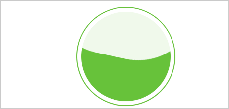
首先是html结构,先是画一个圆,接着便是在上面加入遮罩层盖住绿色部分,然后加入动画旋转,便形成了球内的波浪效果。
1 <div class="wrap">
2     <div class="clice"></div>
3     <div class="mask"></div>
4 </div>
css代码
.wrap {
     200px;
    height: 200px;
    box-sizing: border-box;
    border:2px solid #67c23a;
    background: #fff;
    border-radius: 50%;
    position: fixed;
    top: 50%;
    left: 50%;
    transform: translate(-50%,-50%);
    padding: 5px;
    overflow: hidden;
}
.clice {
     180px;
    height: 180px;
    background: #67c23a;
    border-radius: 50%;
    position: absolute;
    top: 50%;
    left: 50%;
    transform: translate(-50%,-50%);
}
.mask {
     300px;
    height: 300px;
    background-color: #fff;
    opacity: 0.9;
    position: absolute;
    top: -200px;
    left: -50px;
    animation: rotates 10s infinite;
    border-radius: 40%;
}
@keyframes rotates {
    100% {
    transform: rotate(360deg);
     }
}
上面的还可以通过控制遮罩层的定位top属性来修改位置,达到波浪上浮的效果,当然这过程可以修改波浪颜色提醒。
齿轮滚动
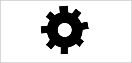
上传的gif图看起来有点卡顿,忽略它长的不是很好看。代码附上
  1 <!DOCTYPE html>
  2 <html>
  3     <head>
  4         <title>动画集合</title>
  5         <meta charset="utf-8">
  6         <style type="text/css">
  7             .wrap {
  8                 width: 200px;
  9                 height: 200px;
 10                 box-sizing: border-box;
 11                 background: #fff;
 12                 position: fixed;
 13                 top: 50%;
 14                 left: 50%;
 15                 transform: translate(-50%,-50%);
 16             }
 17             .gear {
 18                 width: 20px;
 19                 height: 20px;
 20                 border-radius: 50%;
 21                 background-color: #fff;
 22                 border: 15px solid #000;
 23                 position: relative;
 24                 animation: rotates 2s infinite linear;
 25                 -webkit-animation: rotates 2s infinite linear;
 26             }
 27             .gear:before {
 28                 content: "";
 29                 width: 9px;
 30                 height: 10px;
 31                 position: absolute;
 32                 background-color: #000;
 33                 transform: rotate(39deg);
 34                 top: -13px;
 35                 left: -17px;
 36             }
 37             .gear:after {
 38                 content: "";
 39                 width: 9px;
 40                 height: 10px;
 41                 position: absolute;
 42                 background-color: #000;
 43                 transform: rotate(-39deg);
 44                 top: -13px;
 45                 right: -17px;
 46             }
 47             .gear .left {
 48                 width: 9px;
 49                 height: 10px;
 50                 position: absolute;
 51                 background-color: #000;
 52                 transform: rotate(0deg);
 53                 top: 7px;
 54                 right: -23px;
 55             }
 56             .gear .left:before {
 57                 content: "";
 58                 width: 12px;
 59                 height: 10px;
 60                 position: absolute;
 61                 background-color: #000;
 62                 transform: rotate(45deg);
 63                 top: 19px;
 64                 right: 10px;
 65             }
 66             .gear .left:after {
 67                 content: "";
 68                 width: 10px;
 69                 height: 9px;
 70                 position: absolute;
 71                 background-color: #000;
 72                 top: -28px;
 73                 right: 28px;
 74             }
 75             .gear .right {
 76                 width:9px;
 77                 height: 10px;
 78                 position: absolute;
 79                 background-color: #000;
 80                 transform: rotate(0deg);
 81                 top: 7px;
 82                 left: -23px;
 83             }
 84             .gear .right:before {
 85                 content: "";
 86                 width: 12px;
 87                 height: 10px;
 88                 position: absolute;
 89                 background-color: #000;
 90                 transform: rotate(45deg);
 91                 top: 17px;
 92                 left: 6px;
 93             }
 94             .gear .right:after {
 95                 content: "";
 96                 width: 10px;
 97                 height: 9px;
 98                 position: absolute;
 99                 background-color: #000;
100                 top: 26px;
101                 left: 26px;
102             }
103             @keyframes rotates {
104                 100% {
105                     transform: rotate(-360deg);
106                 }
107             }
108         </style>
109     </head>
110     <body>
111         <div class="wrap">
112             <div class="gear">
113                 <div class="left"></div>
114                 <div class="right"></div>
115             </div>
116         </div>
117     </body>
118 </html>