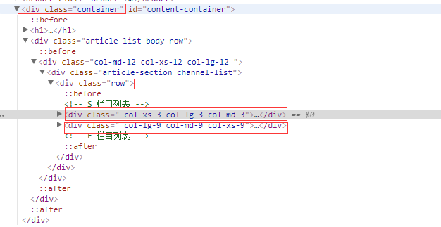
1.如何设置一行两列?
<div class="container">
<div class="row">
<div class="col-lg-3 col-md-3 col-xs-3"></div>
<div class="col-lg-9 col-md-9 col-xs-9"></div>
</div>
</div>
下面看结构
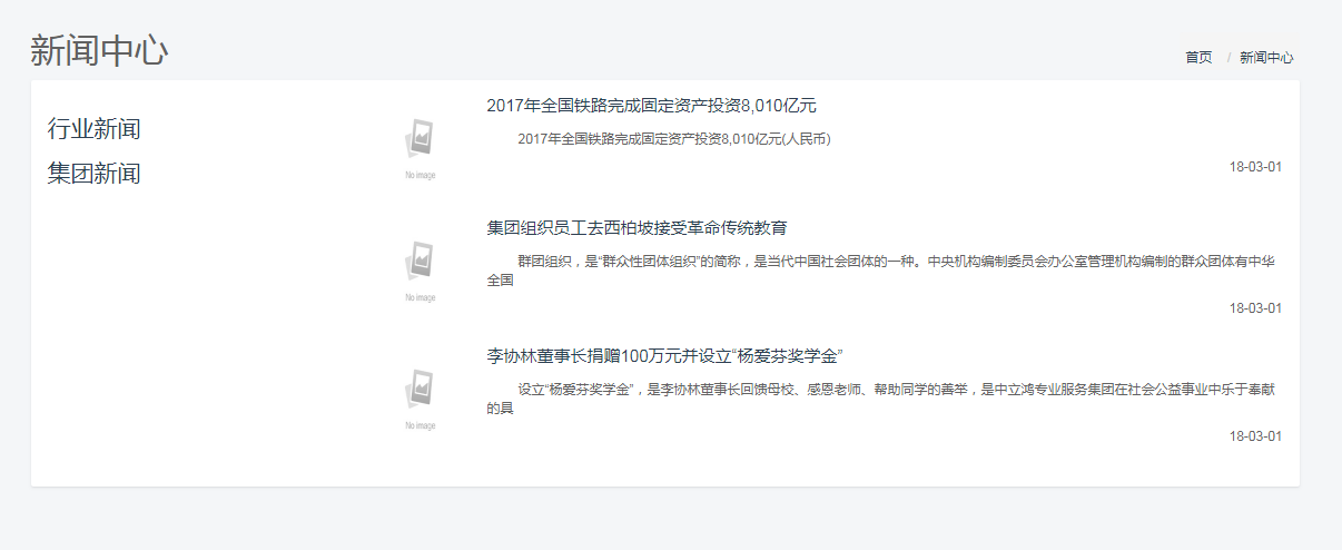
效果
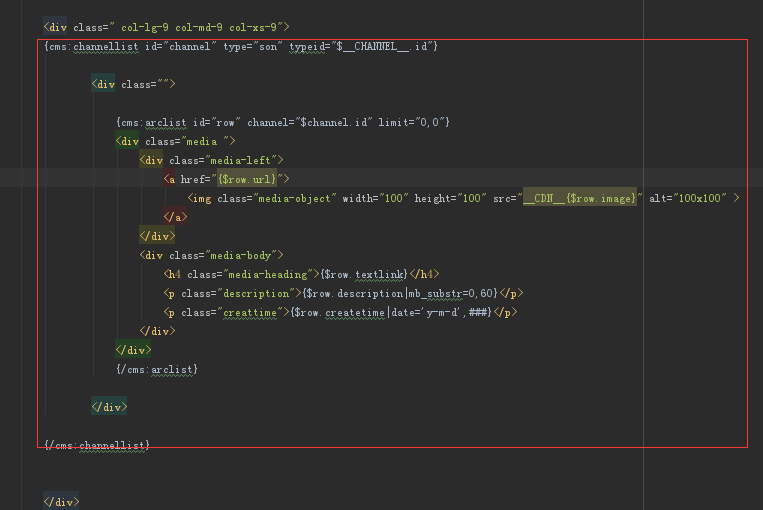
标签嵌套循环都写在 里面
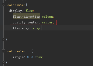
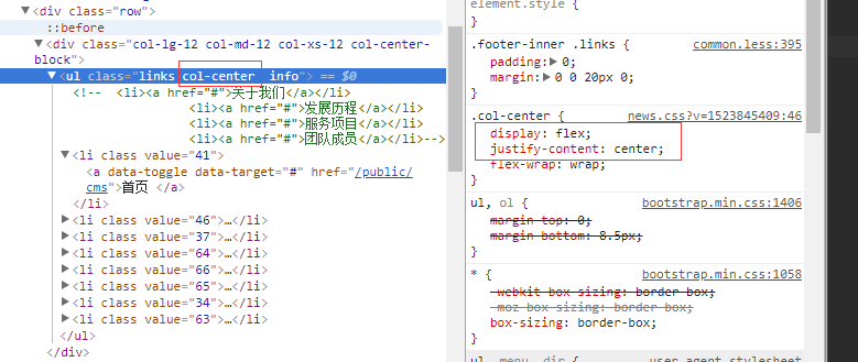
2.bootstrap中后台动态生成li等标签 无法添加col-lg-4 、col-md-4、col-xs-4等情况使用flex布局
兼容情况
IE 10+
红框是居中 justify-content:center
flex布局display flex
flex-warp换行
flex-direction默认是row 从左到右排列
3.bootstarp 中元素居中对齐
div{
float:none;
display:flex;
margin-left:auto;
margin-right:auto;
}
同时这个div 还添加别的类 比如col-lg-8
4.flex居中
实现
div{
display:flex;
justify-content:center
}
这时候父级元素继续上面的样式 就可以实现居中效果
结构
效果
