一、
Flex是Flexible Box的缩写,意为”弹性布局”,用来为盒状模型提供最大的灵活性。
任何一个容器都可以指定为Flex布局。
.box{
  display: -webkit-flex; /* Safari */
  display: flex;
}
采用Flex布局的元素,称为Flex容器(flex container),简称”容器”。它的所有子元素自动成为容器成员,称为Flex项目(flex item),简称”项目”。
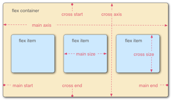
如图:容器默认存在两根轴:水平的主轴(main axis)和垂直的交叉轴(cross axis)。主轴的开始位置(与边框的交叉点)叫做main start,结束位置叫做main end;交叉轴的开始位置叫做cross start,结束位置叫做cross end。
项目默认沿主轴排列。单个项目占据的主轴空间叫做main size,占据的交叉轴空间叫做cross size。
二、
flex容器一共6个属性分别是
- flex-direction
- flex-wrap
- flex-flow
- justify-content
- align-items
- align-content
1)flex-direction属性
flex-direction属性决定主轴的方向(即项目的排列方向)。
.box {
  flex-direction: row | row-reverse | column | column-reverse;
}
- row(默认值):主轴为水平方向,起点在左端。
- row-reverse:主轴为水平方向,起点在右端。
- column:主轴为垂直方向,起点在上沿。
- column-reverse:主轴为垂直方向,起点在下沿。
2)flex-wrap属性
默认情况下,项目都排在一条线(又称”轴线”)上。flex-wrap属性定义,如果一条轴线排不下,如何换行。

nowrap(默认):不换行。
(2)wrap:换行,第一行在上方。

(3)wrap-reverse:换行,第一行在下方。

<!DOCTYPE html>
<html lang="en">
<head>
	<meta charset="UTF-8">
	<title>demo2</title>
	<style type="text/css">
		div,p{
			margin:2px;
		}
		div{
			500px;
			height:300px;
			/*background: #ccc;*/
			border:1px solid #000;
		}
		p{
			100px;
			height:40px;
			background: red;
		}

		.box{
			display:flex;
			flex-direction:row;  /*默认 从左到右*/
			/*flex-direction:row-reverse;  从右到左*/
			/*flex-direction:column;  从上到下*/
			/*flex-direction:column-reverse;   从下到上*/

			/*flex-wrap:nowrap ;   默认  不着折行*/
			/*flex-wrap:wrap;   换行  第一行在上*/
			/*flex-wrap:wrap-reverse;    换行  第一行在下面*/

			/*flex-flow:row wrap;   flex-direction 和 flex-wrap 的简写*/


			/*水平方向*/
			/*justify-content:flex-start;  默认*/
			/*justify-content:flex-end;*/
			/*justify-content:center;*/
			/*justify-content:space-between;  两端对齐,项目之间的间隔都相等*/
			justify-content:space-around;   /*每个项目两侧的间隔相等。所以,项目之间的间隔比项目与边框的间隔大一倍。*/


			/*垂直方向*/
			/*align-items:flex-start;*/
			/*align-items:flex-end;*/
			/*align-items:center;*/
			/*align-items:space-between;  与交叉轴两端对齐,轴线之间的间隔平均分布。*/
			/*align-items:space-around;*/
			 /*每根轴线两侧的间隔都相等。所以,轴线之间的间隔比轴线与边框的间隔大一倍。*/
			 align-items:stretch;  (默认值):轴线占满整个交叉轴。
		}

		.item3{
			/*order:-1;  order属性定义项目的排列顺序。数值越小,排列越靠前,默认为0*/
			/*flex-grow: 3;  属性定义项目的放大比例,默认为0,即如果存在剩余空间,也不放大。*/
			flex-shrink:5;  属性定义了项目的缩小比例,默认为1,即如果空间不足,该项目将缩小。

			/*flex-basis:;
			属性定义了在分配多余空间之前,项目占据的主轴空间(main size)。浏览器根据这个属性,计算主轴是否有多余空间。它的默认值为auto,即项目的本来大小。*/
			 flex:1; /* flex属性是flex-grow, flex-shrink 和 flex-basis的简写,默认值为0 1 auto。后两个属性可选。*/

			 /*align-self属性允许单个项目有与其他项目不一样的对齐方式,可覆盖align-items属性。默认值为auto,表示继承父元素的align-items属性,如果没有父元素,则等同于stretch。*/
		}
		.item4{
			order:1;
		}

	</style>
</head>
<body>
	<div class="box">
		<p class="item1">1</p>
		<p class="item2">2</p>
		<p class="item3">3</p>
		<p class="item4">4</p>
		<p class="item5">5</p>
		<p class="item6">6</p>
	</div>
</body>
</html>
未完待续