1.子控件的位置约束属性:
layout_constraintRight_toLeftOf 在谁左边
layout_constraintRight_toRightOf 在谁右边
layout_constraintTop_toTopOf 在谁上边对齐
layout_constraintTop_toBottomOf 在谁下边
layout_constraintBottom_toTopOf 在谁上边
layout_constraintBottom_toBottomOf 下边对齐
layout_constraintBaseline_toBaselineOf 基于基准线对齐
app:layout_constraintDimensionRatio 宽高比
app:layout_constraintHorizontal_weight,设置水平方向的权重
app:layout_constraintVertical_weight,设置垂直方向的权重
app:layout_constraintHorizontal_chainStyle 没有满屏时候的链样式,有spread spread-inside packed
app:layout_constraintVertical_bias 垂直拉力比例
app:layout-constrainHorizontal_bias 水平拉力比例
Guideline:辅助线
1.位置设置:例子:
<android.support.constraint.ConstraintLayout
xmlns:android="http://schemas.android.com/apk/res/android"
xmlns:app="http://schemas.android.com/apk/res-auto"
xmlns:tools="http://schemas.android.com/tools"
android:id="@+id/activity_main"
android:layout_width="match_parent"
android:layout_height="match_parent"
android:background="#11ff0000"
tools:context="com.zhy.constrantlayout_learn.MainActivity">
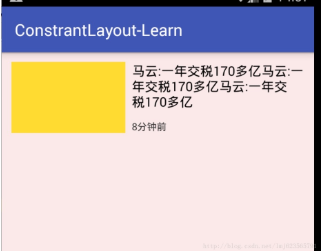
<TextView
android:id="@+id/tv1"
android:layout_width="140dp"
android:layout_height="86dp"
android:layout_marginLeft="12dp"
android:layout_marginTop="12dp"
android:background="#fd3"
app:layout_constraintLeft_toLeftOf="parent"
app:layout_constraintTop_toTopOf="parent"
/>
<TextView
android:id="@+id/tv2"
android:layout_width="0dp"
android:layout_height="wrap_content"
android:layout_marginLeft="8dp"
android:layout_marginRight="12dp"
android:text="马云:一年交税170多亿马云:一年交税170多亿马云:一年交税170多亿"
android:textColor="#000000"
android:textSize="16dp"
app:layout_constraintLeft_toRightOf="@id/tv1"
app:layout_constraintRight_toRightOf="parent"
app:layout_constraintTop_toTopOf="@id/tv1" />
<TextView
android:layout_width="wrap_content"
android:layout_height="wrap_content"
android:layout_marginLeft="8dp"
android:layout_marginTop="12dp"
android:text="8分钟前"
android:textColor="#333"
android:textSize="12dp"
app:layout_constraintLeft_toRightOf="@id/tv1"
app:layout_constraintBottom_toBottomOf="@id/tv1" />
</android.support.constraint.ConstraintLayout>
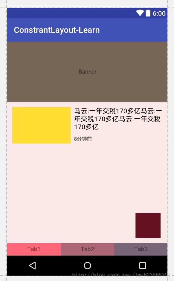
分析:
tv1设置了: tv1应该是在父布局的左上角;
app:layout_constraintLeft_toLeftOf="parent"
app:layout_constraintTop_toTopOf="parent"
tv2设置了: tv2在tv1的右侧,tv2的右侧和父布局对其,tv2和tv1顶部对齐;
app:layout_constraintLeft_toRightOf="@id/tv1"
app:layout_constraintRight_toRightOf="parent"
app:layout_constraintTop_toTopOf="@id/tv1"
tv3设置了: tv3在tv1的右侧,tv3和tv1底部对其。
app:layout_constraintLeft_toRightOf="@id/tv1"
app:layout_constraintBottom_toBottomOf="@id/tv1"
2.使用 match_contraint,即宽高:设置0,让约束来控制布局宽高。
让我们的宽度充满整个父布局
app:layout_constraintDimensionRatio 设置宽高比

//满屏
 android:layout_width="0dp"
 android:layout_height="0dp"

 app:layout_constraintLeft_toLeftOf="parent"
 app:layout_constraintRight_toRightOf="parent"
//三种写法都可以,设置宽高比
app:layout_constraintDimensionRatio="16:6" //16:6==H,16:6 宽:高=16:6

app:layout_constraintDimensionRatio="W,16:6" //6:16==H,16:6 宽:高=6:16
app:layout_constraintDimensionRatio="H,16:6"
该属性指的是宽高比,所以16:6就可以完成我们的需求。
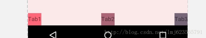
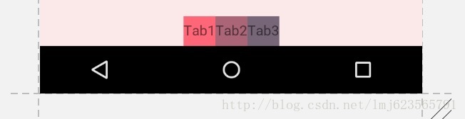
3类似LinearLayout的weight的权重布局
三个tab width均分
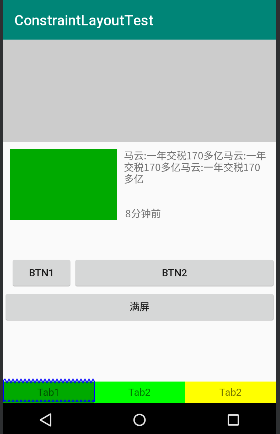
TextView在哪个控件的左边和右边都进行设置,并且width设置为0dp可以实现,三个tab的均分
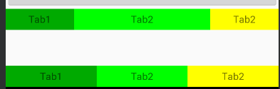
<TextView
        android:id="@+id/tv4"
        android:layout_width="0dp"
        android:layout_height="30dp"
        android:background="#00aa00"
        android:text="Tab1"
        android:gravity="center"
        app:layout_constraintBottom_toBottomOf="parent"
        app:layout_constraintLeft_toLeftOf="parent"
        app:layout_constraintRight_toLeftOf="@id/tv5"
        />
    <TextView
        android:id="@+id/tv5"
        android:layout_width="0dp"
        android:layout_height="30dp"
        android:text="Tab2"
        android:gravity="center"
        app:layout_constraintBottom_toBottomOf="parent"
        app:layout_constraintLeft_toRightOf="@id/tv4"
        app:layout_constraintRight_toLeftOf="@+id/tv6"
        android:background="#00ff00"
        />
    <TextView
        android:id="@+id/tv6"
        android:layout_width="0dp"
        android:layout_height="30dp"
        android:text="Tab2"
        android:gravity="center"
        app:layout_constraintBottom_toBottomOf="parent"
        app:layout_constraintLeft_toRightOf="@id/tv5"
        android:background="#ffff00"
        app:layout_constraintRight_toRightOf="parent"/>
app:layout_constraintHorizontal_weight,设置水平方向的权重
在上面三个TextView中加入这个属性,值分别设置为1,2,1,效果为第一个行,1:2:1的比例划分,没有设置的效果为第二行均分
app:layout_constraintHorizontal_chainStyle="spread" 设置链的样式并且width不为0
- spread + 宽度非0
-
spread + 宽度为0,且可以通过weight控制分配比例(上例)
-
spread_inside + 宽度非0
- packed + 宽度非0
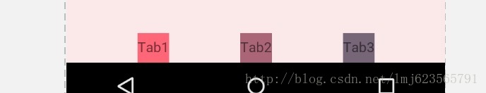
浮动框
 <TextView
        android:layout_width="60dp"
        android:layout_height="60dp"
        android:background="#612"
        app:layout_constraintBottom_toBottomOf="parent"
        app:layout_constraintLeft_toLeftOf="parent"
        app:layout_constraintRight_toRightOf="parent"
        app:layout_constraintTop_toTopOf="parent"
        app:layout_constraintHorizontal_bias="0.9"  //水平方向的拉力,90%说明
        app:layout_constraintVertical_bias="0.9" />
即设置上下两侧间隙比例分别为90%与10%。这个很好理解,我们之前说了,再没有bias这个属性的时候,这两侧的拉力大小是一样的,但是你可以通过bias来控制哪一侧的力要大一些~~明白了么~
所以,该属性可以用于约束之前,控制两侧的“拉力”。
我们看一下效果图:
六、尝试使用Guideline
android.support.constraint.Guideline该类比较简单,主要用于辅助布局,即类似为辅助线,横向的、纵向的。该布局是不会显示到界面上的。
所以其有个属性为:
android:orientation取值为”vertical”和”horizontal”.
除此以外,还差个属性,决定该辅助线的位置:
layout_constraintGuide_begin
layout_constraintGuide_end
layout_constraintGuide_percent
可以通过上面3个属性其中之一来确定属性值位置。
begin=30dp,即可认为距离顶部30dp的地方有个辅助线,根据orientation来决定是横向还是纵向。
end=30dp,即为距离底部。
percent=0.8即为距离顶部80%。
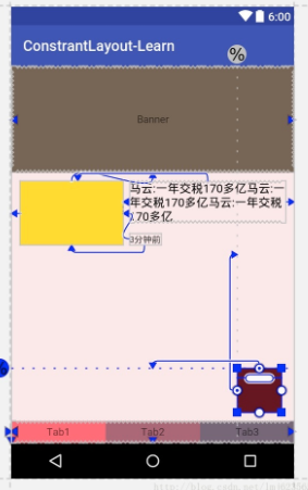
好了,下面看一个例子,刚才我们的浮点按钮,我决定通过两根辅助线来定位,一根横向距离底部80%,一个纵向距离顶部80%,浮点按钮就定位在他们交叉的地方。
<android.support.constraint.ConstraintLayout
...
tools:context="com.zhy.constrantlayout_learn.MainActivity">

<android.support.constraint.Guideline
android:id="@+id/guideline_h"
android:layout_width="wrap_content"
android:layout_height="wrap_content"
android:orientation="horizontal"
app:layout_constraintGuide_percent="0.8" />


<android.support.constraint.Guideline
android:id="@+id/guideline_w"
android:layout_width="wrap_content"
android:layout_height="wrap_content"
android:orientation="vertical"
app:layout_constraintGuide_percent="0.8" />

<TextView
android:layout_width="60dp"
android:layout_height="60dp"
android:background="#612"
app:layout_constraintLeft_toRightOf="@id/guideline_w"
app:layout_constraintTop_toBottomOf="@id/guideline_h" />

</....>
我感觉都不用解释了~~看眼效果图吧:
到此,属性基本上讲完啦~
可以看到,上述相当复杂的一个布局,在ConstraintLayout中完全没有嵌套!
六、总结
本文通过实际的按钮,基本上介绍了ConstraintLayout所支持的所有的属性,全文没有提及拖拽,因为当界面复杂之后,想要完美的拖拽实在是太难了,而且谁也不期望,看不懂拖拽完成后的布局属性吧~
所以,我建议还是尽可能手写,通过本文这样一个流程,虽然支持的属性有20多个,但是分类后并不难记,难记也可以拿出本文翻一翻~
转自:https://blog.csdn.net/lmj623565791/article/details/78011599?utm_source=tuicool&utm_medium=referral