tabs控件使用uib-tabset指令和uib-tab指令,效果是这样的:
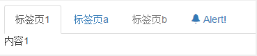
 1 <!DOCTYPE html>
 2 <html ng-app="ui.bootstrap.demo" xmlns="http://www.w3.org/1999/xhtml">
 3 <head>
 4     <meta http-equiv="Content-Type" content="text/html; charset=utf-8" />
 5     <link href="/Content/bootstrap.css" rel="stylesheet" />
 6     <title></title>
 7
 8     <script src="/Scripts/angular.js"></script>
 9     <script src="/Scripts/ui-bootstrap-tpls-1.3.2.js"></script>
10     <script>
11
12         angular.module('ui.bootstrap.demo', ['ui.bootstrap']).controller('TabsDemoCtrl', function ($scope, $window) {
13             $scope.tabs = [
14               { title: '标签页a', content: '标签页a的内容' },
15               { title: '标签页b', content: '标签页b的内容', disabled: true }
16             ];
17
18             $scope.alertMe = function () {
19                 setTimeout(function () {
20                     $window.alert('clicked!');
21                 });
22             };
23         });
24     </script>
25 </head>
26 <body>
27     <div ng-controller="TabsDemoCtrl">
28         <uib-tabset active="active" type="tabs">
29             <uib-tab index="0" heading="标签页1">内容1</uib-tab>
30             <uib-tab index="$index + 1" ng-repeat="tab in tabs" heading="{{tab.title}}" active="tab.active" disable="tab.disabled">
31                 {{tab.content}}
32             </uib-tab>
33             <uib-tab index="3" select="alertMe()">
34                 <uib-tab-heading>
35                     <i class="glyphicon glyphicon-bell"></i> Alert!
36                 </uib-tab-heading>
37                 内容部分
38             </uib-tab>
39         </uib-tabset>
40     </div>
41 </body>
42 </html>
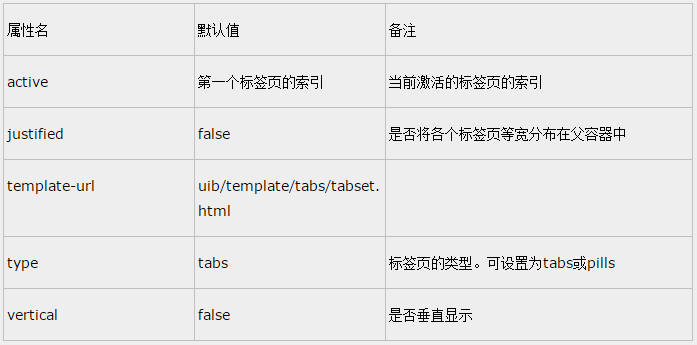
uib-tabset可使用的属性有:
uib-tab可使用的属性有:
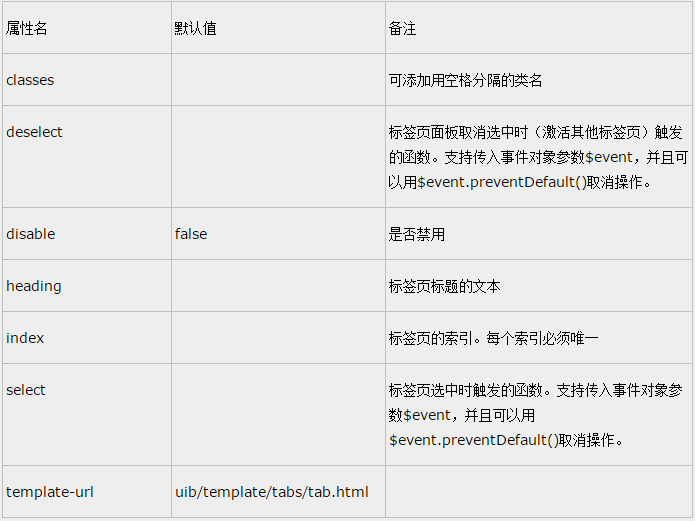
如果面板的标题是简单的文本,使用heading属性就足够了。如果是复杂的内容,比如有图标,那么可以使用uib-tab-heading。这一点和According控件是一样的。