
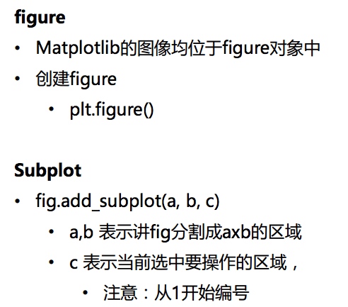 


figure /subplot
# 创建figure
fig = plt.figure()
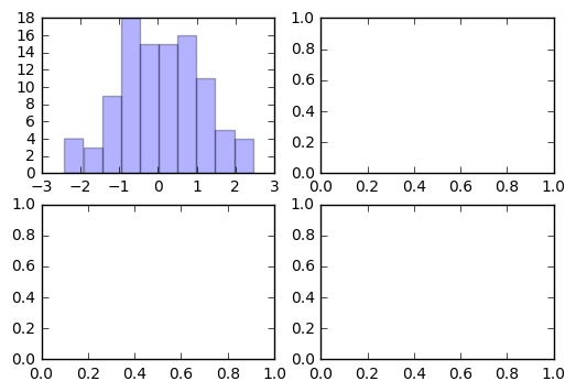
ax1 = fig.add_subplot(2,2,1)
ax2 = fig.add_subplot(2,2,2)
ax3 = fig.add_subplot(2,2,3)
ax4 = fig.add_subplot(2,2,4)
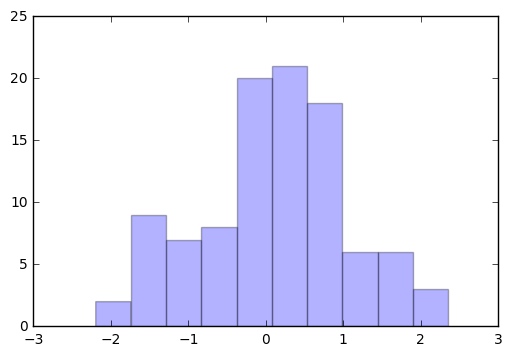
直方图、散点图、柱状图
plt.hist(np.random.randn(100), bins=10, color='b', alpha=0.3)
plt.show()
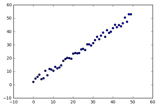
x = np.arange(50)
y = x + 5 * np.random.rand(50)
plt.scatter(x, y)
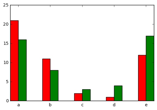
x = np.arange(5)
y1, y2 = np.random.randint(1, 25, size=(2, 5))
width = 0.25
ax = plt.subplot(1,1,1)
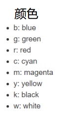
ax.bar(x, y1, width, color='r')
ax.bar(x+width, y2, width, color='g')
ax.set_xticks(x+width)
ax.set_xticklabels(['a', 'b', 'c', 'd', 'e'])
plt.show()


矩阵绘图
m = np.random.rand(10,10)
print(m)
plt.imshow(m, interpolation='nearest', cmap=plt.cm.ocean)
plt.colorbar()
plt.show()
 

plt.subplots()
fig, subplot_arr = plt.subplots(2,2)
subplot_arr[0,0].hist(np.random.randn(100), bins=10, color='b', alpha=0.3)
plt.show()

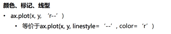
颜色、标签、线型
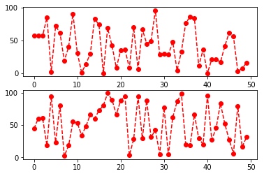
fig, axes = plt.subplots(2)
axes[0].plot(np.random.randint(0, 100, 50), 'ro--')
# 等价
axes[1].plot(np.random.randint(0, 100, 50), color='r', linestyle='dashed', marker='o')

刻度、标签、图例
fig, ax = plt.subplots(1)
ax.plot(np.random.randn(1000).cumsum(), label='line0')

# 设置刻度
#plt.xlim([0,500])
ax.set_xlim([0, 800])

# 设置显示的刻度
#plt.xticks([0,500])
ax.set_xticks(range(0,500,100))

# 设置刻度标签
ax.set_yticklabels(['Jan', 'Feb', 'Mar'])

# 设置坐标轴标签
ax.set_xlabel('Number')
ax.set_ylabel('Month')

# 设置标题
ax.set_title('Example')

# 图例
ax.plot(np.random.randn(1000).cumsum(), label='line1')
ax.plot(np.random.randn(1000).cumsum(), label='line2')
ax.legend()
ax.legend(loc='best')
#plt.legend()
 

# -*- coding: utf-8 -*-

import numpy as np
import matplotlib.pyplot as plt
import scipy as sp
from scipy import stats


# 创建figure
fig = plt.figure()

ax1 = fig.add_subplot(2,3,1)
ax2 = fig.add_subplot(2,3,2)
ax3 = fig.add_subplot(2,3,3)
ax4 = fig.add_subplot(2,3,4)

random_arr = np.random.randn(100)
plt.plot(random_arr)

#
x = np.linspace(-5, 15, 50)
ax2.plot(x, sp.stats.norm.pdf(x=x, loc=5, scale=2))
ax2.hist(sp.stats.norm.rvs(loc=5, scale=2, size=200), bins=50, normed=True, color='red', alpha=0.5)

# 绘制直方图
ax1.hist(np.random.randn(100), bins=10, color='b', alpha=0.3)

# 绘制散点图
x = np.arange(50)
y = x + 5 * np.random.rand(50)
ax3.scatter(x, y)

# 柱状图
ax5 = fig.add_subplot(2,3,5)
x = np.arange(5)
y1, y2 = np.random.randint(1, 25, size=(2, 5))
width = 0.25
ax5.bar(x, y1, width, color='r')
ax5.bar(x+width, y2, width, color='g')
ax5.set_xticks(x+width)
ax5.set_xticklabels(['a', 'b', 'c', 'd', 'e'])
plt.show()

# 矩阵绘图
m = np.random.rand(10,10)
plt.imshow(m, interpolation='nearest', cmap=plt.cm.ocean)
plt.colorbar()
plt.show()

# plt.subplots()
fig, subplot_arr = plt.subplots(2,2)
subplot_arr[0,0].hist(np.random.randn(100), bins=10, color='b', alpha=0.3)
plt.show()