最近的计划,就是每天来几个特效,当然这里有限制,在什么候选区只能放一个,还每天有限制发布的,哎,
啊 终于写完了,看到一个挺好玩的东西,想到能不能用网页的特效做出来,试试呗!不过,一想肯东有很多的
相类似的了,不过,反正就是挺有成就感的。高兴即来淫诗一首,两眼黑黑,灯下黑黑,嘿嘿嘿嘿嘿嘿嘿嘿。。。
赶紧上例子咯
<!DOCTYPE html>
<html>

	<head>
		<meta charset="UTF-8">
		<title></title>
		<link rel="stylesheet" href="css/normalize.css" />/*normalize这个css框架呢,可以去搜搜,挺好用的*/
	<link rel="stylesheet" href="css/font-awesome.min.css" />/*这个呢,是小图标css框架,用法和bootstrap差不多*/
	<style>
		*,*:before,*:after{
			-ms-box-sizing:border-box;
			-o-box-sizing:border-box;
			-moz-box-sizing:border-box;
			-webkit-box-sizing:border-box;

			box-sizing:border-box;/*这里主要是想真正的widdth就是width,不要把什么padding啊,border啊等加进来,这才真正的符合人的视角*/
		}
		html,body{
			 100%;
			height: 100%;
			background: rgba(95, 234, 234, 0.8);
			font-size: 24px;
			font-weight: 600;
			font-family: "arial black";
		}
		ul,li{
			list-style: none;
			display: inline-block;
		}
		a{
			display: block;
			text-decoration: none;
			color:rgba(0,0,0,0.3);
		}
		li{
			padding: 20px 0;
			margin: 0 10px;
		}
		.da{
			 700px;
			margin-top: 200px;

			margin-left: 50%;
			-webkit-transform:translateX(-50%);/*这两行代码也是居中的技巧*/

		}
		.da li{
			 100px;
			height: 100px;

			text-align: center;
			position: relative;
			z-index: 999;/*一定位就要想到z-index,不管有没有用*/
		}
		.da span{
			position: absolute;
			bottom:100%;/*我归之为“巧用100%”,先什么left,top 啊,都不加,光是position看看,因为%是相对于他的父类,如果他的上边贴紧父类的上边框,这就是不是可以考虑用100%了呢?*/
                        left: 60%;
			margin-left: -50%;
                        z-index: 9998;
			 80px;
			height: 80px;
			background: #fff;
			border-radius: 50%;/*圆角*/
			color:rgba(12, 130, 130, 0.8);

			opacity: 0;
			transition:opacity 0.3;/*css3很重要的标签,过渡。4个值,标签名(对象是谁)时间(多久)方式(匀速啊,变速啊,先怎么后怎么样啊)延迟时间(等多久开始)我这里只用到前两个*/
		}
		.da span:after{/*做完今天这个,我感觉伪类就是来修修补补,或者拼接用的,当然,他还有一个很好用的东东,就是清除浮动{content:“”;display:block;clear:both,核心这个}*/
			content: "";
			 40px;
			height: 40px;
			background: url(imges/tip.svg) no-repeat;/*avg格式的图片,不会因为变大而失真*/
			position: absolute;
			top:100%;
			left:80%;
			margin-left: -50%;
			margin-top: -8px;

		}
		.da i{
			position: absolute;
			left:85%;
			margin-left:-50%;
			margin-top:30px;
			margin-bottom: 20px;
		}
                /*-----------------------接下来就是核心代码,前边是在搭框架-----------------------------------------------------------------*/
		span{
			transition:transform 0.3s;
			-webkit-transition:transform 0.3s;
		}
		span i{
			transition:transform 0.1s;
			-webkit-transition:transform 0.1s;
		}
		li:hover span{
			transform:rotate3d(0,0,0,0deg) translate3d(0,0,0) scale3d(1,1,1);
			-webkit-transform:rotate3d(0,0,0,0deg) translate3d(0,0,0) scale3d(1,1,1);
			opacity: 1;
		}
		li:hover span i{
			transform:scale3d(1,1,1) translate3d(0,0,0);
			-webkit-transform:scale3d(1,1,1) translate3d(0,0,0);
		}/*这里每个类吧相同的都提出来了,相同的是什么?就是最终的状态是一样的*/
/*接下来就是每个分部分,rotatwd旋转角度 scale缩放 translate平移 其中加了3d就是让他进行3d变换,当然还有一个2d。 */
span.content1{
transform-origin: center bottom;
-webkit-transform-origin: center bottom;
transform:rotate3d(1,1,1,60deg);
-webkit-transform:rotate3d(1,1,1,60deg);
}
span.content1 i{
transform:scale3d(0.01,0.01,1);
-webkit-transform:scale3d(0.01,0.01,1);
}
span.content2{
transform-origin: center bottom;
-webkit-transform-origin: center bottom;
transform:translate3d(0,20px,0);
-webkit-transform:translate3d(0,20px,0);
}
span.content2 i{
transform:translate3d(0,10px,0);
-webkit-transform:translate3d(0,10px,0);
}
span.content3{
transform-origin: center bottom;
-webkit-transform-origin: center bottom;
transform:rotate3d(0,1,0,90deg) translate3d(0,8px,0);
-webkit-transform:rotate3d(0,1,0,90deg) translate3d(0,8px,0);
}
span.content3 i{
transform:translate3d(0,-2px,0);
-webkit-transform:translate3d(0,-2px,0);
}
span.content4{
transform:translate3d(0,-12px,0);
-webkit-transform:translate3d(0,-12px,0);
}
span.content4 i{
transform:translate3d(0,12px,0);
-webkit-transform:translate3d(0,12px,0);
}
span.content5{
transform:scale(0.01) translate3d(0,10px,0);/*最重要的,就是scale如果你把它缩成0,可能会发生效果不发出现的情况,不行你可以去试,所以尽可能把他弄成0,01*/
-webkit-transform:scale(0.01) translate3d(0,10px,0);
}
span.content5 i{
transform:translate3d(0,20px,0);
-webkit-transform:translate3d(0,20px,0);
}
</style>
</head>
<body>
<div class="da">
<ul>
<li>
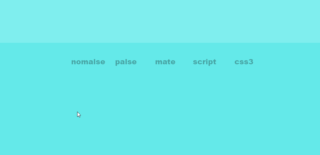
<a href="#">nomalse<span class="content1"><i class="fa fa-camera"></i></span></a>
</li>
<li>
<a href="#">palse<span class="content2" ><i class="fa fa-bicycle"></i></span></a>
</li>
<li>
<a href="#">mate<span class="content3" ><i class="fa fa-bus"></i></span></a>
</li>
<li>
<a href="#">script<span class="content4"><i class="fa fa-ship"></i></span></a>
</li>
<li>
<a href="#">css3<span class="content5"><i class="fa fa-plane"></i></span></a>
</li>
</ul>
</div>
</body>
</html>