源:DataCamp
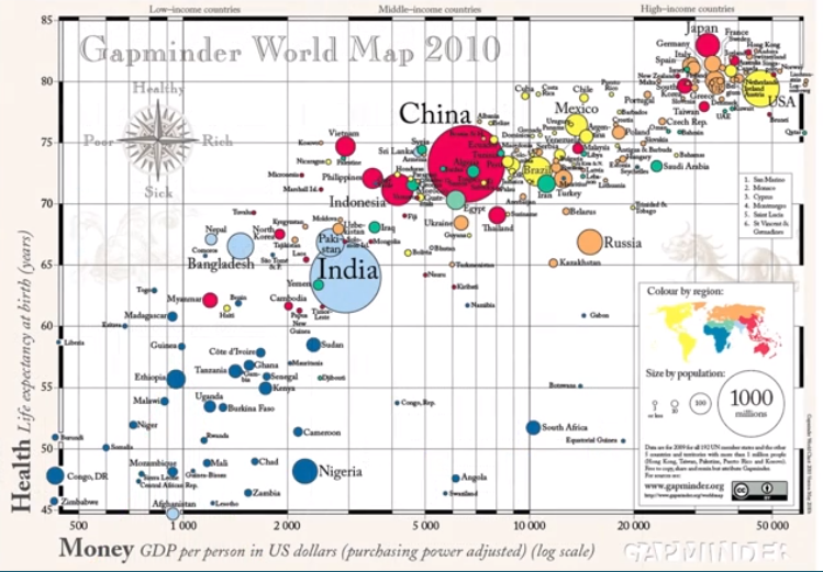
气泡的大小表示人口的多少,横坐标表示人均GDP(美元),纵坐标表示预期寿命。-- 作者:Hans Rosling
Python 中有许许多多用于可视化的包,而 matplotlib 是它们的源头。
我们需要用到的是它的子包 pyplot ,通常它被简写成 plt 导入
1、Line plot
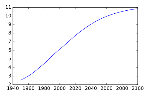
# Print the last item from year and pop
print(year[-1])
print(pop[-1])

# Import matplotlib.pyplot as plt
import matplotlib.pyplot as plt

# Make a line plot: year on the x-axis, pop on the y-axis
plt.plot(year, pop)

# Display the plot with plt.show()
plt.show()
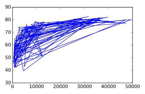
# Print the last item of gdp_cap and life_exp
print(gdp_cap[-1])
print(life_exp[-1])

# Make a line plot, gdp_cap on the x-axis, life_exp on the y-axis
plt.plot(gdp_cap, life_exp)

# Display the plot
plt.show()
2、Scatter Plot
When you have a time scale along the horizontal axis, the line plot is your friend. But in many other cases, when you're trying to assess if there's a correlation between two variables, for example, the scatter plot is the better choice. Below is an example of how to build a scatter plot.
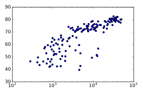
# Change the line plot below to a scatter plot
plt.scatter(gdp_cap, life_exp)

# Put the x-axis on a logarithmic scale
plt.xscale('log')

# Show plot
plt.show()
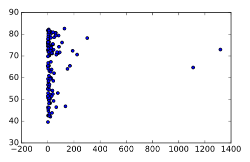
# Import package
import matplotlib.pyplot as plt

# Build Scatter plot
plt.scatter(pop, life_exp)

# Show plot
plt.show()