三行代码实现上下居中
position: relative;
top: 50%;
transform: translateY(-50%);
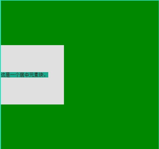
<!DOCTYPE html>
<html>
<head lang="en">
<meta charset="UTF-8">
<title>css123</title>
<style>
body {
background: #2ae0bb;
}
.box {
40%;
height: 500px;
background: #008800;
}
.text {
40%;
height: 200px;
background: #e0e0e0;
position: relative;
top: 50%;
transform: translateY(-50%);
-webkit-transform: translateY(-50%);
-ms-transform: translateY(-50%);
}
.text span{
position: absolute;
top: 50%;
transform: translateY(-50%);
-webkit-transform: translateY(-50%);
-ms-transform: translateY(-50%);
background: #18aa8c;
}
</style>
</head>
<body>
<div class="box">
<div class="text">
<span>这是一个居中元素块。</span>
</div>
</div>
<div class="pool">
<div class="text-dec">
<span>Look!I'm here.while just you know.</span>
</div>
</div>
</body>
</html>
height: 0;
padding-bottom: 20%;
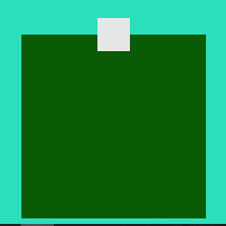
<!DOCTYPE html>
<html>
<head lang="en">
<meta charset="UTF-8">
<title>square</title>
<style>
body {
background: #2ae0bb;
}
.aa {
20%;
height: 0;
padding-bottom: 20%;
background: #095c05;
margin: 0 auto;
}
.aa .cc{
position: relative;
top: 50%;
transform: translateY(50%);
-webkit-transform: translateY(-50%);
-ms-transform: translateY(-50%);
18%;
height: 0;
padding-bottom: 18%;
background: #E6E6E6;
margin: 0 auto;
}
</style>
</head>
<body>
<div class="aa">
<div class="cc"></div>
</div>
</body>
</html>