图形的引用、裁切和蒙版
<use>标签创建图形引用
<clip>标签裁切图形
<mask>标签创建蒙版
这里在重申一下,webBox相当于画布的实际尺寸,比如画布中的圆形是宽400,高400的圆形;viewBox表示从0,0位置开始,宽和高分别是400,正好可以把整个圆形显示出来,然后把该画布整个放在
宽100 高100的原始画布中去。这样原始画布无论如何变化,都会把整个圆形显示出来,因为webBox已经设置好了图形用到的画布的大小;
<svg xmlns="http://www.w3.org/2000/svg" style="border:1px solid red"
     width="100" height="100"
     viewBox="0 0 400 400">
<circle cx="200" cy="200" r="200" fill="#fdd" stroke="none"></circle>
</svg>
<use>的使用,
1. 其xlink 必须在html中使用
2.id必须是可以展示出来的元素
<defs>
   <polygon  id="stars" points="0 -10 2 -2 10 0 2 2 0 10 -2 2 -10 0 -2 -2" fill="yellow"></polygon>
</defs>
<use xlink:href="#stars" x="10" y="10" stroke="green" stroke-width="2"></use>
<use xlink:href="#stars" x="10" y="30" stroke="green" stroke-width="2"></use>
比如这里的stars必须是放在星星上,不能放在defs上
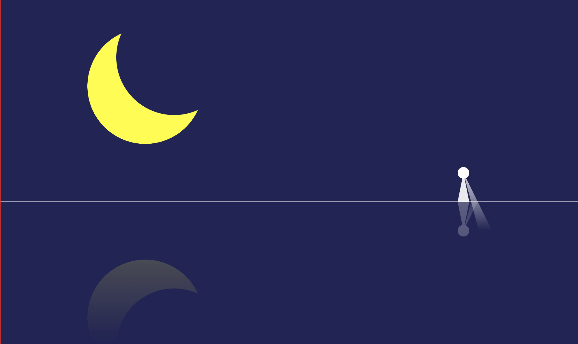
有关蒙层、剪切的使用方法:
<!DOCTYPE html>
<html lang="en">
<head>
    <meta charset="UTF-8">
    <meta name="viewport" content="width=device-width, initial-scale=1.0">
    <meta http-equiv="X-UA-Compatible" content="ie=edge">
    <title>Document</title>
</head>
<body>
    <svg xmlns="http://www.w3.org/2000/svg"
        style="border:1px solid red;background: #222256;"
        width="1000" height="600"
        viewBox="-500 -300 1000 600"
        >
        <!--这里的viewBox将坐标系放在了画布的中央,才有了后面的所有标签设置为 0 0 的时候,起始位置在画布的中央的效果-->
        <!--从-500开始 宽度为1000的坐标系,也就是画布的0对应这view的-500,则view的0,对应着画布的500,所以是正中央 -->
    <defs>
        <radialGradient id="tower" cx="0" cy="0" r="0.5">
            <stop offset="0" stop-color="rgba(255,255,255,0.7)"></stop>
            <stop offset="1" stop-color="rgba(255,255,255,0.9)"></stop>
        </radialGradient>
        <radialGradient id="light" cx="0.5" cy="0.5" r="0.5">
            <stop offset="0" stop-color="rgba(255,255,255,0.8)"></stop>
            <stop offset="1" stop-color="rgba(255,255,255,0)"></stop>
        </radialGradient>
        <!-- clipPath 是把两个图形重合的部分剪切显示-->
        <clipPath id="light-clip">
            <polygon  points="-300 -30  0 0 -300 30" fill="green">
                <animateTransform
                    attributeName="transform"
                    attributeType="XML"
                    type="rotate"
                    from="0"
                    to="360"
                    dur="10s"
                    repeatCount="indefinite">
                </animateTransform>
            </polygon>
        </clipPath>
    </defs>
    <g id="real">
        <g id="moon-group">
            <!--蒙版中黑色代表不可见(opacity: 0),白色代表可见(opacity: 100%)-->
            <mask id="moon-mask">
                <circle cx="-250" cy="-150" r="100" fill="white"></circle>
                <circle cx="-200" cy="-200" r="100" fill="black"></circle>
            </mask>
            <circle cx="-250" cy="-150" r="100" fill="yellow" mask="url(#moon-mask)"></circle>
        </g>
        <g id="light-tower" transform="translate(300,0)">
            <polygon points="0 0 10 50 -10 50" fill="url(#tower)"></polygon>
            <ellipse cx="0" cy="0" rx="300" ry="100" fill="url(#light)"
            clip-path="url(#light-clip)"
            ></ellipse>
            <circle cx="0" cy="0" r="10" fill="#fff"></circle>
        </g>
    </g>
    <g id="reflact" transform="translate(0,50)" mask="url(#fading)">
        <defs>
            <linearGradient id="fade" x1="0" y1="0" x2="0" y2="1">
                <stop offset="0" stop-color="rgba(255,255,255,0.3)"></stop>
                <stop offset="0.8" stop-color="rgba(255,255,255,0)"></stop>
            </linearGradient>
            <mask id="fading">
                <rect x="-400" y="0" width="800" height="300" fill="url(#fade)"></rect>
            </mask>
        </defs>
        <use xlink:href="#real" transform="scale(1,-1) translate(0,-50)"></use>
    </g>
    <line x1="-500" y1="50" x2="500" y2="50" stroke="#fff"></line>
    </svg>
</body>
</html>