伸缩布局也叫 flex 布局。有 2 个属性比较重要:
| display: inline-flex | 将对象作为弹性伸缩盒展示,用于行内元素 |
| display: flex | 将对象作为弹性伸缩盒展示,用于块级元素 |
一般都是用 display: flex 。基本都是针对块级元素布局。
常用属性
| flex-direction | 用于指定 flex 主轴的方向,继而决定 flex 子项在 flex 容器中的位置 | |
| 取值: | row | row-reverse | column | column-reverse | |
| justify-content | 用于指定主轴(水平方向)上 flex 子项的对齐方式 | |
| 取值: | flex-start | flex-end | center | space-between | space-around | |
| align-items | 用于指定侧轴(垂直方向)上 flex 子项的对齐方式 | |
| 取值: | stretch | flex-start | flex-end | center | baseline | |
| flex-wrap | 用于指定 flex 子项是否换行 | |
| 取值: | nowrap | wrap | wrap-reverse | |
| align-content | 该属性只作用于多行的情况下,用于多行的对齐方式 | |
| 取值: | stretch | flex-start | flex-end | center | space-between | space-around | |
| align-self | 该属性用来单独指定某 flex 子项的对齐方式 | |
| 取值: | auto | flex-start | flex-end | center | baseline | stretch | |
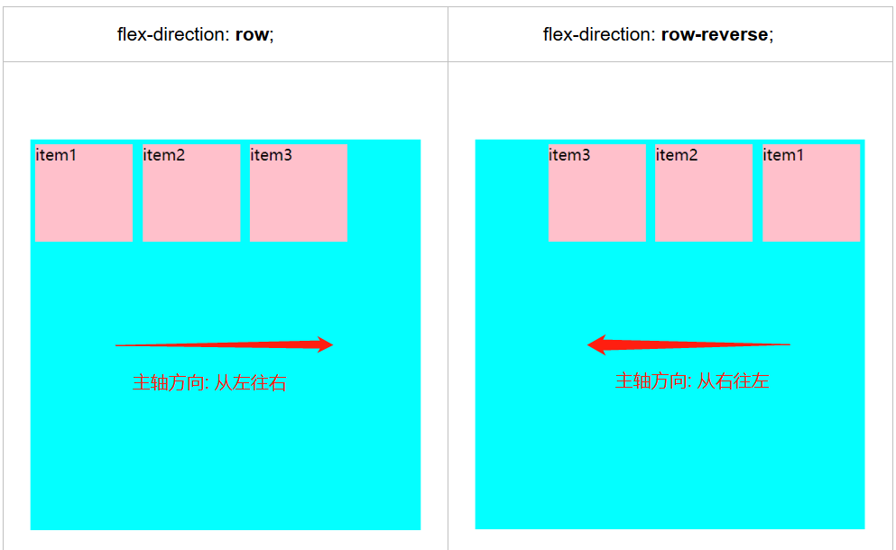
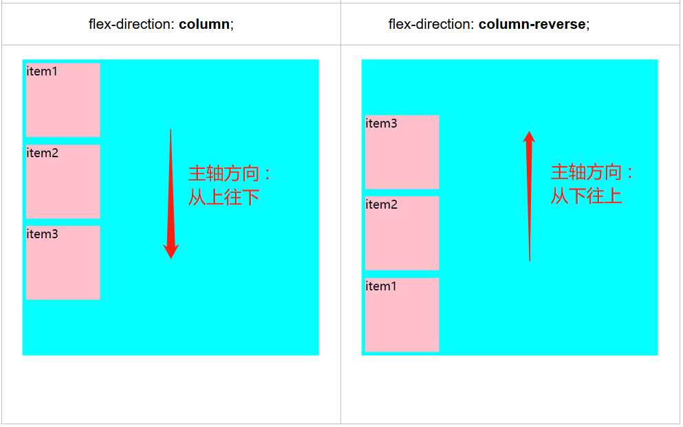
flex-direction 用于指定Flex主轴的方向,继而决定 Flex子项在Flex容器中的位置。
例 子
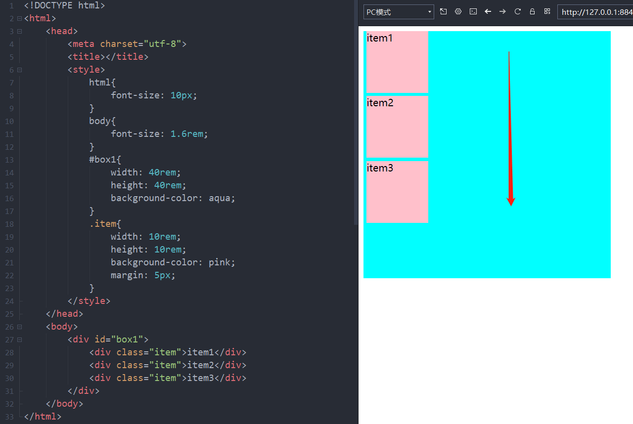
如果没有进行伸缩布局,在标准流中就是从上往下的,如果是行级标签就是从左往右的。


<!DOCTYPE html>
<html>
    <head>
        <meta charset="utf-8">
        <title></title>
        <style>
            html{
                font-size: 10px;
            }
            body{
                font-size: 1.6rem;
            }
            #box1{
                width: 40rem;
                height: 40rem;
                background-color: aqua;
            }
            .item{
                width: 10rem;
                height: 10rem;
                background-color: pink;
                margin: 5px;
            }
        </style>
    </head>
    <body>
        <div id="box1">
            <div class="item">item1</div>
            <div class="item">item2</div>
            <div class="item">item3</div>
        </div>
    </body>
</html>
接下来通过设置 display 属性设置伸缩布局。
<!DOCTYPE html>
<html>
    <head>
        <meta charset="utf-8">
        <title></title>
        <style>
            html{
                font-size: 10px;
            }
            body{
                font-size: 1.6rem;
            }
            #box1{
                width: 40rem;
                height: 40rem;
                background-color: aqua;
                /*伸缩布局*/
                display: flex;
            }
            .item{
                width: 10rem;
                height: 10rem;
                background-color: pink;
                margin: 5px;
            }
        </style>
    </head>
    <body>
        <div id="box1">
            <div class="item">item1</div>
            <div class="item">item2</div>
            <div class="item">item3</div>
        </div>
    </body>
</html>
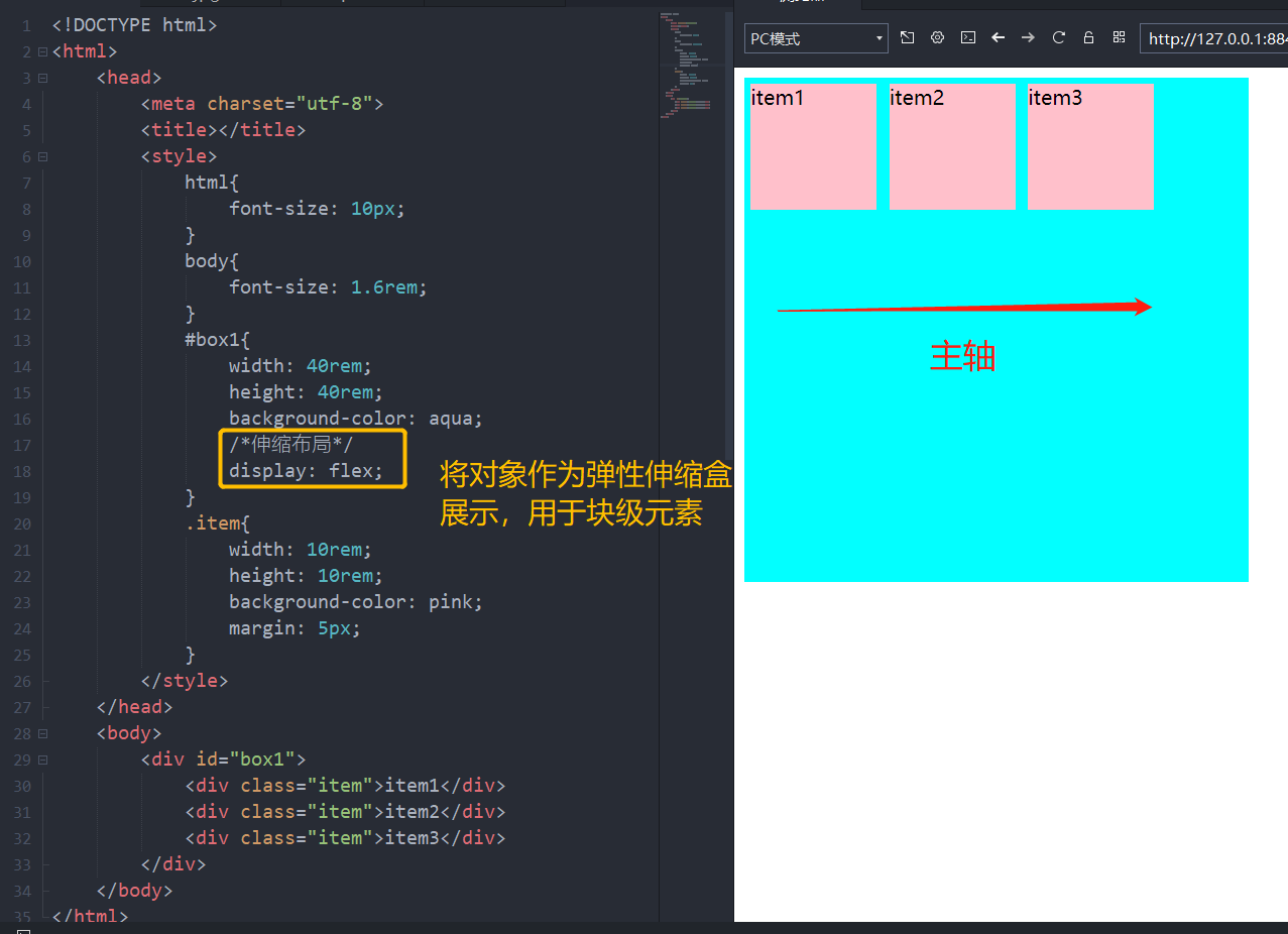
可以看到设置了伸缩布局之后主轴方向变了。伸缩布局默认主轴方向为从左往右。
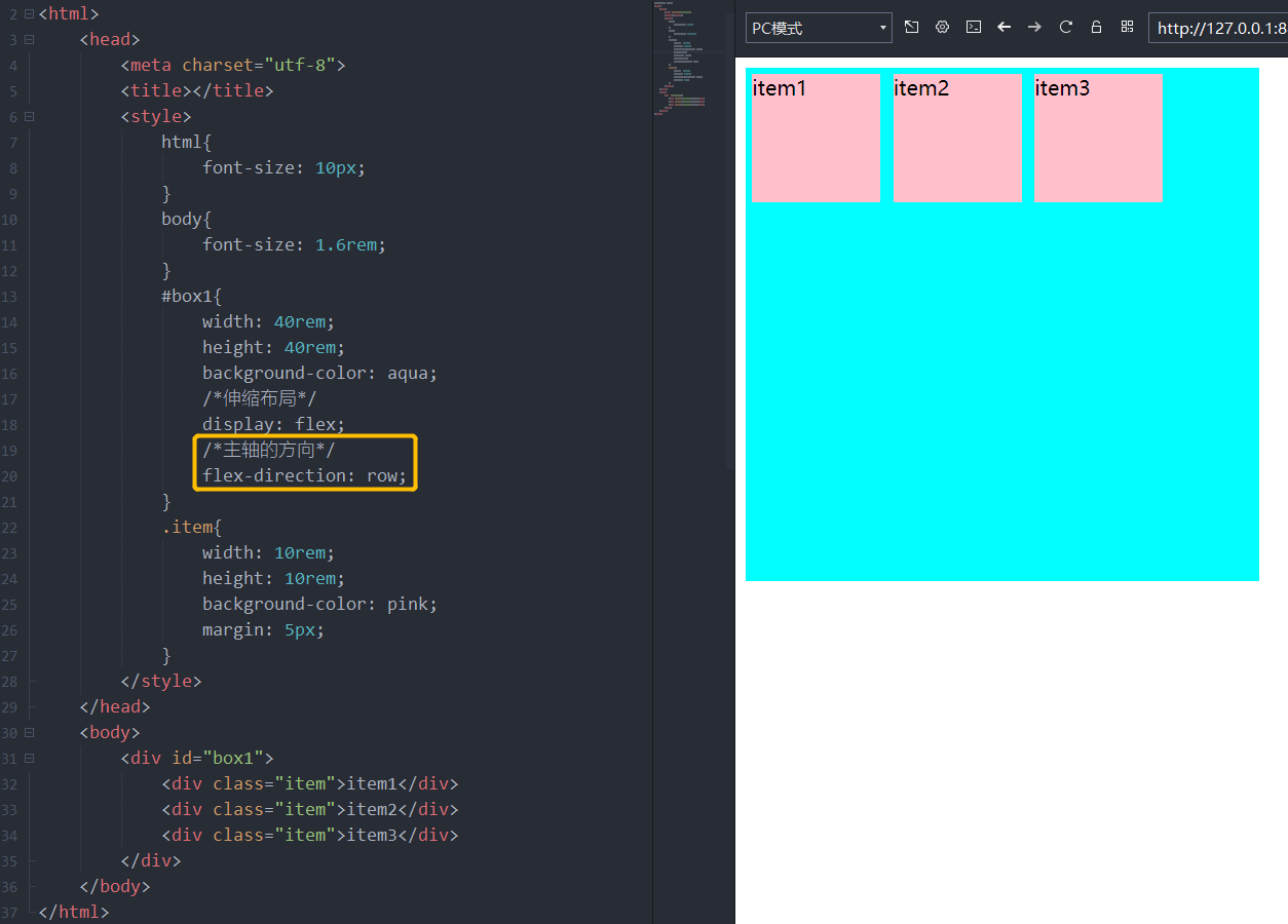
下面通过设置 flex-direction 来设置主轴方向。
各种主轴方向:
justify-content 用于指定主轴(水平方向)上Flex子项的对齐方式
相关网络资料:https://www.runoob.com/cssref/css3-pr-justify-content.html
例 子
在下面代码的基础上,设置主轴对齐方式。
<!DOCTYPE html>
<html>
    <head>
        <meta charset="utf-8">
        <title></title>
        <style>
            html{
                font-size: 10px;
            }
            body{
                font-size: 1.6rem;
            }
            #box1{
                width: 40rem;
                height: 40rem;
                background-color: aqua;
                /*伸缩布局*/
                display: flex;
                /*主轴的方向*/
                flex-direction: row;
            }
            .item{
                width: 10rem;
                height: 10rem;
            }
        </style>
    </head>
    <body>
        <div id="box1">
            <div class="item" style="background-color: grey;">item1</div>
            <div class="item" style="background-color: yellow;">item2</div>
            <div class="item" style="background-color: pink;">item3</div>
        </div>
    </body>
</html>

通过设置 justify-content 来设置主轴对齐方式。
<!DOCTYPE html>
<html>
    <head>
        <meta charset="utf-8">
        <title></title>
        <style>
            html{
                font-size: 10px;
            }
            body{
                font-size: 1.6rem;
            }
            #box1{
                width: 40rem;
                height: 40rem;
                background-color: aqua;
                /*伸缩布局*/
                display: flex;
                /*主轴的方向*/
                flex-direction: row;
                /*主轴对齐方式*/
                justify-content: flex-start;
            }
            .item{
                width: 10rem;
                height: 10rem;
            }
        </style>
    </head>
    <body>
        <div id="box1">
            <div class="item" style="background-color: grey;">item1</div>
            <div class="item" style="background-color: yellow;">item2</div>
            <div class="item" style="background-color: pink;">item3</div>
        </div>
    </body>
</html>

设置主轴对齐方式为 flex-start 即设置主轴对齐方式为与行的起始位置对齐。
各种主轴对齐方式:

特殊情况:
1. 当剩余空间为负数或者只有一个项时,space-between 效果等同于 flex-start
2. 当剩余空间为负数或者只有一个项时,space-around 效果等同于 center
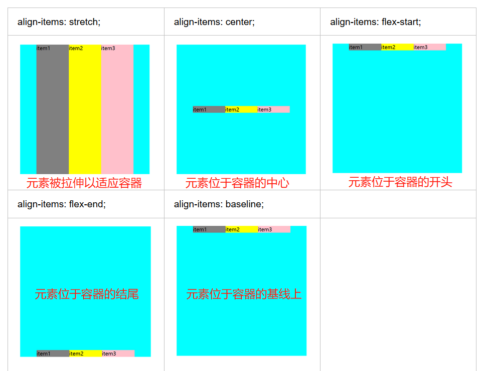
align-items 用于指定侧轴(垂直方向)上Flex子项的对齐方式
相关网络资料:https://www.runoob.com/cssref/css3-pr-align-items.html
例 子
主轴方向为从左向右,主轴对齐方式为居中。设置侧轴(垂直方向)上 flex 子项的对齐方式
<!DOCTYPE html>
<html>
    <head>
        <meta charset="utf-8">
        <title></title>
        <style>
            html{
                font-size: 10px;
            }
            body{
                font-size: 1.6rem;
            }
            #box1{
                width: 40rem;
                height: 40rem;
                background-color: aqua;
                /*伸缩布局*/
                display: flex;
                /*主轴的方向*/
                flex-direction: row;
                /*主轴对齐方式*/
                justify-content: center;
                /*侧轴对齐方式*/
                align-items: stretch;
            }
            .item{
                width: 10rem;
            }
        </style>
    </head>
    <body>
        <div id="box1">
            <div class="item" style="background-color: grey;">item1</div>
            <div class="item" style="background-color: yellow;">item2</div>
            <div class="item" style="background-color: pink;">item3</div>
        </div>
    </body>
</html>


各种侧轴对齐方式:
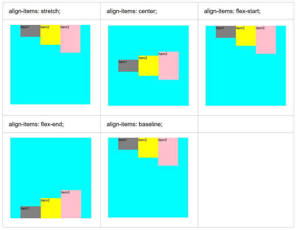
为了看清楚点,为 3 个盒子设置了高度。
<!DOCTYPE html>
<html>
    <head>
        <meta charset="utf-8">
        <title></title>
        <style>
            html{
                font-size: 10px;
            }
            body{
                font-size: 1.6rem;
            }
            #box1{
                width: 40rem;
                height: 40rem;
                background-color: aqua;
                /*伸缩布局*/
                display: flex;
                /*主轴的方向*/
                flex-direction: row;
                /*主轴对齐方式*/
                justify-content: center;
                /*侧轴对齐方式*/
                align-items: baseline;
            }
            .item{
                width: 10rem;
            }
        </style>
    </head>
    <body>
        <div id="box1">
            <div class="item" style="background-color: grey; height: 6rem;">item1</div>
            <div class="item" style="background-color: yellow; height: 10rem;">item2</div>
            <div class="item" style="background-color: pink; height: 14rem;">item3</div>
        </div>
    </body>
</html>
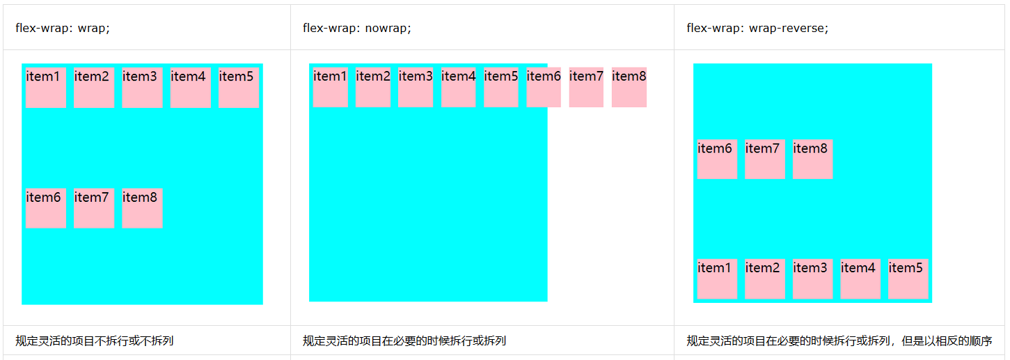
flex-wrap 用于指定 flex 子项是否换行
相关网络资料:https://www.runoob.com/cssref/css3-pr-flex-wrap.html
例 子
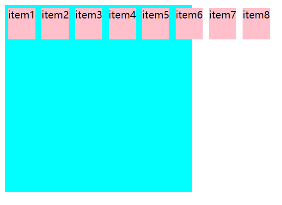
如果没有设置 flex 子项换行,可能会出现以下状况:
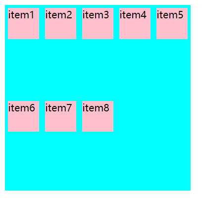
设置主轴上的 flex 子项换行:
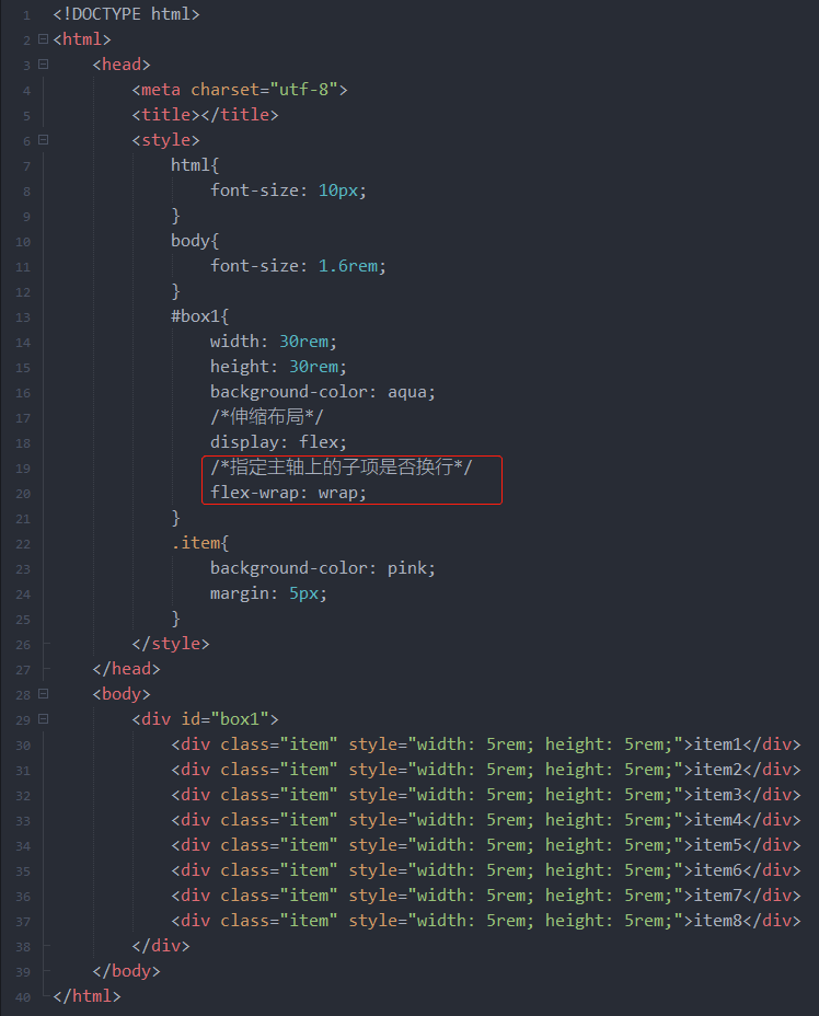
<!DOCTYPE html>
<html>
    <head>
        <meta charset="utf-8">
        <title></title>
        <style>
            html{
                font-size: 10px;
            }
            body{
                font-size: 1.6rem;
            }
            #box1{
                width: 30rem;
                height: 30rem;
                background-color: aqua;
                /*伸缩布局*/
                display: flex;
                /*指定主轴上的子项是否换行*/
                flex-wrap: wrap;
            }
            .item{
                background-color: pink;
                margin: 5px;
            }
        </style>
    </head>
    <body>
        <div id="box1">
            <div class="item" style=" 5rem; height: 5rem;">item1</div>
            <div class="item" style=" 5rem; height: 5rem;">item2</div>
            <div class="item" style=" 5rem; height: 5rem;">item3</div>
            <div class="item" style=" 5rem; height: 5rem;">item4</div>
            <div class="item" style=" 5rem; height: 5rem;">item5</div>
            <div class="item" style=" 5rem; height: 5rem;">item6</div>
            <div class="item" style=" 5rem; height: 5rem;">item7</div>
            <div class="item" style=" 5rem; height: 5rem;">item8</div>
        </div>
    </body>
</html>
可以看到主轴上的 flex 子项换行了
设置 flex容器是单行或者多行:
align-content 只作用于多行的情况下,用于多行的对齐方式
相关网络资料:https://www.runoob.com/cssref/css3-pr-align-content.htm
例 子
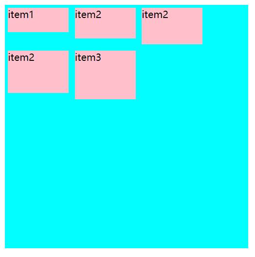
设置元素位于容器的中心
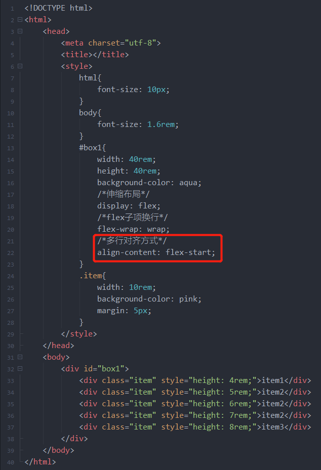
<!DOCTYPE html>
<html>
    <head>
        <meta charset="utf-8">
        <title></title>
        <style>
            html{
                font-size: 10px;
            }
            body{
                font-size: 1.6rem;
            }
            #box1{
                width: 40rem;
                height: 40rem;
                background-color: aqua;
                /*伸缩布局*/
                display: flex;
                /*flex子项换行*/
                flex-wrap: wrap;
                /*多行对齐方式*/
                align-content: flex-start;
            }
            .item{
                width: 10rem;
                background-color: pink;
                margin: 5px;
            }
        </style>
    </head>
    <body>
        <div id="box1">
            <div class="item" style="height: 4rem;">item1</div>
            <div class="item" style="height: 5rem;">item2</div>
            <div class="item" style="height: 6rem;">item2</div>
            <div class="item" style="height: 7rem;">item2</div>
            <div class="item" style="height: 8em;">item3</div>
        </div>
    </body>
</html>
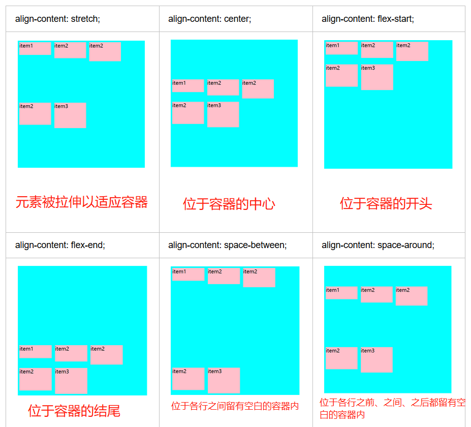
各种多行对齐方式:
align-self 用来单独指定某 flex 子项的对齐方式
相关网络资料:https://www.runoob.com/cssref/css3-pr-align-self.html
例 子
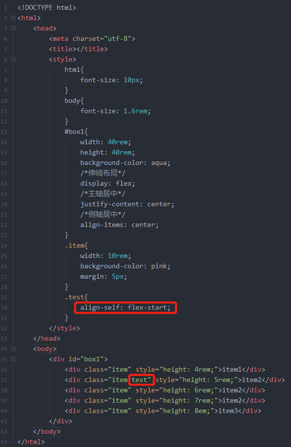
整体是主轴方向从左往右,主轴对齐方式为居中,侧轴对齐方式为居中,单独指定 class 为 test 的 flex 子项的对齐方式为 flex-start。
<!DOCTYPE html>
<html>
    <head>
        <meta charset="utf-8">
        <title></title>
        <style>
            html{
                font-size: 10px;
            }
            body{
                font-size: 1.6rem;
            }
            #box1{
                width: 40rem;
                height: 40rem;
                background-color: aqua;
                /*伸缩布局*/
                display: flex;
                /*主轴居中*/
                justify-content: center;
                /*侧轴居中*/
                align-items: center;
            }
            .item{
                width: 10rem;
                background-color: pink;
                margin: 5px;
            }
            .test{
                align-self: flex-start;
            }
        </style>
    </head>
    <body>
        <div id="box1">
            <div class="item" style="height: 4rem;">item1</div>
            <div class="item test" style="height: 5rem;">item2</div>
            <div class="item" style="height: 6rem;">item2</div>
            <div class="item" style="height: 7rem;">item2</div>
            <div class="item" style="height: 8em;">item3</div>
        </div>
    </body>
</html>
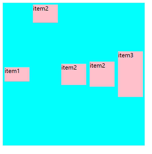
各种单独对齐方式:
