首先 引入css
<link rel="stylesheet" href="css/bootstrap.min.css">
<link rel="stylesheet" href="css/font-awesome.min.css">
<link rel="stylesheet" href="css/gooey.min.css">
引入js
<script type="text/javascript" src="js/jquery-2.1.3.min.js"></script>
<script src="js/gooey.min.js"></script>
html:
<div class="nav1">
<nav id="gooey-upper">
<input type="checkbox" class="menu-open" name="menu-open1" id="menu-open1"/>
<label class="open-button" for="menu-open1">
<span class="burger burger-1"></span>
<span class="burger burger-2"></span>
<span class="burger burger-3"></span>
</label>
<a href="#features" class="gooey-menu-item"> <i title="Features" class="fa fa-cog fa-2x"></i> </a>
<a href="#h-spaced-menu" class="gooey-menu-item"> <i title="Horizontal Menu" class="fa fa-arrows-h fa-2x"></i> </a>
<a href="#menu-v-example" class="gooey-menu-item"> <i title="Vertical Menu" class="fa fa-arrows-v fa-2x"></i> </a>
<a href="#docs" class="gooey-menu-item"> <i title="Docs" class="fa fa-book fa-2x"></i> </a>
<a href="#event-api" class="gooey-menu-item"> <i title="Event API" class="fa fa-code fa-2x"></i> </a>
<a href="#round" class="gooey-menu-item"> <i title="Round Menu" class="fa fa-circle fa-2x"></i> </a>
</nav>
</div>
<div class="nav1">
<nav id="gooey-h">
<input type="checkbox" class="menu-open" name="menu-open2" id="menu-open2"/>
<label class="open-button" for="menu-open2">
<span class="burger burger-1"></span>
<span class="burger burger-2"></span>
<span class="burger burger-3"></span>
</label>
<a href="#features" class="gooey-menu-item"> <i title="Features" class="fa fa-cog fa-2x"></i> </a>
<a href="#h-spaced-menu" class="gooey-menu-item"> <i title="Horizontal Menu" class="fa fa-arrows-h fa-2x"></i> </a>
<a href="#menu-v-example" class="gooey-menu-item"> <i title="Vertical Menu" class="fa fa-arrows-v fa-2x"></i> </a>
<a href="#docs" class="gooey-menu-item"> <i title="Docs" class="fa fa-book fa-2x"></i> </a>
<a href="#event-api" class="gooey-menu-item"> <i title="Event API" class="fa fa-code fa-2x"></i> </a>
<a href="#round" class="gooey-menu-item"> <i title="Round Menu" class="fa fa-circle fa-2x"></i> </a>
</nav>
</div>
js:
<script>
$(function(){
$("#gooey-upper").gooeymenu({
bgColor: "#ff6666",
contentColor: "white",
style: "circle",
horizontal: {
menuItemPosition: "glue"
},
vertical: {
menuItemPosition: "spaced",
direction: "up"
},
circle: {
radius: 80
},
margin: "small",
size: 90,
bounce: true,
bounceLength: "small",
transitionStep: 100,
hover: "#e55b5b"
});
$("#gooey-h").gooeymenu({
bgColor: "#68d099",
contentColor: "white",
style: "horizontal",
horizontal: {
menuItemPosition: "glue"
},
vertical: {
menuItemPosition: "spaced",
direction: "up"
},
circle: {
radius: 90
},
margin: "small",
size: 80,
bounce: true,
bounceLength: "small",
transitionStep: 100,
hover: "#5dbb89"
});
$("#gooey-round").gooeymenu({
bgColor: "#68d099",
contentColor: "white",
style: "circle",
horizontal: {
menuItemPosition: "spaced"
},
vertical: {
menuItemPosition: "spaced",
direction: "up"
},
circle: {
radius: 85
},
margin: "small",
size: 80,
bounce: true,
bounceLength: "small",
transitionStep: 100,
hover: "#5dbb89"
});
$("#gooey-API").gooeymenu({
bgColor: "#68d099",
contentColor: "white",
style: "circle",
circle: {
radius: 85
},
margin: "small",
size: 70,
bounce: true,
bounceLength: "small",
transitionStep: 100,
hover: "#5dbb89",
open: function () {
$(this).find(".gooey-menu-item").css("background-color", "steelblue");
$(this).find(".open-button").css("background-color", "steelblue");
},
close: function () {
$(this).find(".gooey-menu-item").css("background-color", "#ffdf00");
$(this).find(".open-button").css("background-color", "#ffdf00");
}
});
$("#gooey-v").gooeymenu({
bgColor: "#68d099",
contentColor: "white",
style: "vertical",
horizontal: {
menuItemPosition: "glue"
},
vertical: {
menuItemPosition: "spaced",
direction: "up"
},
circle: {
radius: 90
},
margin: "small",
size: 70,
bounce: true,
bounceLength: "small",
transitionStep: 100,
hover: "#68d099"
});
})
/*style:gooey菜单的样式,可用值有:”horizontal”,”vertical”,”circle”。
size:菜单项的尺寸,单位像素。
margin:菜单项之间的margin值。只有在”horizontal” 或 “vertical”参数设置为”spaced”时才有效。可用值有:”small”,”medium” 和 “large”。
bgColor:设置菜单项的背景颜色。
contentColor:设置菜单项的字体颜色。
transitionStep:设置菜单项打开的速度,单位毫秒。
bounce:是否打开”bounce”效果。
bounceLength:如果打开了”bounce”效果,设置bounce的长度。可用值有:”small”, “medium” 和 “large”。
hover:设置鼠标滑过菜单项时的颜色。
circle:设置菜单打开时圆形的半径。
horizontal:menuItemPosition:设置为”Spaced”表示要指定菜单项之间的margin值。设置为”Glue”表示菜单项堆叠在一起。
vertical:menuItemPosition:设置为”Spaced”表示要指定菜单项之间的margin值。设置为”Glue”表示菜单项堆叠在一起。
vertical:direction:菜单的垂直展开方向,可用值有:”up” 或 “down”。
回调函数
open:function(){}:菜单打开是触发。
close:function() {}:菜单关闭时触发。*/
</script>
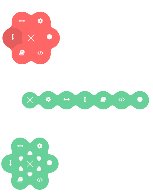
效果图: