整理了一下之前用到过的css代码,实现一种效果或许有许多种写法,我这里整理了一下我个人认为兼容性比较好,结构比较简洁的代码……如有写得不对的地方敬请前辈们指点赐教一下,小弟不胜感激!此学习笔记是动态的——我日后发现有好的代码段会陆陆续续整理添加上去。
css:ellipsis省略号
<style>
.news{width:320px; text-overflow:ellipsis; -o-text-overflow:ellipsis; -moz-binding:url('ellipsis.xml#ellipsis'); -ms-text-overflow:ellipsis; -webkit-text-overflow:ellipsis; overflow:hidden;}
.news a{white-space:nowrap;}
</style>

<div class="news">
    <a href="javascript:void(0);">你好,我是个css省略号,支持各种浏览器,包括大IE6</a>
    <a href="javascript:void(0);">你好,我是个css省略号,支持各种浏览器,包括大IE6</a>
</div>
鼠标移过去图片慢慢变暗(亮)一点
也就是用到了透明(opacity),渐变(transition)实现,如下是变暗的情况:
<style>
.link_img{display:inline-block; width:auto; height:auto;}
.link_img:hover{  background-color:#000;}
.link_img:hover img{ display:block; filter:alpha(opacity=80); opacity:0.8; transition:all 0.5s ease-out; -webkit-transition:all 0.5s ease-out; -moz-transition:all 0.5s ease-out; -o-transition:all 0.5s ease-out;}
</style>

<a href="javascript:void(0);" class="link_img"><img src="images/zy_19.jpg" /></a>
<a href="javascript:void(0);" class="link_img"><img src="images/pro3.jpg" /></a>
css:border实现的三角形
如要实现汽包,如新浪微博里的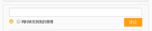 ,新浪里用到的是的是特殊字符“◆”,
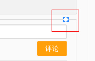 ,能实现兼容到IE6,html代码结构上不简洁了,在html里要多写了class为”WB_arrow“的一层代码,如图:
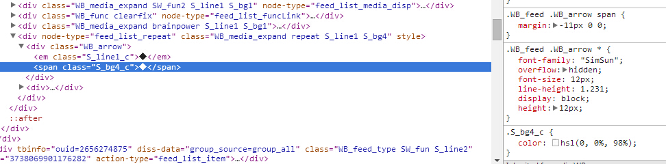
要简洁点,只能用border与伪类before,after了,附代码如下:


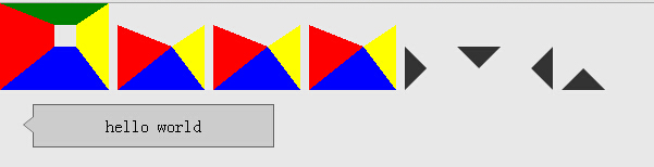
 1 <!DOCTYPE html PUBLIC "-//W3C//DTD XHTML 1.0 Strict//EN" "http ://www.w3.org/TR/xhtml1/DTD/xhtml1-strict.dtd">
 2 <html xmlns="http://www.w3.org/1999/xhtml">
 3 <head>
 4 <meta http-equiv="Content-Type" content="text/html; charset=utf-8" />
 5 <title>css制作三角形</title>
 6 <style type="text/css">
 7 body{background-color:#E8E8E8;}
 8 .triangle1{ display:inline-block; width:20px; height:20px;  border-width:20px 30px 40px 50px; border-style:solid; border-color:green yellow blue red;}
 9 .triangle2{ display:inline-block; width:0; height:0;  border-width:20px 30px 40px 50px; border-style:solid; border-color:transparent yellow blue red;}
10 .triangle3{ display:inline-block; width:0; height:0;  border-width:20px 30px 40px 50px; border-style:dashed solid solid solid; border-color:transparent yellow blue red;}
11 .triangle4{ display:inline-block; width:0; height:0; _line-height:0;  border-width:20px 30px 40px 50px; border-style:dashed solid solid solid; border-color:transparent yellow blue red;}/*对于ie6要设置一下line-height,以及透明的border-style要设置成dashed*/
12
13 .rightdirection{ display:inline-block; width:0;height:0; _line-height:0; border-width:20px; border-style:dashed dashed dashed solid;   border-color:transparent transparent transparent #333;  }
14 .bottomdirection{ display:inline-block; width:0;height:0;  border-width:20px; border-style:solid dashed dashed dashed; border-color: #333 transparent transparent transparent;  }
15 .leftdirection{ display:inline-block; width:0;height:0; _line-height:0; border-width:20px; border-style:dashed solid dashed dashed;  border-color: transparent #333 transparent transparent;  }
16 .topdirection{ display:inline-block; width:0;height:0;  border-width:20px; border-style:dashed dashed solid dashed;  border-color: transparent transparent #333 transparent;  }
17
18 .dome{ margin-top:10px; width:200px; padding:10px; text-align:center; background-color:#ccc; border:1px solid #666; position:relative; left:30px;}
19 .dome:before{ display:block; content:""; border-width:8px 10px; border-style:dashed solid dashed dashed; border-color:transparent #666 transparent transparent; position:absolute; top:10px; left:-20px; z-index:1; }
20 .dome:after{ display:block; content:""; border-width:8px 10px; border-style:dashed solid dashed dashed; border-color:transparent #ccc transparent transparent; position:absolute; top:10px; left:-19px; z-index:2;}
21 </style>
22 </head>
23 <body>
24 <em class="triangle1"></em>
25 <em class="triangle2"></em>
26 <em class="triangle3"></em>
27 <em class="triangle4"></em>
28
29 <em class="rightdirection"></em>
30 <em class="bottomdirection"></em>
31 <em class="leftdirection"></em>
32 <em class="topdirection"></em>
33
34 <div class="dome">hello world</div>
35 </body>
36 </html>
运行结果如下图:
IE6的截图: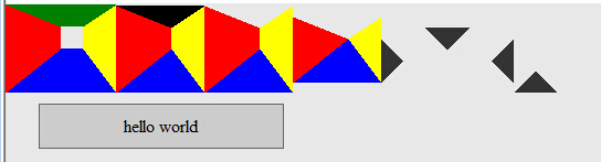
但是用伪类before,after的border在大IE6里不能做出三角形来,如要兼容IE6还得用新浪里的方法,或者用与新浪的相似,不过不是用特殊字符,而是也是用border做三角形,如下:
 1 <style>
 2 .dome{width:300px; padding:30px 20px; border:1px solid #beceeb; position:relative;}
 3 .dome .triangle{ position:absolute; bottom:0px; left:50px;}
 4 .dome .triangle .bot{
 5     _display:block;
 6     _line-height:0px;
 7     border-width:20px;
 8     border-style:solid dashed dashed dashed;
 9     border-color:#beceeb transparent transparent transparent;
10     position:absolute;
11     bottom:-40px;
12 }
13 .dome .triangle .top{
14     _display:block;
15     _line-height:0px;
16     border-width:20px;
17     border-style:solid dashed  dashed dashed;
18     border-color:#FFF transparent transparent transparent;
19     position:absolute;
20     bottom:-39px;
21 }
22 </style>
23
24 <div class="dome">
25   <div class="triangle">
26       <em class="bot"></em>
27       <em class="top"></em>
28   </div>
29   <div class="txtBox">
30      我是用border实现的三角形,html结构上跟新浪微博上的结构相似
31   </div>
32 </div>