详细请看我的博客:http://www.haorooms.com/post/phone_web
Xhtml和html5的区别:http://www.zhihu.com/question/20258628
一、关于meta
(一)、常用的公共meta属性
1、viewport
<metaname="viewport"content="width=device-width,initial-scale=1.0,maximum-scale=1.0,user-scalable=0"/>
width=device-width 宽度是设备屏幕的宽度(像素)
height=device-height 高度是设备屏幕的高度(像素)
initial-scale 初始的缩放比例
minimum-scale 允许用户缩放到的最小比例
maximum-scale 允许用户缩放到的最大比例
user-scalable 用户是否可以手动缩放
2、Format-detection
format-detection翻译成中文的意思是“格式检测”,顾名思义,它是用来检测html里的一些格式的,那关于meta的format-detection属性主要是有以下几个设置:
meta name="format-detection" content="telephone=no"
meta name="format-detection" content="email=no"
meta name="format-detection" content="adress=no"
也可以连写:meta name="format-detection" content="telephone=no,email=no,adress=no"
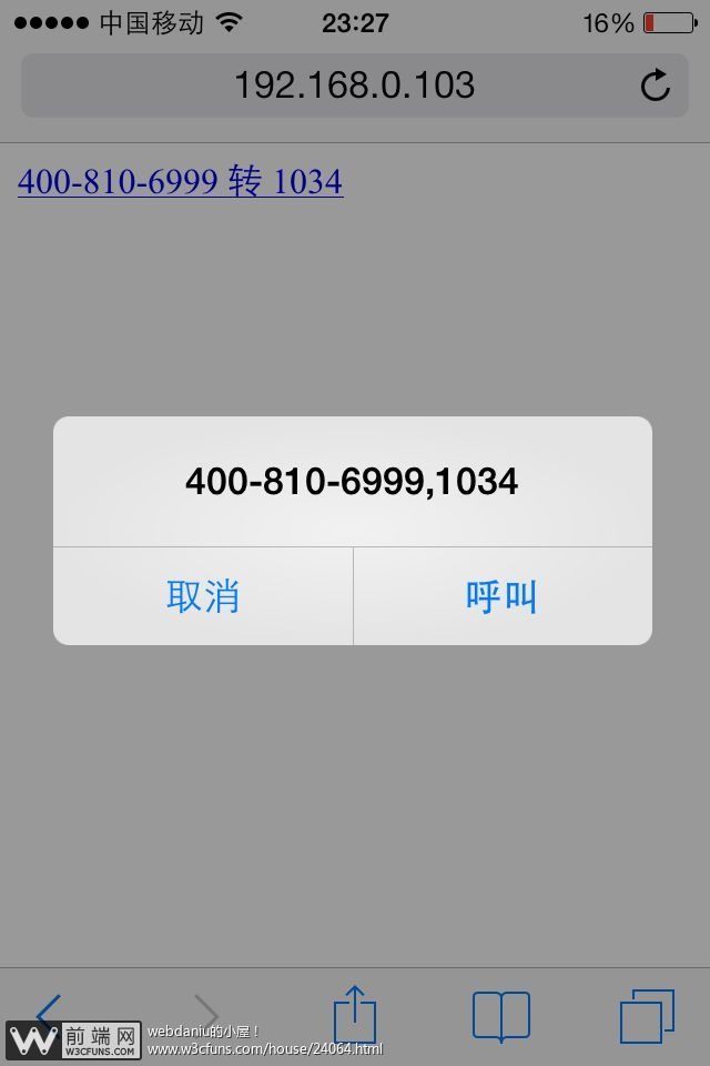
如果禁用,我们调用拨号功能可以这么写!
如下:
<ahref="tel:4008106999,1034">400-810-6999 转 1034</a>
拨打手机直接如下
<a href="tel:15677776767">点击拨打15677776767</a>
点击拨号苹果手机就会出现如下图:
安卓手机会直接到号码输入拨打的界面。
3、http-equiv
http-equiv顾名思义,相当于http的文件头作用,它可以向浏览器传回一些有用的信息,以帮助正确和精确地显示网页内容,与之对应的属性值为
content,content中的内容其实就是各个参数的变量值。 meat标签的http-equiv属性语法格式是:<meta
http-equiv="参数" content="参数变量值"> ;
这个属性是很老的属性了,一般手机网页都是要有一定缓存的,所以这个可以不用设置,关于更多的meta,请看我之前的一篇文章:http://www.haorooms.com/post/html_meta_ds
(二)、IOS私有meta属性
<meta name="apple-mobile-web-app-capable" content="yes" />
<meta name="apple-mobile-web-app-status-bar-style" content="black" />
1、第一个meta:
<meta name="apple-mobile-web-app-capable" content="yes" />
说明:
网站开启对web app程序的支持。
如果content设置为yes,Web应用会以全屏模式运行,反之,则不会。content的默认值是no,表示正常显示。你可以通过只读属性window.navigator.standalone来确定网页是否以全屏模式显示。
还有一个全屏显示的属性就是:
为了更好的兼容,两个meta可以都写上!
2、第二个meta:
<meta name="apple-mobile-web-app-status-bar-style" content="black" />
说明:
在web app应用下状态条(屏幕顶部条)的颜色;
默认值为default(白色),可以定为black(黑色)和black-translucent(灰色半透明)。
注意:
若值为“black-translucent”将会占据页面px位置,浮在页面上方(会覆盖页面20px高度–iphone4和itouch4的Retina屏幕为40px)。
具体如下图:

black状态

default状态

black-translucent状态
(三)、IOS其他私有设置
添加主屏设置:
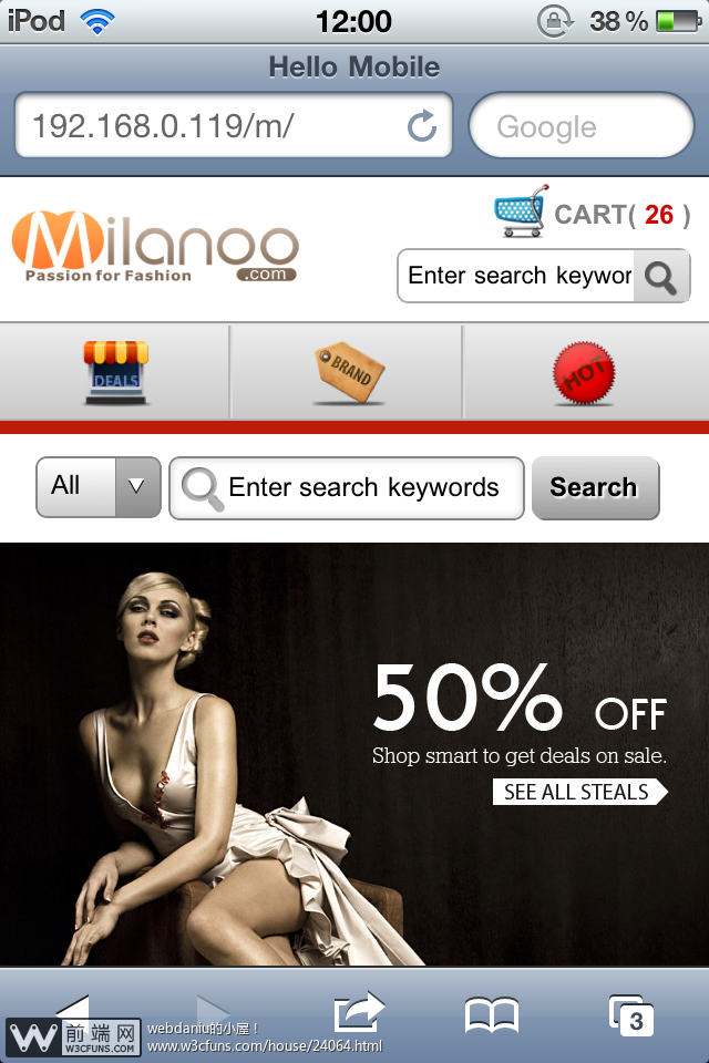
图片一:在网站中进行保存
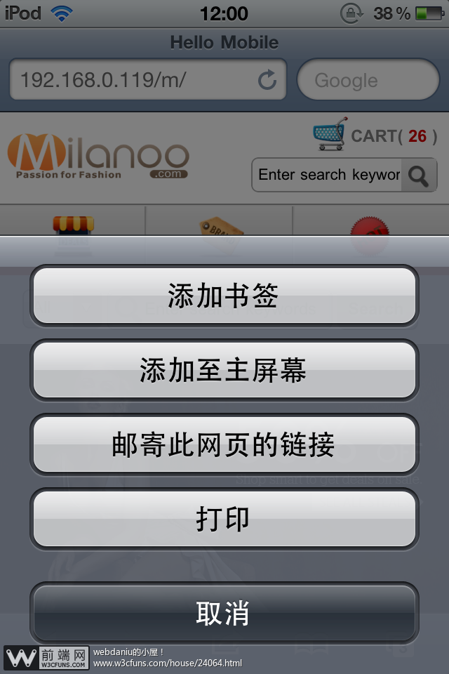
图片二:保存至主屏幕
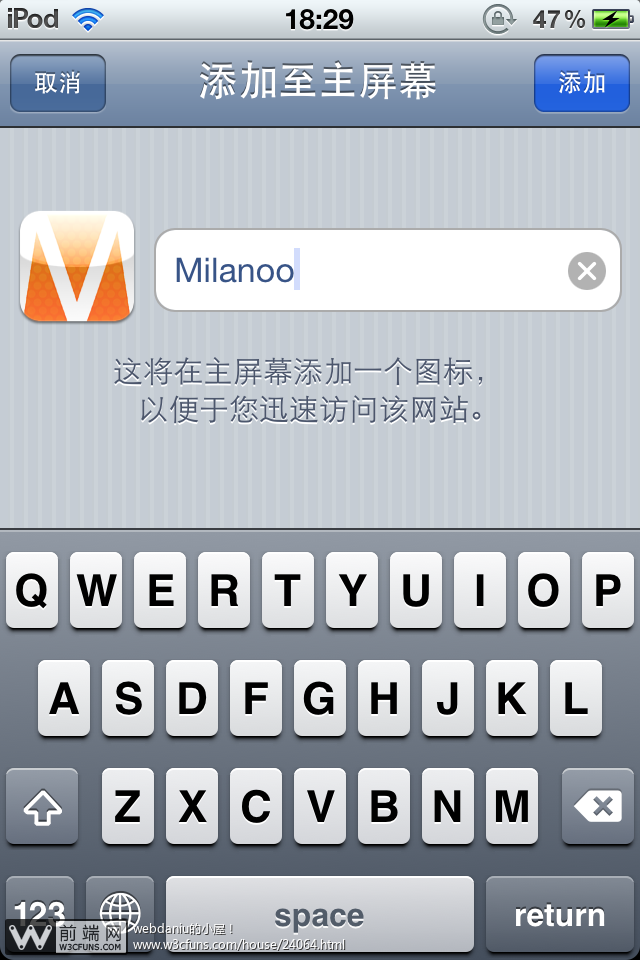
图片三:填写名称

图片四:主屏幕中样式

图片五:启动时的启动界面
添加主屏之后,桌面图片和启动画面如何设置呢?
桌面图标设置:
<link rel="apple-touch-icon" href="touch-icon-iphone.png" />
<link rel="apple-touch-icon-precomposed" href="touch-icon-iphone.png" />
两者的区别如下:
第一种会有一个光感,第二种是设计原图显示!
启动画面的设置:
<link rel="apple-touch-startup-image" href="milanoo_startup.png" />
当然,可以指定不同尺寸。
(四)、其他浏览器私有meta属性【除非特需,一般不推荐使用】
1、QQ浏览器私有
全屏模式
<meta name="x5-fullscreen" content="true">
强制竖屏
<meta name="x5-orientation" content="portrait">
强制横屏
<meta name="x5-orientation" content="landscape">
应用模式
<meta name="x5-page-mode" content="app">
2、UC浏览器私有
全屏模式
<meta name="full-screen" content="yes">
强制竖屏
<meta name="screen-orientation" content="portrait">
强制横屏
<meta name="screen-orientation" content="landscape">
应用模式
<meta name="browsermode" content="application">
3、其它
针对手持设备优化,主要是针对一些老的不识别viewport的浏览器,比如黑莓
<meta name="HandheldFriendly" content="true">
微软的老式浏览器
<meta name="MobileOptimized" content="320">
windows phone 点击无高光
<meta name="msapplication-tap-highlight" content="no">
二、关于样式
1、上下拉动滚动条时卡顿、慢
body {
-webkit-overflow-scrolling: touch;
overflow-scrolling: touch;
}
2、禁止复制、选中文本
Element {
-webkit-user-select: none;
-moz-user-select: none;
-khtml-user-select: none;
user-select: none;
}
解决移动设备可选中页面文本(视产品需要而定)
3、长时间按住页面出现闪退
element {
-webkit-touch-callout: none;
}
4、iphone及ipad下输入框默认内阴影
Element{
-webkit-appearance: none;
}
5、ios和android下触摸元素时出现半透明灰色遮罩
Element {
-webkit-tap-highlight-color:rgba(255,255,255,0)
}
设置alpha值为0就可以去除半透明灰色遮罩,备注:transparent的属性值在android下无效。
后面一篇文章有详细介绍,地址:http://www.haorooms.com/post/phone_web_ysk
6、active兼容处理
<body ontouchstart="">
7、动画定义3D启用硬件加速
Element {
-webkit-transform:translate3d(0, 0, 0)
transform: translate3d(0, 0, 0);
}
注意:3D变形会消耗更多的内存与功耗
8、Retina屏的1px边框
Element{
border- thin;
}
9、旋转屏幕时,字体大小调整的问题
html, body, form, fieldset, p, div, h1, h2, h3, h4, h5, h6 {
-webkit-text-size-adjust:100%;
}
10、transition闪屏
/设置内嵌的元素在 3D 空间如何呈现:保留3D /
-webkit-transform-style: preserve-3d;
/ 设置进行转换的元素的背面在面对用户时是否可见:隐藏 /
-webkit-backface-visibility:hidden;
11、圆角bug
某些Android手机圆角失效
background-clip: padding-box;
三、关于HTML5
HTML5 中的一些有趣的新特性:
1、用于绘画的 canvas 元素
2、用于媒介回放的 video 和 audio 元素
demo:
<video width="320" height="240" controls="controls">
你浏览器不支持video
</video>
同理:
<audio controls="controls">
你浏览器不支持audio
</audio>
3、对本地离线存储的更好的支持
4、地理定位 navigator.geolocation.getCurrentPosition(callback,error,options)
5、新的特殊内容元素,比如 article、footer、header、nav、section
6、新的表单控件:
email
url
number
range
Date pickers (date, month, week, time, datetime, datetime-local)
search
color