<!DOCTYPE html>
<html xmlns="http://www.w3.org/1999/xhtml">
<head>
<title>Animation同时改变多个属性的变化</title>
<style>
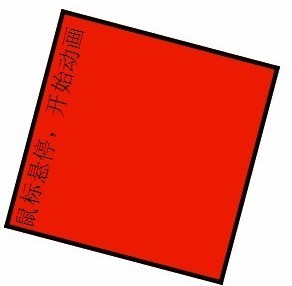
div {
150px;
height:150px;
background:#4cff00;
border:3px solid #000000;
position:absolute;
left:200px;
top:300px;
}
/*定义一个关键帧*/
@-webkit-keyframes 'xiaolei' {
0%
{
-webkit-transform:rotate(0deg) scale(1);
background-color:#4cff00;
}
40% {
-webkit-transform:rotate(720deg) scale(1.5);
background-color:#f00;
}
70% {
-webkit-transform:rotate(1080deg) scale(2.5);
background-color:#ffd800;
}
100% {
-webkit-transform:rotate(0deg) scale(1);
background-color:#4cff00;
}
}
div:hover {
-webkit-animation-name:'xiaolei';
-webkit-animation-duration:8s;
-webkit-animation-interation-count:1;
}
</style>
</head>
<body>
<div>鼠标悬停,开始动画</div>
</body>
</html>