本次的实验目的就是:
①按时间段查询显示省市的疫情状况
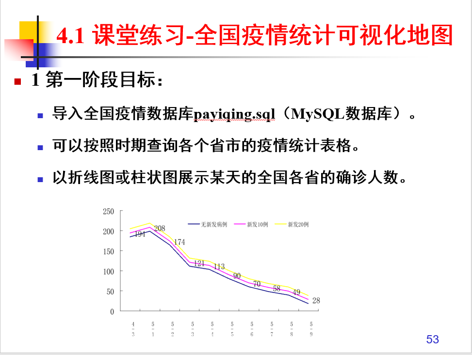
②实现图表的展示全国的患者人数
第一个功能比较好实现:从前台中获取这两个时间数据,在后台进行数据的查询,格式的转换,找到数据库中在这两个区间的数据,然后将他们展示出来
package servlet;

import java.io.IOException;
import java.util.ArrayList;

import javax.servlet.ServletException;
import javax.servlet.annotation.WebServlet;
import javax.servlet.http.HttpServlet;
import javax.servlet.http.HttpServletRequest;
import javax.servlet.http.HttpServletResponse;

import Dao.predao;
import Bean.Pre;

/**
 * Servlet implementation class checkfind
 */
@WebServlet("/checkfind")
public class checkfind extends HttpServlet {
    private static final long serialVersionUID = 1L;

    /**
     * @see HttpServlet#HttpServlet()
     */
    public checkfind() {
        super();
        // TODO Auto-generated constructor stub
    }

    /**
     * @see HttpServlet#doGet(HttpServletRequest request, HttpServletResponse response)
     */
    protected void doGet(HttpServletRequest request, HttpServletResponse response) throws ServletException, IOException {
        // TODO Auto-generated method stub
        request.setCharacterEncoding("utf-8");
        String btime=request.getParameter("btime");
        String etime=request.getParameter("etime");
        predao dao=new predao();
        ArrayList<Pre> list=null;
        list=dao.findtime(btime,etime);
        if(list!=null)
        {
            request.setAttribute("pres", list);
            request.getRequestDispatcher("listall.jsp").forward(request, response);
        }
        else
        {
            request.setAttribute("message", "没有符合的信息");
            request.getRequestDispatcher("listall.jsp").forward(request, response);
        }
    }

    /**
     * @see HttpServlet#doPost(HttpServletRequest request, HttpServletResponse response)
     */
    protected void doPost(HttpServletRequest request, HttpServletResponse response) throws ServletException, IOException {
        // TODO Auto-generated method stub
        doGet(request, response);
    }

}
public ArrayList<Pre> findtime(String btime,String etime)
    {
        String begin="";
        String []s=btime.split("-");
        for(int i=0;i<s.length;i++)
            begin+=s[i].toString();

        String end="";
        String []e=etime.split("-");
        for(int i=0;i<e.length;i++)
            end+=e[i].toString();
        System.out.println(begin+" "+end);
        int bg=Integer.valueOf(begin);
        int ed=Integer.valueOf(end);
        //System.out.println(bg+" "+end);
        ArrayList<Pre> list=new ArrayList<>();
        String sql="select * from info";
        Connection con=null;
        Statement state=null;
        ResultSet rs=null;
        con=DBUtil.getConn();
        Pre bean=null;
        try {
            state=con.createStatement();
            rs=state.executeQuery(sql);
            while(rs.next())
            {
                int id=rs.getInt("id");
                String name=rs.getString("Province");
                String city=rs.getString("city");
                String confirmed=rs.getString("Confirmed_num");
                String cured=rs.getString("Cured_num");
                String dead=rs.getString("Dead_num");
                String date=rs.getString("Date");
                String ans="";
                String date2=date.substring(0, 10);
                String []d=date2.split("-");
                for(int i=0;i<d.length;i++)
                {
                    ans+=d[i].toString();
                }
                int k=Integer.valueOf(ans);
                System.out.println(k);
                if(k>=bg&&k<=ed) {
                    bean=new Pre(id,name,city,confirmed,cured,dead,date);
                    list.add(bean);
                }
            }
        } catch (SQLException e1) {
            // TODO Auto-generated catch block
            e1.printStackTrace();
        }
        DBUtil.close(rs, state, con);
        return list;
    }
第二个功能就借助到:echart图表
用他的图表要先导入echart.min.js,然后再body里给他分出一个区域,通过他的id在js里对他进行图表的初始化
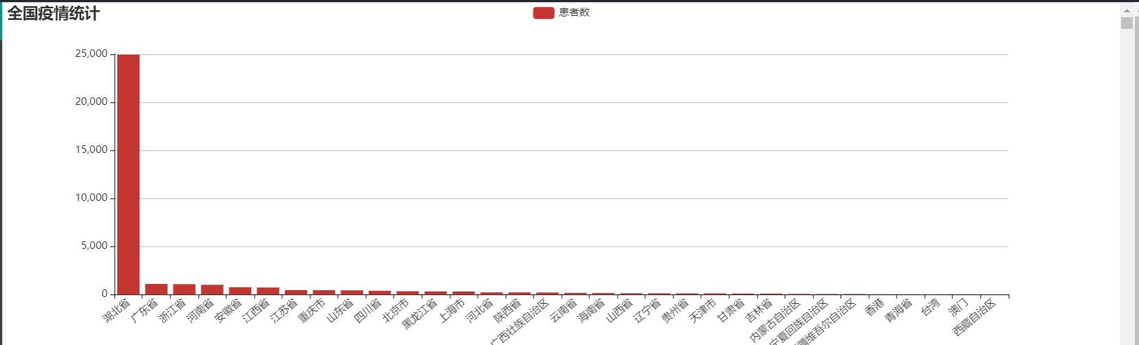
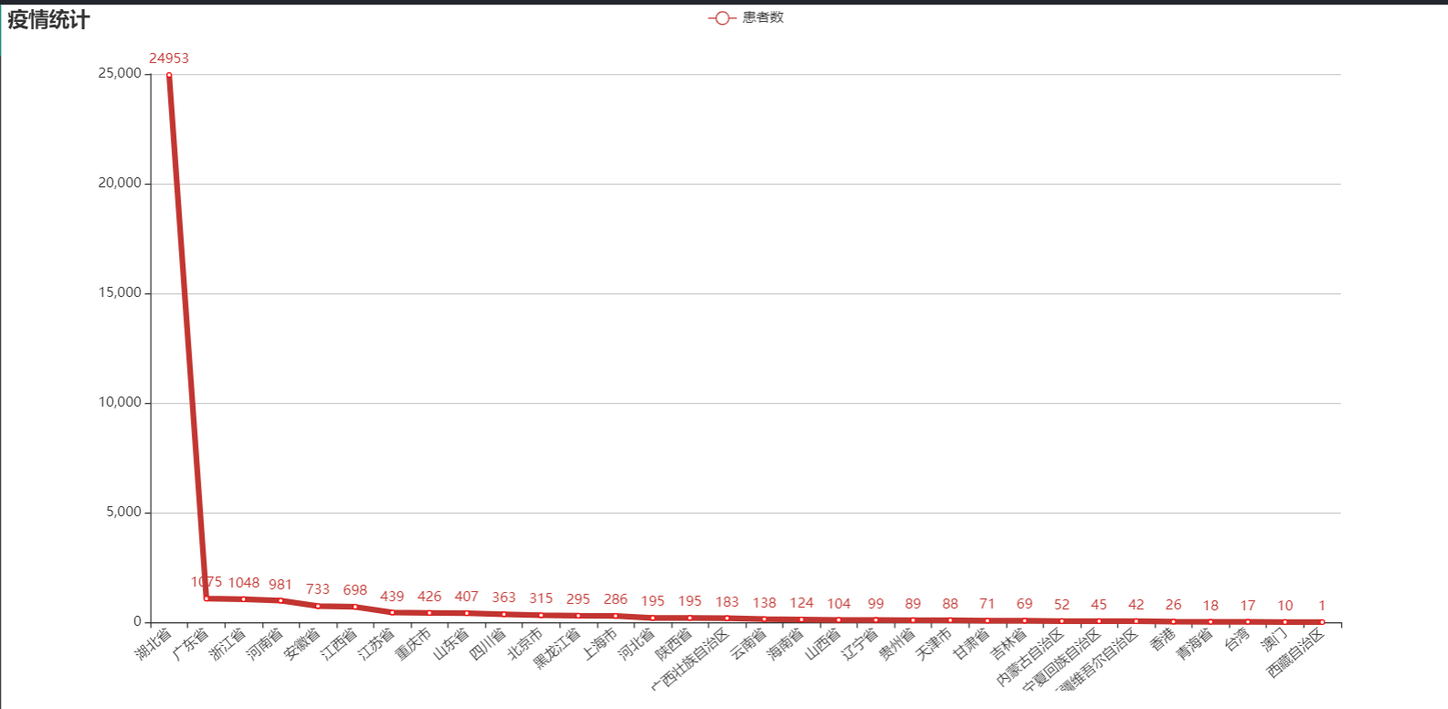
这里我获取的全国的信息是从servlet里获取的然后转发到该jsp里,将该信息里的确诊人数存到了一个arr数组里
然后对于x轴上的名字进行遍历一遍存入数据,设置她们的名字显示是倾斜的。
最后使用刚指定的配置项和数据显示图表。
myChart.setOption(option);
<%@ page language="java" contentType="text/html; charset=UTF-8" pageEncoding="UTF-8"%> <%@taglib uri="http://java.sun.com/jsp/jstl/core" prefix="c"%> <%@page import="Dao.predao" %> <%@page import="java.util.ArrayList" %> <%@page import="Bean.Pre" %> <!DOCTYPE html> <html> <head> <meta charset="UTF-8"> <!-- 上述3个meta标签*必须*放在最前面,任何其他内容都*必须*跟随其后! --> <title>Bootstrap 101 Template</title> <!-- Bootstrap --> <link href="css/bootstrap.min.css" rel="stylesheet"> <script src="js/echarts.min.js"></script> <!-- jQuery (Bootstrap 的所有 JavaScript 插件都依赖 jQuery,所以必须放在前边) --> <script src="js/jquery-1.11.3.min.js"></script> <!-- 加载 Bootstrap 的所有 JavaScript 插件。你也可以根据需要只加载单个插件。 --> <script src="js/bootstrap.js"></script> <title>浏览需求</title> </head> <body> <% Object message = request.getAttribute("message"); if (message != null && !"".equals(message)) { %> <script type="text/javascript"> alert("<%=request.getAttribute("message")%>"); </script> <% } %> <% predao dao=new predao(); if(request.getAttribute("pres") == null){ ArrayList<Pre> list = dao.getall(); request.setAttribute("pres",list); } %> <div id="main" style="height:400px"></div> <div id="box" style="height:600px;"></div> <div align="center"> <h1>各省市疫情统计表</h1> <br> 技术需求名称<input type="text" id="name" name="name"> 日期范围<input type="date" id="btime" name="btime">-<input type="date" id="etime" name="etime"> <button type="button" class="btn btn-info" onclick="checkfind()">查询</button> <button type="button" class="btn btn-info" onclick="checkgetall()">显示全部</button> <br><br> <table class="table"> <thead> <tr bgcolor="#1E90FF"> <th>编号</th> <th>日期</th> <th>省名</th> <th>市名</th> <th>确诊人数</th> <th>治愈人数</th> <th>死亡人数</th> </tr> </thead> <tbody> <c:forEach items="${pres}" var="item"> <tr class="active"> <td>${item.id}</td> <td>${item.date}</td> <td>${item.name}</td> <td>${item.city}</td> <td>${item.confirmed}</td> <td>${item.cured}</td> <td>${item.dead}</td> </tr> </c:forEach> </tbody> </table> </div> <script type="text/javascript"> // 基于准备好的dom,初始化echarts实例 var myChart = echarts.init(document.getElementById('main')); var arr = new Array(); var index = 0; <c:forEach items="${gpres}" var="goods"> arr[index++] = ${goods.confirmed}; </c:forEach> // 指定图表的配置项和数据 var option = { title: { text: '全国疫情统计' }, tooltip: { show: true }, legend: { data:['患者数'] }, xAxis : [ { type : 'category', axisLabel:{ interval:0,//横轴信息全部显示 rotate:40,//-30度角倾斜显示 }, data : [ <c:forEach items="${gpres}" var="g"> ["${g.name}"], </c:forEach> ] } ], yAxis : [ { type : 'value' } ], series : [ { name:'患者数', type:'bar', data: arr } ] }; // 使用刚指定的配置项和数据显示图表。 myChart.setOption(option); //初始化ehcharts实例 var myChart2=echarts.init(document.getElementById("box")); //指定图表的配置项和数据 var option={ //标题 title:{ text:'疫情统计' }, //工具箱 //保存图片 toolbox:{ show:true, feature:{ saveAsImage:{ show:true } } }, //图例-每一条数据的名字叫销量 legend:{ data:['患者数'] }, //x轴 xAxis : [ { type : 'category', axisLabel:{ interval:0,//横轴信息全部显示 rotate:40,//-30度角倾斜显示 }, data : [ <c:forEach items="${gpres}" var="g"> ["${g.name}"], </c:forEach> ] } ], //y轴没有显式设置,根据值自动生成y轴 yAxis : [ { type : 'value' } ], //数据-data是最终要显示的数据 series:[{ name:'患者数', type:'line', data:arr, itemStyle:{ normal:{ // 拐点上显示数值 label : { show: true }, borderColor:'red', // 拐点边框颜色 lineStyle:{ 5, // 设置线宽 type:'solid' //'dotted'虚线 'solid'实线 } } } }] }; //使用刚刚指定的配置项和数据项显示图表 myChart2.setOption(option); function checkfind() { var name=document.getElementById("name").value; var btime=document.getElementById("btime").value; var etime=document.getElementById("etime").value; if(name==""&&(btime==""&&etime=="")) { alert("名字或者时间区间至少写一个!"); return ; } else { window.location.href = "checkfind?name="+name+"&btime="+btime+"&etime="+etime; } } function checkgetall() { window.location.href="listall"; } </script> </body> </html>
页面展示:
柱状图:
折线图:
时间范围搜索:

本次这堂课主要的学习:学会使用echart图表,之后会继续做下个阶段的图表显示,敬请期待!!!