规定背景的绘制区域
浏览器支持
IE9+、Firefox、Opera、Chrome 以及 Safari 支持 background-clip 属性。
注释:Internet Explorer 8 以及更早的版本不支持 background-clip 属性。IE9+、Firefox、Opera、Chrome 以及 Safari 支持 background-clip 属性。
有三个值:
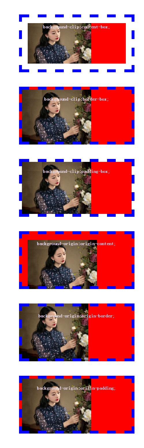
border-box 背景被裁剪到边框盒。
padding-box 背景被裁剪到内边距框。
content-box 背景被裁剪到内容框
demo:
.clip{
400px;
margin: 50px auto;
background-color: red;
padding: 20px;
color: #ddd;
line-height:25px;
text-align: center;
border: 10px dashed blue;
}
.clip-content{
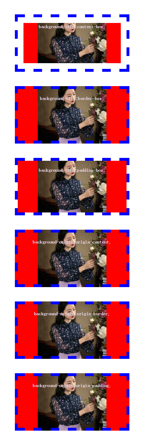
background-clip:content-box;
}
.clip-border{
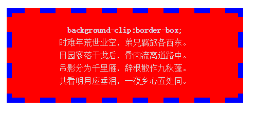
background-clip:border-box;
}
.clip-padding{
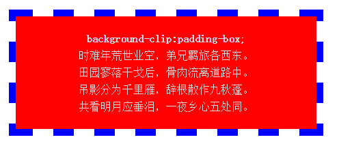
background-clip:padding-box;
}
border-box
padding-box
content-box
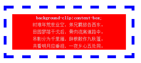
其实background-clip的真正作用是决定背景在哪些区域显示。如果它的值为border,则背景在元素的边框、补白和内容区域都会显示;如果值为padding,则背景只会在补白和内容区域显示;如果值为content,则背景只会在内容区域显示。
那为毛前面的background-clip:border不起作用?这就得说说background-origin了
background-origin是指背景显示的区域,或者说背景是从哪个区域开始绘制的(边框、补白或内容区域)。
还不理解的话那就这么来说吧,background-position总该知道吧?它指定了背景的位置,比如background-position:0px 0px ;那这个0像素是指相对于哪里来说的呢?这就涉及到一个参照点的问题了。background-origin的作用就是指定background-position的参照点是在边框区域的左上角,还是在补白区域的左上角,或是在内容区域的左上角,对应的三个值就分别是border、padding、content. background-position的也可以是left、right等方向词语,这时候就不能说参照点了,而应该说参照面,如果值为background-origin的值为border,则参照面包括边框区域、补白区域、内容区域三个部分,如果值为padding,则参照面只包括补白区域和内容区域,如果值为content,则不用我讲了吧。
这个时候再来看看前面那个问题就豁然开朗了,你把background-clip设为border,这时候边框里是能显示背景的,但问题是背景并不是从边框的左上角开始绘制的,它是从补白区域才开始绘制的,女神背景压根就没想要搭理屌丝边框,你屌丝摆出一个怀抱来迎接女神又有个屁用啊,赶紧细软跑吧。background-origin的默认值是padding,也就是默认从补白区域开始绘制背景。
demo:当背景是图片是background-origin:border-box。与background-clip:border-box。显示时有区别,如果都是背景颜色,没有区别,background-origin控制的是背景图片显示的区域,不会影响背景颜色
demo:
.clip{
            400px;
            margin: 50px auto;
            background-image: url("images/1.jpg");
            background-repeat: no-repeat;
            background-position: left top;
            background-color: red;
            overflow: hidden;
            padding: 20px;
            height:200px;
            color: #ddd;
            line-height:25px;
            text-align: center;
            border: 10px dashed blue;
        }
        .clip-content{
            background-clip:content-box;
        }
        .clip-border{
            background-clip:border-box;
        }
        .clip-padding{
            background-clip:padding-box;
        }
        .origin-content{
            -webkit-background-origin: content-box;
            background-origin: content-box;
        }
        .origin-border{
            -webkit-background-origin: border-box;
            background-origin: border-box;
        }
        .origin-padding{
            -webkit-background-origin: padding-box;
            background-origin: padding-box;
        }
发现一个小问题:
当设置背景backgroud-position:center center时,background-origin不起作用,background-clip:border-box可以让背景颜色绘制在边框上(不太明白,希望懂得人可以指教)
修改上面的代码:
 .clip{
            background-position: center center;

        }
效果图