圆:
html
<div class="demo4"><div></div></div>
css
.demo4{
            width: 200px;
            height: 200px;
            margin: 100px auto;
            border-radius: 50%;
            position: relative;
            box-sizing: border-box;
        }
        .demo4 div{
            width: 50px;
            height: 50px;
            border-radius: 50%;
            background-color: blue;
            transform-origin:100px 100px;// 移动元素渲染的圆心位置,因为是位置父元素旋转,父元素的圆心是100px 100px
            animation: bb 2s infinite linear;
        }
        @keyframes bb{
            to{
                transform: rotate(1turn);
            }
        }
椭圆运动:
原理就是在圆运动的基础上给父元素添加一个y轴上的上下运动
css
.demo4{
            width: 200px;
            height: 300px;
            margin: 100px auto;
            /*border:1px solid red;*/
            border-radius: 50%;
            position: relative;
            box-sizing: border-box;
            animation: cc 1s infinite alternate ease-in-out;//父元素y轴上添加一个循环 往复的上下运动,最终效果看着像是子元素在做椭圆运动
        }
        .demo4 div{
            width: 50px;
            height: 50px;
            border-radius: 50%;
            background-color: blue;
            transform-origin:100px 100px;
            animation: bb 2s infinite linear;
        }
        @keyframes cc{
            to{
                transform: translateY(50px);
            }
        }
        @keyframes bb{
            to{
                transform: rotate(1turn);
            }
        }
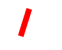
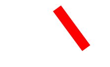
钟摆运动:
这个比较简单,就是把元素的运动参考点移动到顶部中心,就是设置 transform-origin:top center;
demo:
html
<div class="demo3"></div>
css
.demo3{
            width: 20px;
            height: 100px;
            background-color: red;
            margin: 100px auto;
            transform-origin: top center;
            transform:rotate(45deg);
            animation: aa .5s infinite alternate ease-in-out;//循环往复的运动,实现运动宁效果的连贯性

        }
        @keyframes aa{
            to{
                transform:rotate(-45deg);
            }
        }