前篇:做自适应网页
网页是一个正常网页(高度大于宽度),都可以用上面博客的做法搞定。
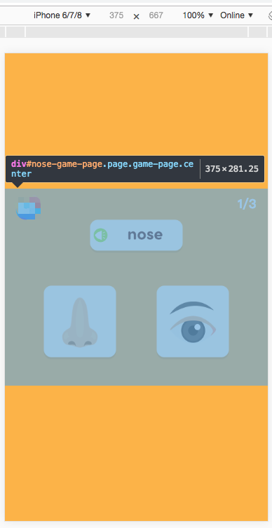
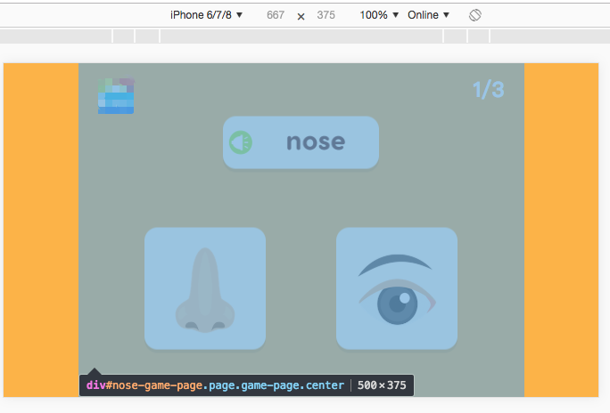
但是,设计给了一个固定比例的设计图。他是按照ipad的宽高设计的:1024*768
要求是无论在哪,都保证这个比例显示,并且居中。这个问题就变成了:固定宽高比,充分利用页面空间(不需要滚动条),做一个居中网页的问题。
事实上,我们的cocos游戏就是这种设计和布局。网页端可以这么判断:
.center {
            position: absolute;
            left: 50%;
            top: 50%;
            transform: translate(-50%, -50%) !important;
        }

 (function () {
        var bodyWidth = document.body.offsetWidth;
        var bodyHeight = document.body.offsetHeight;
        var min = Math.min(bodyWidth, bodyHeight);
        console.log(bodyWidth, bodyHeight);
        var getRem = function () {
            document.documentElement.style.fontSize = (min * (bodyWidth > bodyHeight ? 1024 / 768 : 1) / 1024) * 100 + 'px';
        }
        setPosition();
        getRem();
        window.onresize = function () {
            getRem();
        };

        function setPosition() {
        	//这里调整页面的大小
            var contentNodeArrLike = document.getElementsByClassName('page');
            for (var i = 0; i < contentNodeArrLike.length; i++) {
                contentNodeArrLike[i].style.width = min * (bodyWidth > bodyHeight ? 1024 / 768 : 1) + 'px';
                contentNodeArrLike[i].style.height = min * (bodyWidth > bodyHeight ? 1 : 768 / 1024) + 'px';
                contentNodeArrLike[i].classList.add('center');
            }

        }
    })()
我们判断宽与高的大小,取最小的一边作为基准,然后确定另一边的大小。调整整个页面的大小,让整个页面在基准外的一个方向上居中,最后利用rem布局。
1024*768的比例在iphone6上的展示,横屏:
竖屏: