vue组件中使用
<template>
  <div>
    //创建一个dom元素用来放echats图表
    <div id="xline"></div>
  </div>
</template>
script中的
<script>
export default {
mounted() {
var chart = this.$echarts.init(document.getElementById("xline"));
var Colors = ["#10B9E7","#F57474","#56D0E3","#F8B448","#F8B78F"]
var option = {
//图标的表题
title: {
//主标题内容
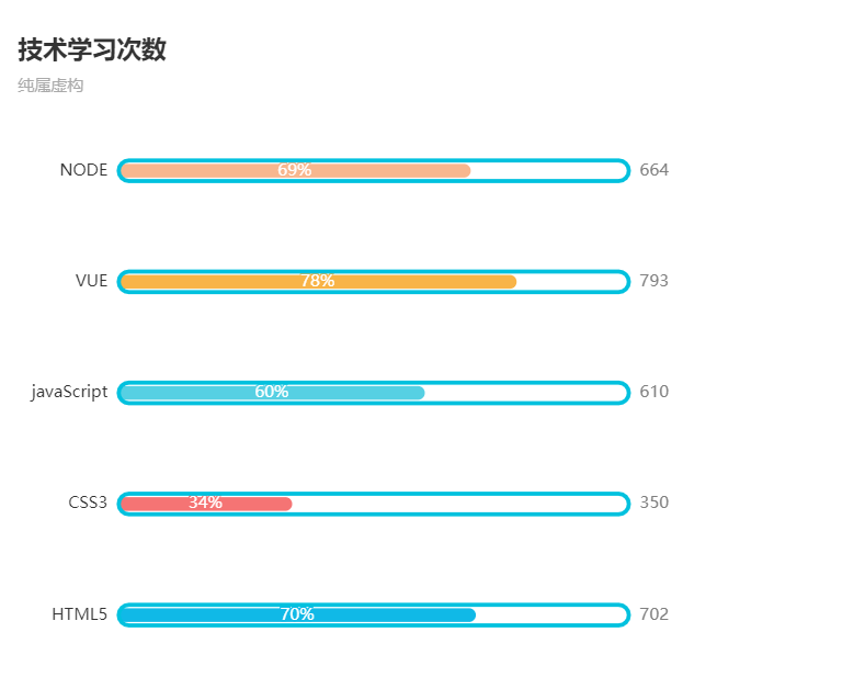
text: "技术学习次数",
//副标题内容
subtext: "纯属虚构"
},
//鼠标移入指定区域的提示框
tooltip: {
//移入当前行/列
trigger: "axis",
//设置样式
axisPointer: {
type: "shadow"
}
},
//图表头部提示
legend: {
//提示内容,要和series中name保持一致
data: [ "条","框"],
//是否显示(true显示/false不显示)
show:false
},
//网格也就是整个图表
grid: {
//距离左边的距离
left: "3%",
//距离右边的距离
right: "4%",
//距离底部的距离
bottom: "3%",
//
containLabel: true
},
//x轴
xAxis: {
//不显示x轴
show:false
},
//y轴
yAxis: [
{
//坐标轴
type: "category",
//显示的左侧提示
data: ["HTML5", "CSS3", "javaScript", "VUE", "NODE"],
//y轴的线
axisLine:{
//设置为不显示
show:false
},
//y轴线上的标记刻度
axisTick:{
//设置为不显示
show:false
},
},
{
//坐标轴
type:"category",
//设置为显示
show:true,
//右侧显示的数据
data:[702,350,610,793,664],
//同样不让y轴线显示出来
axisLine:{
show:false
},
//不显示刻度
axisTick:{
show:false
},
//设置
axisLabel:{
//右侧显示的数据样式
textStyle:{
//字体大小
fontSize:12,
//字体颜色
color:"gray"
}
},
}
],
//具体数据及样式
series: [
{
//这是显示条
name: "条",
//设置为条状图
type: "bar",
//具体每一个的数据
data: [70, 34, 60, 78, 69],
//单个的样式
itemStyle:{
//通过naomal属性设置
normal:{
//柱状图的边角弧度
barBorderRadius:20,
//设置颜色
color:function(params){
//拿到每一个的下标,然后在Colors数组中选一个颜色
// var num = Colors.length;
// console.log(Colors[params.dataIndex])
return Colors[params.dataIndex];
}
}
},
//
barCategoryGap:50,
//柱状图的宽度
barWidth:10,
//样式
label:{
//设置样式
normal:{
//显示
show:true,
//定位
position:"inside",
//每个图上显示百分比
formatter:"{c}%"
}
},
//这是第一个
yAxisIndex:0,
//
},
{
//设置柱状图的外框
name: "框",
//设置为柱状
type: "bar",
//
barCategoryGap:50,
//柱状图的宽度
barWidth:15,
//每一个的样式
itemStyle:{
//颜色
color:"none",
//边框色
borderColor:"#00C1DE",
//border宽度
borderWidth:3,
//border的边角弧度
barBorderRadius:15
},
//柱状图的长度
data: [100,100,100,100,100],
//第二个堆在第一个上
yAxisIndex:1,
}
]
};
//echarts使用自己定义的数据option
chart.setOption(option)
}
};
</script>
效果图