解决echarts柱状图横轴文字显示不全
在使用echarts图表框架开发的过程中,当柱状图底部X轴文字过长时,将会出现文字显示不全的问题。
解决代码演示:
  1 <!-- 为ECharts准备一个具备大小(宽高)的Dom -->
  2     <div id='${id}' style="${width}px;height:${height}px"></div>
  3
  4     <script type="text/javascript">
  5     var dom = document.getElementById('${id}');
  6     var myChart = echarts.init(dom,'macarons');
  7     var app = {};
  8
  9
 10
 11 var option = {
 12     tooltip: {
 13         trigger: 'axis',
 14         axisPointer: {
 15             type: 'cross',
 16             crossStyle: {
 17                 color: '#999'
 18             },
 19             label:{
 20                 default: 2
 21                 }
 22         }
 23     },
 24    toolbox: {
 25         feature: {
 26          // dataView: {show: true, readOnly: false},
 27           //magicType: {show: true, type: ['line', 'bar']},
 28            //restore: {show: true},
 29           //saveAsImage: {show: true}
 30         },
 31         right:'3%'
 32    },
 33     legend: {
 34         left:'2%',
 35         data:['同期销售金额','销售金额','同比增长率']
 36     },
 37       grid: { // 控制图的大小,调整下面这些值就可以,
 38         x: 50,//控制x轴文字与底部的距离
 39          y2: 150 // y2可以控制倾斜的文字狱最右边的距离,放置倾斜的文字超过显示区域
 40         },
 41     xAxis: [
 42         {
 43             type: 'category',
 44             data: ${cpx},//['CPS','LS','MD','TD','其他'],
 45             axisPointer: {
 46                 type: 'shadow'
 47             },
 48              axisLabel:{
 49                   interval:0,
 50                   rotate:-45,//倾斜度 -90 至 90 默认为0
 51                   margin:2,
 52                   textStyle:{
 53
 54                 fontSize: 9,//横轴字体大小
 55                     color:"#000000"
 56                   }
 57                 }
 58         }
 59     ],
 60     yAxis: [
 61         {
 62             type: 'value',
 63             name: '金额/百万',
 64             min: 0,
 65             max: 20,
 66             interval: 4,
 67             splitLine:{show:  true},
 68             axisLabel: {
 69                 formatter: '{value}'
 70             }
 71         },
 72         {
 73             type: 'value',
 74             name: '同比增长率',
 75             min: -20,
 76             max: 100,
 77             interval: 24,
 78             splitLine:{show: true},
 79             axisLabel: {
 80                 formatter: '{value} %'
 81             }
 82         }
 83     ],
 84     series: [
 85         {
 86             name:'同期销售金额',
 87             type:'bar',
 88              itemStyle:{
 89                                     normal:{
 90                                         color:'#7BC9EA',
 91                                          barBorderRadius: [3, 3, 0, 0],
 92                 },
 93                  //柱形图圆角,鼠标移上去效果,如果只是一个数字则说明四个参数全部设置为那么多
 94               emphasis: {
 95                           barBorderRadius: 30
 96              }
 97
 98                },
 99             data:${xsmb}
100
101         },
102         {
103             name:'销售金额',
104             type:'bar',
105             itemStyle:{
106                                     normal:{
107                                         color:'#B194D1',
108                                          barBorderRadius: [3, 3, 0, 0],
109                                     }
110                },
111
112             data:${xsdc}
113         },
114         {
115             name:'同比增长率',
116             type:'scatter',
117             yAxisIndex: 1,
118 itemStyle:{
119                                     normal:{
120                                         color:'#FDA029'
121
122                                     }
123                },
124             data:${dc} // #FF7256
125         }
126     ]
127 };
128
129 myChart.setOption(option);
130 </script>
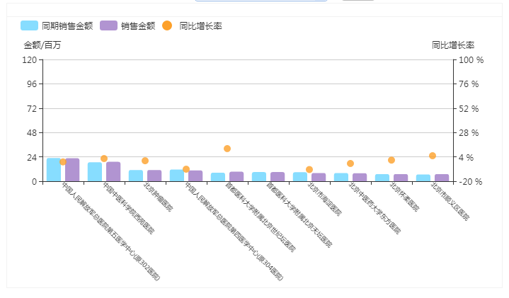
效果