昨日内容回顾
高级选择器:
后代选择   :  div p
子代选择器 : div>p
并集选择器:  div,p
交集选择器: div.active

属性选择器:
[属性~='属性值']
伪类选择器
a  LoVe HAte 必须要 遵循这个准则 “爱恨准则”
nth-child(3n+1)
first-child
last-child

继承性和层叠性

继承性:
文本的属性: color text-*,line-*,font-*
盒子属性 定位布局的元素

层叠性:
1.先看标签元素有没有被选中,如果选中了,就数数 (id,class,标签的数量),谁的权重大 就显示谁的属性。权重一样大,后来者居上
2.如果没有被选中标签元素(继承来的),权重为0。
如果属性都是被继承下来的 权重都是0 。权重都是0:"就近原则" : 谁描述的近,就显示谁的属性

3.继承来的,描述的一样近,数权重
4.继承来的,描述的一样近,权重一样,后来者居上

盒模型:
width:内容宽度
height:内容的高度
padding:盒子的内边距,内边距能填充盒子,+padding-left,如果要保持盒子不变,减width
border:盒子的边框

三要素: 粗细 线性样式 颜色

border: 1px solid red;
margin: 外边距。
介绍2个网站
1.BootCDN 稳定、快速、免费的前端开源项目 CDN 加速服务。
一般网站,比如js,bootstrap,vue这种公共资源,会优先链接它,当它无法访问时,链接到自己的服务器。
2.Iconfont-国内功能很强大且图标内容很丰富的矢量图标库,提供矢量图标下载、在线存储、格式转换等功能。
很多网站都在使用它的图标库,即使放大,也不会导致模糊。
一、标准文档流
什么是标准文档流
宏观的将,我们的web页面和ps等设计软件有本质的区别,web 网页的制作,是个“流”,从上而下 ,像 “织毛衣”。而设计软件 ,想往哪里画东西,就去哪里画
标准文档流下 有哪些微观现象?
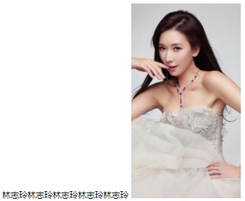
1.空白折叠现象
多个空格会被合并成一个空格显示到浏览器页面中。img标签换行写。会发现每张图片之间有间隙,如果在一行内写img标签,就解决了这个问题,但是我们不会这样去写我们的html结构。这种现象称为空白折叠现象。


<!DOCTYPE html>
<html lang="en">
<head>
    <meta charset="UTF-8">
    <title>Document</title>
    <style>

    </style>
</head>
<body>
    <img src="images/lzl.jpg" width="250" height="444">
    <img src="images/lzl.jpg" width="250" height="444">
</body>
<html>
网页效果:
可以看出2张图片之间有间隙。因为img是2行写的,一行就不会出现这个问题。
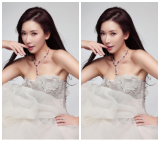
2.高矮不齐,底边对齐
文字还有图片大小不一,都会让我们页面的元素出现高矮不齐的现象,但是在浏览器查看我们的页面总会发现底边对齐
<!DOCTYPE html>
<html lang="en">
<head>
    <meta charset="UTF-8">
    <title>Document</title>
    <style>

    </style>
</head>
<body>
    <span>林志玲林志玲林志玲林志玲林志玲</span>
    <img src="images/lzl.jpg" width="250" height="444">
</body>
<html>
网页效果:
从效果中可以看出,文字加图片,会底边对齐
3.自动换行,一行写不满,换行写
如果在一行内写文字,文字过多,那么浏览器会自动换行去显示我们的文字。
<!DOCTYPE html>
<html lang="en">
<head>
    <meta charset="UTF-8">
    <title>Document</title>
    <style>
        .t{
            font-size: 30px;
        }
    </style>
</head>
<body>
    <span><span class='t'>iconfont不是什么新技术了。我们知道web网页能使用的字体一直很少,很多时候设计师用ps做出来的效果图,里面的字体我们都没办法在网页上实现。其实网页里面可以使用自定义字体的。而且还是所有浏览器都支持,包括烦人的ie。</span></span>
</body>
<html>
网页效果:
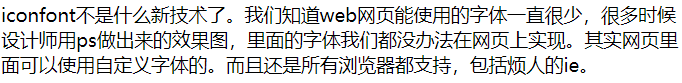
文字过多时,会自动换行
二、块级元素和行内元素
学习的初期,我们就要知道,标准文档流等级森严。标签分为两种等级:
- 行内元素
- 块级元素
比如h1标签和span,同时设置宽高,来看浏览器效果,那么你会发现:
行内元素和块级元素的区别:(非常重要)
行内元素:
- 与其他行内元素并排;
- 不能设置宽、高。默认的宽度,就是文字的宽度。
块级元素:
- 霸占一行,不能与其他任何元素并列;
- 能接受宽、高。如果不设置宽度,那么宽度将默认变为父亲的100%。
块级元素和行内元素的分类:
在以前的HTML知识中,我们已经将标签分过类,当时分为了:文本级、容器级。
从HTML的角度来讲,标签分为:
- 文本级标签:p、span、a、b、i、u、em。
- 容器级标签:div、h系列、li、dt、dd。
PS:为甚么说p是文本级标签呢?因为p里面只能放文字&图片&表单元素,p里面不能放h和ul,p里面也不能放p。
现在,从CSS的角度讲,CSS的分类和上面的很像,就p不一样:
-
行内元素:除了p之外,所有的文本级标签,都是行内元素。p是个文本级,但是是个块级元素。
-
块级元素:所有的容器级标签都是块级元素,还有p标签。
块级元素和行内元素的相互转换
我们可以通过display属性将块级元素和行内元素进行相互转换。display即“显示模式”。
块级元素可以转换为行内元素:
一旦,给一个块级元素(比如div)设置:
display: inline;那么,这个标签将立即变为行内元素,此时它和一个span无异。inline就是“行内”。也就是说:
- 此时这个div不能设置宽度、高度;
- 此时这个div可以和别人并排了
行内元素转换为块级元素:
同样的道理,一旦给一个行内元素(比如span)设置:
display: block;那么,这个标签将立即变为块级元素,此时它和一个div无异。block”是“块”的意思。也就是说:
- 此时这个span能够设置宽度、高度
- 此时这个span必须霸占一行了,别人无法和他并排
- 如果不设置宽度,将撑满父亲
<!DOCTYPE html>
<html lang="en">
<head>
    <meta charset="UTF-8">
    <title>Document</title>
    <style>
        * {
            padding: 0;
            margin: 0;
        }

        ul li {
            width: 180px;
            height: 60px;
            background: #566363;
            /*设置边框*/
            /*border: 1px solid red;*/
            /*垂直居中。行高等于盒子高度,就实现垂直居中*/
            line-height: 60px;
            /*水平居中*/
            text-align: center;
        }

        ul li a {
            width: 180px;
            height: 60px;
            display: block;
            /*去掉下划线*/
            text-decoration: none;
            color: white;
            font-size: 30px;

        }

        ul li a:hover {
            background: #ff6700;
            color: white;
        }
    </style>
</head>
<body>
<ul>
    <li>
        <a href="#">导航1</a>
    </li>
    <li>
        <a href="#">导航2</a>
    </li>
    <li>
        <a href="#">导航3</a>
    </li>
    <li>
        <a href="#">导航4</a>
    </li>
    <li>
        <a href="#">导航5</a>
    </li>
</ul>

</body>
<html>
网页效果:
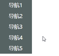
行高等于盒子高度,就实现垂直居中
标准流里面的限制非常多,导致很多页面效果无法实现。如果我们现在就要并排、并且就要设置宽高,那该怎么办呢?办法是:移民!脱离标准流!
css中一共有三种手段,使一个元素脱离标准文档流:
- (1)浮动
- (2)绝对定位
- (3)固定定位
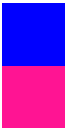
<!DOCTYPE html>
<html lang="en">
<head>
    <meta charset="UTF-8">
    <title>Document</title>
    <style>
        .box1{
            width: 100px;
            height: 100px;
            background-color: blue;
        }
        .box2{
            width: 100px;
            height: 100px;
            background-color: deeppink;
        }
    </style>
</head>
<body>
<div class="box1"></div>
<div class="box2"></div>
</body>
<html>
网页效果:
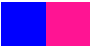
<!DOCTYPE html>
<html lang="en">
<head>
    <meta charset="UTF-8">
    <title>Document</title>
    <style>
        .box1{
            width: 100px;
            height: 100px;
            background-color: blue;
            float: left;
        }
        .box2{
            width: 100px;
            height: 100px;
            background-color: deeppink;
            float: left;
        }
    </style>
</head>
<body>
    <div class="box1"></div>
    <div class="box2"></div>
</body>
<html>
网页效果:
三、浮动
浮动是css里面布局最多的一个属性,也是很重要的一个属性。
float:表示浮动的意思。它有四个值。
- none: 表示不浮动,默认
- left: 表示左浮动
- right:表示右浮动
看一个例子
html结构:
<div class="box1"></div>
<div class="box2"></div>
<span>路飞学城</span>
css样式:
.box1{
      300px;
     height: 300px;
     background-color: red;
     float:left;
  }
 .box2{
      400px;
     height: 400px;
     background-color: green;
     float:right;
   }
   span{
     float: left;
      100px;
     height: 200px;
     background-color: yellow;
    }
我们会发现,三个元素并排显示,.box1和span因为是左浮动,紧挨在一起,这种现象贴边。.box2盒子因为右浮动,所以紧靠着右边。
那么浮动如果大家想学好,一定要知道它的四大特性
1.浮动的元素脱标
2.浮动的元素互相贴靠
3.浮动的元素由"子围"效果
4.收缩的效果
浮动元素脱标
脱标:就是脱离了标准文档流
看例子
<div class="box1">小红</div>
<div class="box2">小黄</div>
<span>小马哥</span>
<span>小马哥</span>
.box1{
             200px;
            height: 200px;
            background-color: red;
            float: left;

        }
        .box2{
             400px;
            height: 400px;
            background-color: yellow;

        }
        span{
            background-color: green;
            float: left;
             300px;
            height: 50px;
        }
效果:红色盒子压盖住了黄色的盒子,一个行内的span标签竟然能够设置宽高了。
原因1:小红设置了浮动,小黄没有设置浮动,小红脱离了标准文档流,其实就是它不在页面中占位置了,此时浏览器认为小黄是标准文档流中的第一个盒子。所以就渲染到了页面中的第一个位置上。这种现象,也有一种叫法,浮动元素“飘起来了”,但我不建议大家这样叫。
原因2:所有的标签一旦设置浮动,就能够并排,并且都不区分行内、块状元素,都能够设置宽高
浮动元素互相贴靠
看例子
html结构
<div class="box1">1</div>
<div class="box2">2</div>
<div class="box3">3</div>
.box1{
             100px;
            height: 400px;
            float: left;
            background-color: red;
        }
        .box2{
             150px;
            height: 450px;
            float: left;
            background-color: yellow;
        }
        .box3{
             300px;
            height: 300px;
            float: left;
            background-color: green;
        }
效果发现:
如果父元素有足够的空间,那么3哥紧靠着2哥,2哥紧靠着1哥,1哥靠着边。
如果没有足够的空间,那么就会靠着1哥,如果再没有足够的空间靠着1哥,自己往边靠
浮动元素字围效果
<div>
        <img src="./images/企业1.png" alt="">
    </div>
    <p>
        123路飞路飞路飞路飞路飞路飞路飞路飞路飞路飞路飞路飞路飞路飞路飞路飞路飞路飞路飞路飞路飞路飞路飞路飞路飞路飞路飞路飞路飞路飞路飞路飞路飞路飞路飞路飞路飞路飞路飞路飞路飞路飞路飞路飞路飞路飞路飞路飞路飞路飞路飞路飞路飞路飞路飞路飞路飞路飞路飞路飞路飞路飞路飞路飞路飞路飞路飞路飞路飞路飞路飞路飞路飞路飞路飞路飞路飞路飞路飞路飞路飞路飞路飞路飞路飞路飞路飞路飞路飞路飞路飞路飞路飞路飞路飞路飞路飞路飞路飞路飞路飞路飞路飞路飞路飞路飞路飞路飞路飞路飞路飞路飞路飞路飞路飞路飞路飞路飞路飞路飞路飞路飞路飞路飞路飞路飞路飞路飞路飞路飞路飞路飞路飞路飞路飞路飞路飞路飞路飞路飞路飞路飞路飞路飞路飞路飞路飞路飞路飞路飞路飞路飞路飞路飞路飞路飞路飞路飞路飞路飞路飞路飞路飞路飞路飞路飞路飞路飞路飞路飞路飞路飞路飞路飞路飞路飞路飞路飞路飞路飞路飞路飞路飞路飞路飞路飞路飞路飞路飞路飞路飞路飞路飞路飞路飞路飞路飞路飞路飞路飞路飞路飞路飞路飞路飞路飞路飞路飞路飞路飞路飞路飞路飞路飞路飞路飞路飞路飞路飞路飞路飞路飞路飞路飞路飞路飞路飞路飞路飞路飞路飞路飞路飞路飞路飞路飞路飞路飞路飞路飞路飞路飞路飞路飞路飞路飞路飞路飞路飞路飞路飞路飞路飞路飞路飞路飞路飞路飞路飞路飞路飞路飞路飞路飞路飞路飞路飞路飞路飞路飞路飞路飞路飞路飞路飞路飞路飞路飞路飞路飞路飞路飞路飞路飞路飞路飞路飞路飞路飞路飞路飞路飞路飞路飞路飞路飞路飞路飞路飞路飞路飞路飞
    </p>
*{
            padding: 0;
            margin: 0;
        }
        div{
            float: left;
        }
        p{
            background-color: #666;
        }
效果发现:所谓字围效果,当div浮动,p不浮动,div遮盖住了p,div的层级提高,但是p中的文字不会被遮盖,此时就形成了字围效果。
浮动元素紧凑效果
收缩:一个浮动元素。如果没有设置width,那么就自动收缩为文字的宽度(这点跟行内元素很像)
html结构:
<div>
     alex
</div>
css样式:
div{
    float: left;
    background-color: red;
}
大家一定要谨记:关于浮动,我们初期一定要遵循一个原则,永远不是一个盒子单独浮动,要浮动就要一起浮动。另外,有浮动,一定要清除浮动,
学好css,这3部分(display,浮动,定位)必须要会
为什么要清除浮动
在页面布局的时候,每个结构中的父元素的高度,我们一般不会设置。(为什么?)
大家想,如果我第一版的页面的写完了,感觉非常爽,突然隔了一个月,老板说页面某一块的区域,我要加点内容,或者我觉得图片要缩小一下。这样的需求在工作中非常常见的。真想打他啊。那么此时作为一个前端小白,肯定是去每个地方加内容,改图片,然后修改父盒子的高度。那问题来了,这样不影响开发效率吗?答案是肯定的。
看一个效果:
html效果:
<div class="father">
        <div class="box1"></div>
        <div class="box2"></div>
        <div class="box3"></div>

 </div>

<div class="father2"></div>
*{
            padding: 0;
            margin: 0;

        }
        .father{
             1126px;
            /*子元素浮动 父盒子一般不设置高度*/

            /*出现这种问题,我们要清除浮动带来影响*/
            /*height: 300px;*/

        }
        .box1{
             200px;

            height: 500px;
            float: left;
            background-color: red;
        }
        .box2{
             300px;
            height: 200px;
            float: left;
            background-color: green;
        }
        .box3{
             400px;
            float: left;
            height: 100px;
            background-color: blue;
        }
        .father2{
             1126px;
            height: 600px;
            background-color: purple;
        }
效果发现:如果不给父盒子一个高度,那么浮动子元素是不会填充父盒子的高度,那么此时.father2的盒子就会跑到第一个位置上,影响页面布局。
那么我们知道,浮动元素确实能实现我们页面元素并排的效果,这是它的好处,同时它还带来了页面布局极大的错乱!!!所以我们要清除浮动
还好还好。我们有多种清除浮动的方法,在这里给大家介绍四种:
- 给父盒子设置高度
- clear:both
- 伪元素清除法
- overflow:hidden
1.给父盒子设置高度
这个方法给大家上个代码介绍,它的使用不灵活,一般会常用页面中固定高度的,并且子元素并排显示的布局。比如:导航栏
2. clear:both
清除浮动,必须是块元素! 一般用div
clear:意思就是清除的意思。
有三个值:
left:当前元素左边不允许有浮动元素
right:当前元素右边不允许有浮动元素
both:当前元素左右两边不允许有浮动元素
给浮动元素的后面加一个空的div,并且该元素不浮动,然后设置clear:both。
html结构:
<div>
        <ul>
            <li>Python</li>
            <li>web</li>
            <li>linux</li>
            <!-- 给浮动元素最后面加一个空的div 并且该元素不浮动 ,然后设置clear:both  清除别人对我的浮动影响-->
            <!-- 内墙法 -->
            <!-- 无缘无故加了div元素  结构冗余 -->
            <div class="clear"></div>

        </ul>

</div>
<div class="box">

</div>
*{
            padding: 0;
            margin: 0;
        }
        ul{
            list-style: none;

        }


        div{
             400px;

        }


        div ul li {
            float: left;
             100px;
            height: 40px;
            background-color: red;
        }
        .box{
             200px;
            height: 100px;
            background-color: yellow;
        }
        .clear{
            clear: both;
        }
在浮动元素的后面加一个块级标签,设置属性clear:both;解决浮动带来的影响,也称之为 “内墙法”
这种方法不常用。为什么呢?因为清除一次,需要添加div标签,太麻烦了。
3.伪元素清除法(常用)
给浮动子元素的父盒子,也就是不浮动元素,添加一个clearfix(约定俗成的名字)的类,然后设置
.clearfix:after{
    /*必须要写这三句话*/
    content: '.';
    clear: both;
    display: block;
}
新浪首页推荐伪元素清除法的写法
.clearfix{
            /*新浪首页清除浮动伪元素方法*/
            /*添加点。为啥呢?因为content必须要有内容才行*/
            content: ".";
            /*设置为块级标签*/
            display: block;
            /*设置高度为0是为了不显示点*/
            height: 0;
            /*清除浮动*/
            clear: both;
            /*不占位置*/
            visibility: hidden
        }
4. overflow:hidden(常用)
overflow属性规定当内容溢出元素框时发生的事情。
说明:
这个属性定义溢出元素内容区的内容会如何处理。如果值为 scroll,不论是否需要,用户代理都会提供一种滚动机制。因此,有可能即使元素框中可以放下所有内容也会出现滚动条。
<!DOCTYPE html>
<html lang="en">
<head>
    <meta charset="UTF-8">
    <title>Document</title>
    <style>
        div {
            width: 300px;
            height: 200px;
            /*border: 1px solid red;*/
            overflow: scroll;
            font-size: 25px;
        }
    </style>
</head>
<body>
    <div>Python [1]  (英国发音:/ˈpaɪθən/ 美国发音:/ˈpaɪθɑːn/), 是一种面向对象的解释型计算机程序设计语言,由荷兰人Guido van Rossum于1989年发明,第一个公开发行版发行于1991年。</div>
</body>
<html>
网页效果:
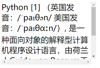
可以看到有一个滚动条,设置值为auto,也是同样的效果。
有五个值:
| 值 | 描述 |
|---|---|
| visible | 默认值。内容不会被修剪,会呈现在元素框之外。 |
| hidden | 内容会被修剪,并且其余内容是不可见的。 |
| scroll | 内容会被修剪,但是浏览器会显示滚动条以便查看其余的内容。 |
| auto | 如果内容被修剪,则浏览器会显示滚动条以便查看其余的内容。 |
| inherit | 规定应该从父元素继承 overflow 属性的值。 |
逐渐演变成overflow:hidden清除法。
其实它是一个BFC区域: https://blog.csdn.net/riddle1981/article/details/52126522
一、什么是BFC
BFC(block formatting context):简单来说,BFC 就是一种属性,这种属性会影响着元素的定位以及与其兄弟元素之间的相互作用。
如果一个元素符合了成为BFC的条件,该元素内部元素的布局和定位就和外部元素互不影响(除非内部的盒子建立了新的 BFC),是一个隔离了的独立容器。(在 CSS3 中,BFC 叫做 Flow Root)
到此为止。关于浮动的实现并排、清除浮动的四个用法已经介绍完毕,大家一定要熟记于心。
上面4种清除方法,记住第三个和第四个就可以了。
四、margin的用法
margin塌陷问题
当时说到了盒模型,盒模型包含着margin,为什么要在这里说margin呢?因为元素和元素在垂直方向上margin里面有坑。
我们来看一个例子:
html结构:
<div class="father">
    <div class="box1"></div>
    <div class="box2"></div>
</div>
*{
            padding: 0;
            margin: 0;
        }
        .father{
             400px;
            overflow: hidden;
            border: 1px solid gray;
        }
        .box1{
             300px;
            height: 200px;
            background-color: red;
            margin-bottom: 20px;}
        .box2{
             400px;
            height: 300px;
            background-color: green;
            margin-top: 50px;
        }
当给两个标准流下兄弟盒子 设置垂直方向上的margin时,那么以较大的为准,那么我们称这种现象叫塌陷。没法解决,我们称为这种技巧叫“奇淫技巧”。记住这种现象,在布局垂直方向盒子的时候主要margin的用法。
当我们给两个标准流下的兄弟盒子设置浮动之后,就不会出现margin塌陷的问题。
margin:0 auto;
div{
     780px;
    height: 50px;
    background-color: red;
    /*水平居中盒子*/
    margin: 0px auto;
    /*水平居中文字*/
    text-align: center;
}
当一个div元素设置margin:0 auto;时就会居中盒子,那我们知道margin:0 auto;表示上下外边距离为0,左右为auto的距离,那么auto是什么意思呢?
设置margin-left:auto;我们发现盒子尽可能大的右边有很大的距离,没有什么意义。当设置margin-right:auto;我们发现盒子尽可能大的左边有很大的距离。当两条语句并存的时候,我们发现盒子尽可能大的左右两边有很大的距离。此时我们就发现盒子居中了。
另外如果给盒子设置浮动,那么margin:0 auto失效。
使用margin:0 auto;注意点:
1.使用margin: 0 auto;水平居中盒子必须有width,要有明确width,文字水平居中使用text-align: center;
2.只有标准流下的盒子 才能使用margin:0 auto;
当一个盒子浮动了,固定定位,绝对定位(后面会讲),margin:0 auto; 不能用了
3.margin:0 auto;居中盒子。而不是居中文本,文字水平居中使用text-align: center;
另外大家一定要知道margin属性是描述兄弟盒子的关系,而padding描述的是父子盒子的关系
善于使用父亲的padding,而不是margin
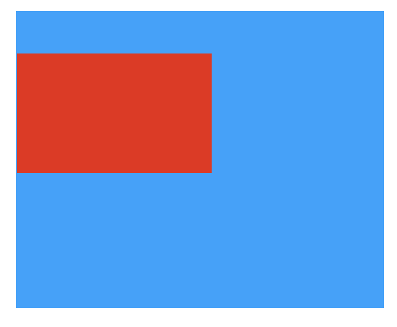
如果让大家实现如图的效果,应该有不少的同学做不出来。
那么我们来看看这个案例,它的坑在哪里?
下面这个代码应该是大家都会去写的代码。
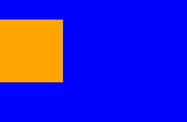
<!DOCTYPE html>
<html lang="en">
<head>
    <meta charset="UTF-8">
    <title>Document</title>
    <style>
        *{
            padding: 0;
            margin: 0;
        }
        .father{
            width: 300px;
            height: 300px;
            background-color: blue;
        }
        .child{
            width: 100px;
            height: 100px;
            background-color: orange;
            margin-top: 30px;
        }
    </style>
</head>
<body>
    <div class="father">
        <div class="child"></div>
    </div>
</body>
<html>
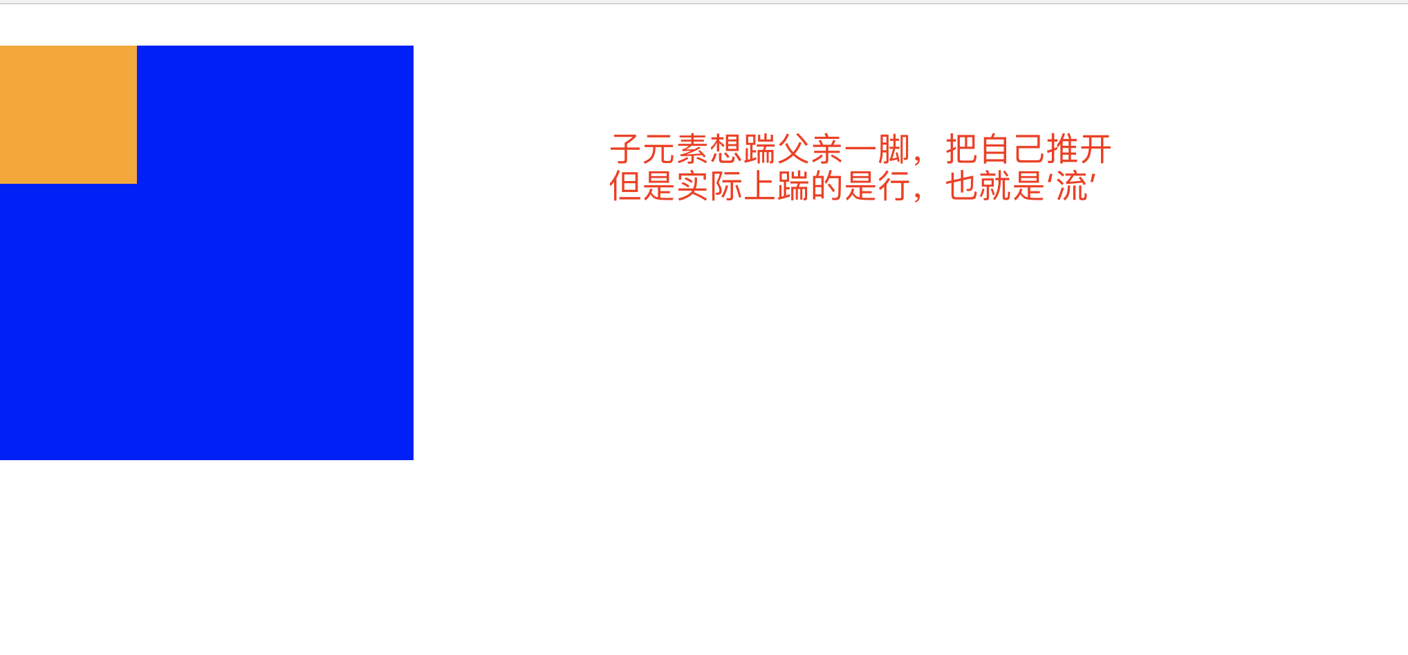
因为父亲没有border,那么儿子margin-top实际上踹的是“流” 踹的是行,所以父亲掉下来了,一旦给父亲一个border发现就好了。
那么问题来了,我们不可能在页面中无缘无故的去给盒子加一个border,所以此时的解决方案只有一种。就是使用父亲的padding。让子盒子挤下来。
<!DOCTYPE html>
<html lang="en">
<head>
    <meta charset="UTF-8">
    <title>Document</title>
    <style>
        *{
            padding: 0;
            margin: 0;
        }
        .father{
            width: 300px;
            height: 299px;
            background-color: blue;
            padding-top: 1px;
        }
        .child{
            width: 100px;
            height: 100px;
            background-color: orange;
            margin-top: 30px;
        }
    </style>
</head>
<body>
    <div class="father">
        <div class="child"></div>
    </div>
</body>
<html>
网页效果:
另外一种方式,使用浮动
<!DOCTYPE html>
<html lang="en">
<head>
    <meta charset="UTF-8">
    <title>Document</title>
    <style>
        *{
            padding: 0;
            margin: 0;
        }
        .father{
            width: 300px;
            height: 300px;
            background-color: blue;
        }
        .child{
            width: 100px;
            height: 100px;
            background-color: orange;
            margin-top: 30px;
            float: left;
        }
    </style>
</head>
<body>
    <div class="father">
        <div class="child"></div>
    </div>
</body>
<html>
效果同上
一个行内元素当设置浮动以后,可以设置宽高。
span默认是不能设置宽高的,设置浮动之后,就可以了
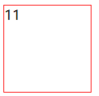
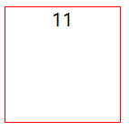
<!DOCTYPE html>
<html lang="en">
<head>
    <meta charset="UTF-8">
    <title>Document</title>
    <style>
        span {
            float: left;
            width: 100px;
            height: 100px;
            /*设置边框*/
            border: 1px solid red;
        }
    </style>
</head>
<body>
    <span>11</span>
</body>
<html>
网页效果:
一个块级元素设置浮动也可以设置宽高。
块级元素,比如div,天生就可以设置宽高。设置浮动之后,依然可以设置宽高。
总结一句话:任何标签只要设置浮动了,都可以设置宽和高。另外一个div元素,如果设置浮动之后,不设置宽高,会发现,它收缩了,变成了内容的宽度(有点像行内元素)
五、文本属性和字体属性
文本属性
介绍几个常用的。
文本对齐
text-align 属性规定元素中的文本的水平对齐方式。
属性值:none | center | left | right | justify
justify 两端对齐,但很少被使用,有的浏览器可能还会不支持该属性。
center 居中
<!DOCTYPE html>
<html lang="en">
<head>
    <meta charset="UTF-8">
    <title>Document</title>
    <style>
        div {
            width: 100px;
            height: 100px;
            /*设置边框*/
            border: 1px solid red;
            text-align: center;
        }
    </style>
</head>
<body>
    <div>11</div>
</body>
<html>
网页效果:
文本颜色
color属性
文本首行缩进
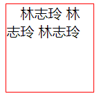
text-indent 属性规定元素首行缩进的距离,单位建议使用em
<!DOCTYPE html>
<html lang="en">
<head>
    <meta charset="UTF-8">
    <title>Document</title>
    <style>
        div {
            width: 100px;
            height: 100px;
            /*设置边框*/
            border: 1px solid red;
            /*文本首行缩进*/
            text-indent: 1em;
        }
    </style>
</head>
<body>
    <div>林志玲 林志玲 林志玲</div>
</body>
<html>
网页效果:
文本修饰
text-decoration属性规定文本修饰的样式
属性值:none(默认) | underline(下划线) | overline(定义文本上的一条线) | line-through (定义穿过文本下的一条线) | inherit(继承父元素的text-decoration属性的值。)
行高
line-height就是行高的意思,指的就是一行的高度。
字体属性
字体大小
font-size表示设置字体大小,如果设置成inherit表示继承父元素的字体大小值。
字体粗细
font-weight表示设置字体的粗细
属性值:none(默认值,标准粗细) | bold(粗体) | bolder(更粗)| lighter(更细) | 100~900(设置具体粗细,400等同于normal,而700等同于bold)| inherit(继承父元素字体的粗细值)
字体系列
font-family
font-family: "Microsoft Yahei", "微软雅黑", "Arial", sans-serif
如果浏览器不支持第一个字体,则会尝试下一个。浏览器会使用它可识别的第一个值。如果都不支持则显示宋体。
行高 line-height
针对单行文本垂直居中
公式:行高的高度等于盒子的高度,可以使当行文本垂直居中,注意只适用单行文本。
针对多行文本垂直居中
行高的高度不能小于字体的大小,不然上下字之间会紧挨一起。
第一步,一个宽度300*300的盒子,看盒子中一共显示了几行文字,假如是5行,再看一下行高,如果行高是line-height:30px; 那么就知道行高*5=150px
第二步,让(盒子的高度-150px)/2=75;那么设置盒子的padding-top:75px;同时保证盒子的高度为300px,那么高度改为225px;
垂直居中
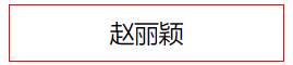
<!DOCTYPE html>
<html lang="en">
<head>
    <meta charset="UTF-8">
    <title>Document</title>
    <style>
        div{
            width: 200px;
            height: 40px;
            border: 1px solid red;
            font-size: 18px;
            /*行高等于盒子高度,就是垂直居中*/
            line-height: 40px;
            text-align: center;
        }
    </style>
</head>
<body>
    <div>赵丽颖</div>
</body>
</html>
网页效果:
font-size 一定比行高小
font-size 一般都是偶数,不会用奇数
font-family介绍
使用font-family注意几点:
1.网页中不是所有字体都能用
因为这个字体要看用户的电脑里面装没装,
比如你设置: font-family: "华文彩云"; 如果用户电脑里面没有这个字体,
那么就会变成宋体
页面中,中文我们只使用: 微软雅黑、宋体、黑体。
如果页面中,需要其他的字体,那么需要切图。 英语:Arial 、 Times New Roman
2.为了防止用户电脑里面,没有微软雅黑这个字体。
就要用英语的逗号,隔开备选字体,就是说如果用户电脑里面,
没有安装微软雅黑字体,那么就是宋体:
font-family: "微软雅黑","宋体"; 备选字体可以有无数个,用逗号隔开。
3.需要将英语字体,放在最前面
这样所有的中文,就不能匹配英语字体,
就自动的变为后面的中文字体:
font-family: "Times New Roman","微软雅黑","宋体";
4.所有的中文字体,都有英语别名
我们也要知道: 微软雅黑的英语别名:
font-family: "Microsoft YaHei";
宋体的英语别名: font-family: "SimSun";
font属性能够将font-size、line-height、font-family合三为一: font:12px/30px "Times New Roman","Microsoft YaHei","SimSun";
5.行高可以用百分比,表示字号的百分之多少
一般来说,都是大于100%的,因为行高一定要大于字号。
font:12px/200% “宋体” 等价于 font:12px/24px “宋体”;
反过来,比如: font:16px/48px “宋体”;
等价于 font:16px/300% “宋体”
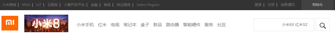
作业:
小米官网导航栏部分

代码如下:
<!DOCTYPE html>
<html lang="en">
<head>
    <meta charset="UTF-8">
    <title>Document</title>
    <style>
        *{
            padding: 0;
            margin: 0;
        }
        ul{
            list-style: none;
        }
        /*最顶部图片*/
        .site_bn_bar img{
             100%;
            background-repeat: no-repeat;
            background-position: center 0;
        }
        /*导航部分*/
        .site_topbar {
            position: relative;
            z-index: 30;
            height: 40px;
            font-size: 12px;
            color: #b0b0b0;
            background: #333;
        }
        .top_nav {
            margin: 0 auto;
             1226px;
            height: 40px;
        }
        .top_nav_ul {
            font-size: 12px;
            text-align: center;
            background: #5f5750;
            /*float: left;*/
        }
        .top_nav_ul li {
            float: left;
            padding: 0 3px;
        }
        .top_nav_ul li a:hover{
            color: white;
        }
        .top_nav .top_li {
            float: left;
            line-height: 40px;
        }
        .sep {
            margin: 0 .5em;
        }
        .site-topbar a {
            color: #b0b0b0;
        }
        a {
            color: #757575;
            text-decoration: none;
        }
        .top_nav .car{
             120px;
            height: 40px;
            background-color: #424242;
            float: right;
            margin-left: 15px;
            line-height: 40px;
            text-align: center;
        }
        .top_nav .login{
             160px;
            height: 40px;
            /*background-color: pink;*/
            float: right;
            line-height: 40px;
        }
        /*.login ul li {*/
            /*float: right;*/
        /*}*/
        /*整体样式*/
        .integral {
            margin: 0 auto;
             1226px;
        }

        /*导航栏的样式*/
        /*.nav{*/
            /*height: 40px;*/
        /*}*/
        /*.nav .navt{*/
            /* 375px;*/
            /*height: 40px;*/
            /*background-color: red;*/
            /*float: left;*/
        /*}*/

        .wrap{
            height: 110px;
        }
        .wrap .logo{
             62px;
            height: 55px;
            background-color: #ff6700;
            /*background-image: url("images/mi-logo.png");background-repeat:no-repeat;*/
            float: left;
            margin-top: 22px;
            /*text-align: center;*/
            /*line-height: 40px;*/
        }
        .wrap .logo img {
            margin-left: 8px;
        }
        .logo2 {
            float: left;
        }
        .logo2 a img {
            margin-top: 18px;margin-left: 22px;
        }
        .nav_item {
            float: left;
            line-height: 110px;
            margin-left: 15px;
        }
        .nav_item ul li{
            /*height: 340px;*/
            float: left;
            /*padding: 28px;*/
            margin-left: 15px;
        }
        .nav_item ul li a:hover{
            color: #ff6700;
        }
        .wrap .nav2{
             850px;
            height: 110px;
            /*background: pink;*/
            float: left;
        }
        .wrap .search{
             296px;
            height: 50px;
            float: right;
            /*background-color: purple;*/
            margin-top: 30px;
        }

        .hide {
            display: none !important;
        }

        user agent stylesheet
        label {
            cursor: default;
        }
        .search-text {
            /*position: absolute;*/
            /*top: 0;*/
            right: 51px;
            z-index: 1;
             223px;
            height: 48px;
            padding: 0 10px;
            border: 1px solid #e0e0e0;
            font-size: 14px;
            line-height: 48px;
            /*outline: 0;*/
            text-align: right;
        }
        /*.iconfont {*/
            /*font-family: "iconfont" !important;*/
            /*font-style: normal;*/
            /*background-image: url("images/search.png");*/
        /*}*/
        .iconfont{
            /*z-index: 99;*/
            /*140px;*/
            /*height:48px;*/
            /*!*line-height:18px;*!*/
            /*!*font-size:18px;*!*/
            /*background:url("images/search.png") no-repeat left top;*/
            /*color:#FFF;*/
            padding-bottom:17px;
        }
        .search-btn {
            /*position: absolute;*/
            /*right: 0;*/
            /*top: 0;*/
            z-index: 2;
             52px;
            height: 48px;
            border: 1px solid #e0e0e0;
            font-size: 24px;
            line-height: 24px;
            background: #fff;
            color: #616161;
            outline: 0;
            background:url("images/search5.png") no-repeat left top;
        }
        /*============================================================*/
        .container::after{
            content: ".";
            display: block;
            height: 0;
            clear: both;
            visibility: hidden
        }

        .choice{
             234px;
            height: 460px;
            background-color: purple;
            float: left;
        }
        .video{
             992px;
            height: 460px;
            background-color: blue;
            float: left;
        }
        .clear {
            clear: both;
        }
        .hero {
            padding-top: 14px;
        }
        .choice_sub {
             234px;
            height: 170px;
            background-color: #c38889;
            float: left;
        }
        .best_seller {
            height: 170px;
            margin-left: 14px;
        }
        .best_seller ul{
            height: 170px;
        }
        .best_seller ul li{
            float: left;
             316px;
            height: 170px;
            background-color:red;
            margin-left: 14px;
        }
        .flicker {
            height: 70px;
        }
        .paging {
             70px;
            height: 25px;
            background-color:#377f7e;
            margin-top: 35px;
            float: right;
        }
        .flicker_text p {
            position:absolute;
            margin-top: 10px;
            font-size: 22px;
            font-weight: 200;
            line-height: 58px;
            color: #333;
        }

        .flicker_goods {
            height: 340px;
            margin-left: -14px;
        }
        .flicker_goods ul{
            list-style: none;
            height: 340px;

        }
        .flicker_goods ul li{
            float: left;
             234px;
            height: 340px;
            background-color:deeppink;
            margin-left: 14px;

        }


    </style>
</head>
<body>
<!--<div class="site_bn_bar">-->
    <!--<img src="images/cms_15270400062082_IKomG.jpg">-->
<!--</div>-->
<div class="site_topbar">
    <div class="top_nav">
        <div class="top_li">
            <ul class="top_nav_ul">
                <li><a href="#">小米商城</a><span class="sep">|</span></li>
                <li><a href="#">MIUI</a><span class="sep">|</span></li>
                <li><a href="#">IoT</a><span class="sep">|</span></li>
                <li><a href="#">云服务</a><span class="sep">|</span></li>
                <li><a href="#">小爱开放平台</a><span class="sep">|</span></li>
                <li><a href="#">金融</a><span class="sep">|</span></li>
                <li><a href="#">有品</a><span class="sep">|</span></li>
                <li><a href="#">政企服务</a><span class="sep">|</span></li>
                <li><a href="#">Select Region</a></li>
            </ul>
        </div>
        <div class="car">购物车</div>
        <div class="login">
            <ul class="top_nav_ul">
                <li><a href="#">登录</a><span class="sep">|</span></li>
                <li><a href="#">注册</a><span class="sep">|</span></li>
                <li><a href="#">消息通知</a></li>
            </ul>
        </div>
    </div>
</div>
<div class="integral">
    <!--<div class="nav">-->
        <!--<div class="navt"></div>-->
    <!--</div>-->

    <div class="wrap">
        <div class="logo">
            <img src="images/mi-logo.png">
        </div>
        <div class="nav2">
            <div class="logo2">
                <a href="#">
                    <img src="images/163-66-1xioami8.gif">
                </a>
            </div>

            <div class="nav_item">
                <ul>
                    <li><a href="#">小米手机</a></li>
                    <li><a href="#">红米</a></li>
                    <li><a href="#">电视</a></li>
                    <li><a href="#">笔记本</a></li>
                    <li><a href="#">盒子</a></li>
                    <li><a href="#">新品</a></li>
                    <li><a href="#">路由器</a></li>
                    <li><a href="#">智能硬件</a></li>
                    <li><a href="#">服务</a></li>
                    <li><a href="#">社区</a></li>
                </ul>
            </div>
        </div>
        <div class="search">
            <form class="search-form clearfix" action="" method="get">
                <label for="search" class="hide">站内搜索</label>
                <input class="search-text" type="search" name="keyword" placeholder="小米6X 红米S2">
                <input type="submit" class="search-btn iconfont" value="">
                <!--<div class="search-hot-words" style="display: block;">-->
                    <!--<a href="#">小米6X</a>-->
                    <!--<a href="#">红米S2</a>-->
                <!--</div>-->
            </form>
        </div>
    </div>
    <div class="container">
        <div class="choice">
            <ul>
                <li><a href="#">手机 电话卡</a></li>
                <li><a href="#">电视 盒子</a></li>
                <li><a href="#">笔记本</a></li>
                <li><a href="#">智能 家电</a></li>
                <li><a href="#">健康 家居</a></li>
                <li><a href="#">出行 儿童</a></li>
                <li><a href="#">路由器 手机配件</a></li>
                <li><a href="#">移动电源 插线板</a></li>
                <li><a href="#">耳机 音箱</a></li>
                <li><a href="#">生活 米兔</a></li>
            </ul>
        </div>
        <div class="video"></div>
    </div>

    <!--<div class="clear"></div>-->
    <div class="hero">
        <div class="choice_sub">111</div>
        <div class="best_seller">
            <ul>
                <li>1</li>
                <li>2</li>
                <li>3</li>
            </ul>
        </div>
    </div>
    <div class="flicker">
        <div class="flicker_text">
            <p>开始闪购</p>
        </div>
        <div class="paging"></div>
    </div>
    <div class="clear"></div>
    <div class="flicker_goods">
        <ul>
            <li>1</li>
            <li>2</li>
            <li>3</li>
            <li>4</li>
            <li>5</li>
        </ul>
    </div>

</div>

</body>
</html>
网页效果: