一开始用lattice包,感觉在多元数据的可视化方面,确实做得非常好。各种函数,可以实现任何想要实现的展示。
| barchart(y ~ x) | y对x的直方图 |
| bwplot(y ~ x) | 盒形图 |
| densityplot(~ x) | 密度函数图 |
| dotplot(y ~ x) | Cleveland点图(逐行逐列累加图) |
| histogram(~ x) | x的频率直方图 |
| qqmath(~ x) | x的关于某理论分布的分位数-分位数图 |
| stripplot(y ~ x) | 一维图,x必须是数值型,y可以是因子 |
| qq(y ~ x) | 比较两个分布的分位数,x必须是数值型,y可以是数值型,字符型,或者因子,但是必须有两个"水平" |
| xyplot(y ~ x) | 二元图(有许多功能) |
| levelplot(z ~ x*y) contourplot(z ~ x*y) |
在x,y坐标点的z值的彩色等值线图(x,y和z等长) |
| cloud(z ~ x*y) | 3-D透视图(点) |
| wireframe(z ~ x*y) | 同上(面) |
| splom(~ x) | 二维图矩阵 |
| parallel(~ x) | 平行坐标图 |
下面详细介绍下xyplot,xyplot相当于plot,不过可以画多个子图。
一.不过如果想要在每个子图里展示几种点或线,就要想想办法了。
1)这是一个利用公式关系的方法:Sepal.Length + Sepal.Width ~ Petal.Length + Petal.Width能在一个子图中画出
Sepal.Length ~ Petal.Length,Sepal.Width ~ Petal.Length,Sepal.Length ~ Petal.Width,Sepal.Width ~ Petal.Width四种关系
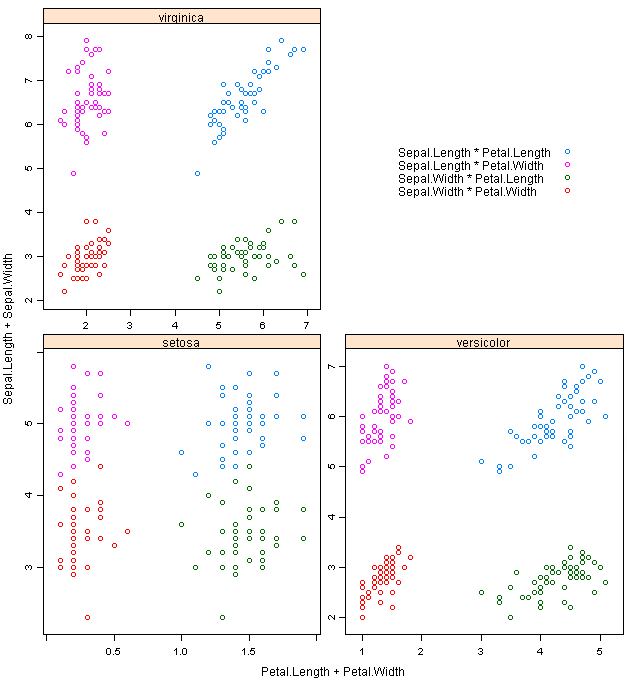
*代码:
library(lattice)
require(stats)
xyplot(Sepal.Length + Sepal.Width ~ Petal.Length + Petal.Width | Species,
data = iris, scales = "free", layout = c(2, 2),
auto.key = list(x = .6, y = .7, corner = c(0, 0)))
2)下面是另一种方法,利用groups参数:
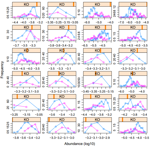
*代码:
xyplot(freq~abun |KO ,groups=country,data =zz, type="o", layout = c(4, 6),xlab="Abundance (log10)",ylab="Frequency",scales="free")
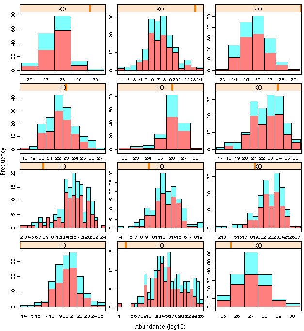
不过我想要画hist分布图,所以尝试了几种不同方法:
1)barchart:可惜柱子的透明度无法调节
*代码:
barchart(freq~abun |KO ,groups=country,data =zz,stack =T,strip=T, layout = c(2, 2),xlab="Abundance (log10)",ylab="Frequency",scales="free",col=rainbow(2,alpha=0.5),box.ratio =100,horizontal=F)
2)想用xyplot 函数,把type改成“h”柱形,但是 lwd 这个参数没法每个子图不一样,lend参数无效 。
*代码:
xyplot(freq~abun |KO ,groups=country,data =zz, type="h", lwd = 10, lend =2, layout = c(4, 6),xlab="Abundance (log10)",ylab="Frequency",scales="free",col=rainbow(2,alpha=0.5))
3)经过一番研究,用histogram函以及函数中的panel(子图中加函数)可以实现,但是发觉xlim无法各个子图自己调整,最后无奈选择最原始的方法。

*代码:
histogram(~abun |KO ,data=zz , layout = c(4, 6),xlab="Abundance (log10)",ylab="Frequency",scales="free",col=rainbow(2,alpha=0.5)[1],
panel = function(x, ...) {
panel.histogram(x[1:100],breaks=NULL,type="count",col = rainbow(2,alpha=0.5)[1])
panel.histogram(x[101:160],breaks=NULL,type="count",col = rainbow(2,alpha=0.5)[2])
}
)
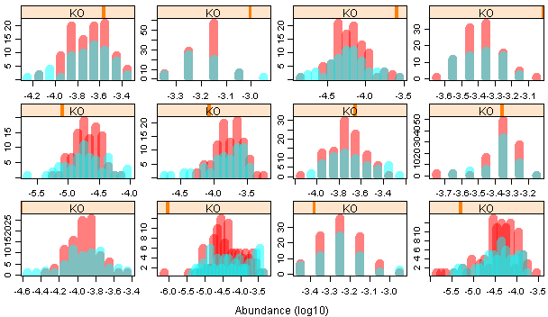
4)最原始的方法:
*代码:
par(mfrow=c(6,4),mar=c(2.1,2.1,0.1,0.1))
for (i in 1:length(id))
{
tmp=log10(as.numeric(data[id[i],2:161]))
a=hist(tmp,breaks=10,plot=F)
b=hist(tmp[1:100],breaks=a$breaks,plot=F)
c=hist(tmp[101:160],breaks=a$breaks,plot=F)
if((max(b$count)/100)>(max(c$count)/60)){
hist(tmp[1:100],breaks=a$breaks,col=rainbow(2,alpha=0.5)[1],xlab="",ylab="",main="");
e=hist(tmp[101:160],breaks=a$breaks,plot=F)
e$counts = e$counts*100/sum(e$counts)
plot(e,add=T,col=rainbow(2,alpha=0.5)[2],xlab="",ylab="",main="")
}else{
e=hist(tmp[101:160],breaks=a$breaks,plot=F)
e$counts = e$counts*100/sum(e$counts)
plot(e,col=rainbow(2,alpha=0.5)[2],xlab="",ylab="",main="",border=0)
hist(tmp[1:100],breaks=a$breaks,add=T,col=rainbow(2,alpha=0.5)[1],xlab="",ylab="",main="");
plot(e,add=T,col=rainbow(2,alpha=0.5)[2],xlab="",ylab="",main="")
}
}
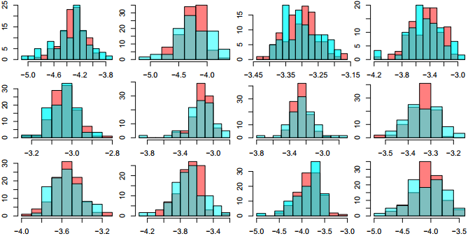
最后终于大功告成,里面还有很多地方值得仔细研究。
例如:
i.我两组样品的数量不一样,但是我想在一个hist图中比较,怎么办?hist纵轴百分比显示!!!
e=hist(tmp[101:160],breaks=a$breaks,plot=F)#先hist存到变量中
e$counts = e$counts*100/sum(e$counts) #将counts转换成百分比
plot(e,add=T,col=rainbow(2,alpha=0.5)[2],xlab="",ylab="",main="")#再画图
ii.我画两个具有一定透明度的hist,发觉画图先后顺序对重叠部分的颜色有影响,例如我先画红色再画蓝色vs.先画蓝色再画红色,结果就不一样了。

但是我又需要让x轴和y轴依据最大的图来确定。
所以我先根据所有数据来取breaks,保持两个hist的break一致,这样x轴问题就解决了;
然后判断哪个hist的y值最大,那么我先根据最大的那个画一个空白的hist,y轴问题解决;
然后再按照先红后蓝的顺序画上两个hist。