1.内容居中:效果
关键代码:
<div class="container"> .........之前上面添加在body标签下的代码 </div>
添加class=“container”之后,div里内容如图居中。
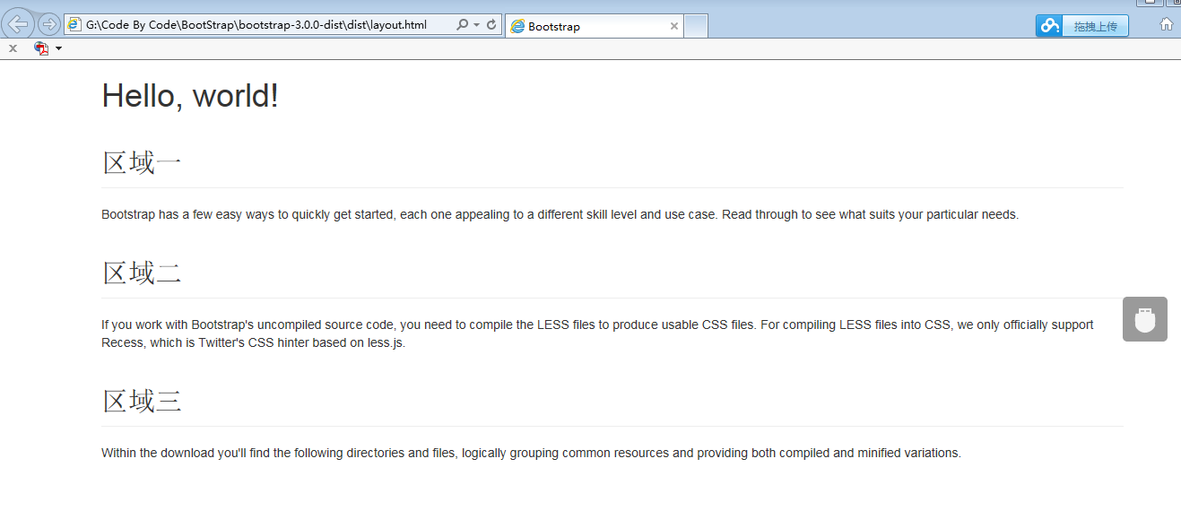
2.类似Table的栅格系统:效果

关键代码:
首先为三个区域添加一个容器,可以使用div,并且为div添加一个类 <div class="row">.
然后我们为每个小的区域也添加一个容器div,并且为div添加一个类<div class="col-xs-4">
简单代码实现如下:
 <div class="container"> <h1>Hello, world!</h1> <div class="row">

<div class="col-xs-4"> <h2 class="page-header">区域一</h2> <p>Bootstrap has a few easy ways to quickly get started, each one appealing to a different skill level and use case. Read through to see what suits your particular needs.</p> </div>

<div class="col-xs-4"> <h2 class="page-header">区域二</h2> <p>If you work with Bootstrap's uncompiled source code, you need to compile the LESS files to produce usable CSS files. For compiling LESS files into CSS, we only officially support Recess, which is Twitter's CSS hinter based on less.js.</p> </div>

<div class="col-xs-4"> <h2 class="page-header">区域三</h2> <p>Within the download you'll find the following directories and files, logically grouping common resources and providing both compiled and minified variations.</p> </div>

</div> </div>
默认一共12列, 这边设置“col-xs-4”,然后就是被 平均分成 3列了,每列包含4小列(也就是占据的 栅格列数目),这边“4“的范围是 1~12,
如果要平均分成2列,则 用 “col-xs-6”