CSS Layout
CSS Layout 是对上下左右布局的一个简单封装,主要针对自己项目里面方便使用。
坚持组合大于继承的原则,复杂的布局也是由简单布局组成的,当你用习惯了,完全在布局上面不用再去写CSS 啦~
所以不习惯margin/padding-top/right/bottom/left-*的同学可以忽略。
大家可以使用免费cdn 做测试: https://gitcdn.xyz/repo/wz2cool/css_layout/0.1/dist/layout.min.css
(PS: 非前端专攻人士,至于你们觉得好不好,反正我是用的挺爽的_)
项目地址:https://github.com/wz2cool/css_layout
.fill
填充父节点全部空间。
.fill-height
填充父节点高度空间。
.fill-width
填充父节点宽度空间。
.float-right
向右浮动。
.float-left
向左浮动。
.margin-/top/right/bottom/left-xx
margin 的上下左右
.padding-/top/right/bottom/left-xx
padding 的上下左右
.horizontal-container
.fill-right

<div class="horizontal-container fill-right" style="height: 100px;">
    <div class="left-panel fill-height" style="background: #EE91AD;  150px;">
        left panel (auto)
    </div>
    <div class="right-panel fill-height" style="background: #7171D1;">
        right panel (fill rest)
    </div>
</div>
.fill-left

<div class="horizontal-container fill-left" style="height: 100px;">
    <div class="right-panel fill-height" style="background: #7171D1;   150px;">
        right panel (auto)
    </div>
    <div class="left-panel fill-height" style="background: #EE91AD;">
        left panel (fill rest)
    </div>
</div>
.vertical-container
.fill-bottom

<div class="vertical-container fill-bottom" style="height: 400px;">
    <div class="top-panel" style="background: #EE91AD; height: 100px;">
        top panel (auto)
    </div>
    <div class="bottom-panel" style="background: #7171D1;">
        bottom panel (fill rest)
    </div>
</div>
.fill-top

<div class="vertical-container fill-top" style="height: 400px;">
    <div class="top-panel" style="background: #EE91AD; ">
        top panel (fill rest)
    </div>
    <div class="bottom-panel" style="background: #7171D1;height: 100px;">
        bottom panel (auto)
    </div>
</div>
complex hor-ver layout
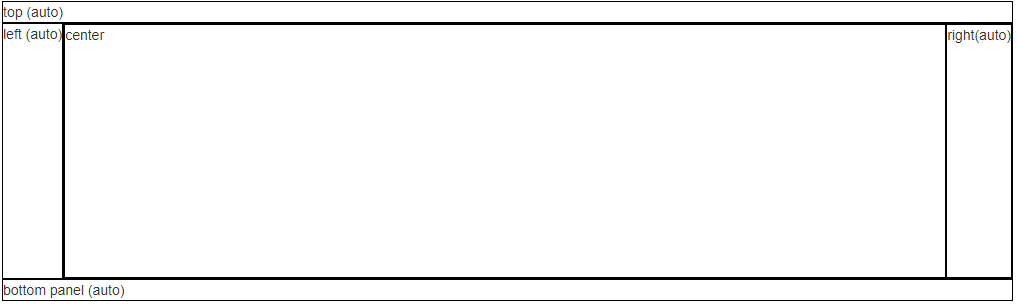
<div class="vertical-container fill-bottom" style="height:300px;">
    <div class="top-panel">
        top (auto)
    </div>
    <div class="bottom-panel">
        <!-- need fill height width -->
        <div class="vertical-container fill-top fill">
            <div class="top-panel">
                <div class="left-panel fill-height">
                    left (auto)
                </div>
                <div class="right-panel fill-height">
                    <div class="horizontal-container fill-left fill">
                        <div class="right-panel fill-height">
                            right(auto)
                        </div>
                        <div class="left-panel fill-height">
                            center
                        </div>
                    </div>
                </div>
            </div>
        </div>
        <div class="bottom-panel">
            bottom panel (auto)
        </div>
    </div>
</div>
.center-container
.center-horizontal

<div class="center-container center-horizontal" style="background: #EE91AD;  200px; height: 50px">
    <div class="center-panel">
        center item
    </div>
</div>
.center-vertical

<div class="center-container center-vertical" style="background: #EE91AD;  200px; height: 50px">
    <div class="center-panel">
        center item
    </div>
</div>
ver-hor center

<div class="center-container center-vertical" style="background: #EE91AD;  200px; height: 50px">
    <div class="center-panel">
        <div class="center-container center-horizontal">
            <div class="center-panel">
                <span>*</span> center item
            </div>
        </div>
    </div>
</div>
仿照葡萄城举例
正好看到别人举例的一个布局: http://www.cnblogs.com/powertoolsteam/p/combine-flexbox-and-css-grids-for-layouts.html
我们立刻用我们的方法实现了一下: 在线demo
关注我 ##
最后大家可以关注我和 css_layout项目 _
Follow @wz2cool Star Fork