一、添加meta
<meta name="viewport" content="width=device-width, user-scalable=no, initial-scale=1.0, maximum-scale=1.0, minimum-scale=1.0, viewport-fit=cover"/>
另外移动端还可以加上以下meta
<meta name="format-detection" content="telephone=no" />
<meta name="format-detection" content="email=no">
<meta name="x5-orientation" content="landscape">
<meta name="screen-orientation" content="landscape">
二、引入js


<script type="text/javascript">
      !function () { var a = "@charset "utf-8";html{color:#000;background:#fff;overflow-y:scroll;-webkit-text-size-adjust:100%;-ms-text-size-adjust:100%}html *{outline:0;-webkit-text-size-adjust:none;-webkit-tap-highlight-color:rgba(0,0,0,0)}html,body{font-family:sans-serif}body,div,dl,dt,dd,ul,ol,li,h1,h2,h3,h4,h5,h6,pre,code,form,fieldset,legend,input,textarea,p,blockquote,th,td,hr,button,article,aside,details,figcaption,figure,footer,header,hgroup,menu,nav,section{margin:0;padding:0}input,select,textarea{font-size:100%}table{border-collapse:collapse;border-spacing:0}fieldset,img{border:0}abbr,acronym{border:0;font-variant:normal}del{text-decoration:line-through}address,caption,cite,code,dfn,em,th,var{font-style:normal;font-weight:500}ol,ul{list-style:none}caption,th{text-align:left}h1,h2,h3,h4,h5,h6{font-size:100%;font-weight:500}q:before,q:after{content:''}sub,sup{font-size:75%;line-height:0;position:relative;vertical-align:baseline}sup{top:-.5em}sub{bottom:-.25em}a:hover{text-decoration:underline}ins,a{text-decoration:none}", b = document.createElement("style"); if (document.getElementsByTagName("head")[0].appendChild(b), b.styleSheet) b.styleSheet.disabled || (b.styleSheet.cssText = a); else try { b.innerHTML = a } catch (c) { b.innerText = a } }(); !function (a, b) { function c() { var b = f.getBoundingClientRect().width; b / i > 540 && (b = 540 * i); var c = b / 10; f.style.fontSize = c + "px", k.rem = a.rem = c } var d, e = a.document, f = e.documentElement, g = e.querySelector('meta[name="viewport"]'), h = e.querySelector('meta[name="flexible"]'), i = 0, j = 0, k = b.flexible || (b.flexible = {}); if (g) { console.warn("将根据已有的meta标签来设置缩放比例"); var l = g.getAttribute("content").match(/initial-scale=([d.]+)/); l && (j = parseFloat(l[1]), i = parseInt(1 / j)) } else if (h) { var m = h.getAttribute("content"); if (m) { var n = m.match(/initial-dpr=([d.]+)/), o = m.match(/maximum-dpr=([d.]+)/); n && (i = parseFloat(n[1]), j = parseFloat((1 / i).toFixed(2))), o && (i = parseFloat(o[1]), j = parseFloat((1 / i).toFixed(2))) } } if (!i && !j) { var p = (a.navigator.appVersion.match(/android/gi), a.navigator.appVersion.match(/iphone/gi)), q = a.devicePixelRatio; i = p ? q >= 3 && (!i || i >= 3) ? 3 : q >= 2 && (!i || i >= 2) ? 2 : 1 : 1, j = 1 / i } if (f.setAttribute("data-dpr", i), !g) if (g = e.createElement("meta"), g.setAttribute("name", "viewport"), g.setAttribute("content", "initial-scale=" + j + ", maximum-scale=" + j + ", minimum-scale=" + j + ", user-scalable=no"), f.firstElementChild) f.firstElementChild.appendChild(g); else { var r = e.createElement("div"); r.appendChild(g), e.write(r.innerHTML) } a.addEventListener("resize", function () { clearTimeout(d), d = setTimeout(c, 300) }, !1), a.addEventListener("pageshow", function (a) { a.persisted && (clearTimeout(d), d = setTimeout(c, 300)) }, !1), "complete" === e.readyState ? e.body.style.fontSize = 12 * i + "px" : e.addEventListener("DOMContentLoaded", function () { e.body.style.fontSize = 12 * i + "px" }, !1), c(), k.dpr = a.dpr = i, k.refreshRem = c, k.rem2px = function (a) { var b = parseFloat(a) * this.rem; return "string" == typeof a && a.match(/rem$/) && (b += "px"), b }, k.px2rem = function (a) { var b = parseFloat(a) / this.rem; return "string" == typeof a && a.match(/px$/) && (b += "rem"), b } }(window, window.lib || (window.lib = {}));
    </script>
<script>!function(t){"use strict";t.loadCSS||(t.loadCSS=function(){});var e=loadCSS.relpreload={};if(e.support=function(){var e;try{e=t.document.createElement("link").relList.supports("preload")}catch(t){e=!1}return function(){return e}}(),e.bindMediaToggle=function(t){function e(){t.media=a}var a=t.media||"all";t.addEventListener?t.addEventListener("load",e):t.attachEvent&&t.attachEvent("onload",e),setTimeout(function(){t.rel="stylesheet",t.media="only x"}),setTimeout(e,3e3)},e.poly=function(){if(!e.support())for(var a=t.document.getElementsByTagName("link"),n=0;n<a.length;n++){var o=a[n];"preload"!==o.rel||"style"!==o.getAttribute("as")||o.getAttribute("data-loadcss")||(o.setAttribute("data-loadcss",!0),e.bindMediaToggle(o))}},!e.support()){e.poly();var a=t.setInterval(e.poly,500);t.addEventListener?t.addEventListener("load",function(){e.poly(),t.clearInterval(a)}):t.attachEvent&&t.attachEvent("onload",function(){e.poly(),t.clearInterval(a)})}"undefined"!=typeof exports?exports.loadCSS=loadCSS:t.loadCSS=loadCSS}("undefined"!=typeof global?global:this);</script>
添加完后,你的项目html显示这样
此时,1rem等于37.5px
三、当设计稿是750的时候,也就是iphone6的屏幕分辨率(750px是iphone6的物理像素)
例子:当拿到设计稿100*200的矩阵,对于px其实是50*100,当配置了适配方案,为了省事,不用换算,(默认装好了less)
@rem-base: 75;
div{
   width: 100rem/@rem-base;
   height: 200rem/@rem-base;
}
这样,直接拿设计稿的尺寸就好了,完全不用我们换算,就可以实现移动端适配。
为了验证是不是50px*100px,我们计算一下:
width = 100 * 37.5 / 75 = 50
height = 200 *37.5 / 75 = 100
四、全局配置引入base.scss,这样可以直接使用里面的变量
安装sass-resources-loader:yarn add sass-resources-loader -D
vue.config.js增加配置:
module.exports = {
  publicPath: './',
  chainWebpack: config => {
    const oneOfsMap = config.module.rule('scss').oneOfs.store
    oneOfsMap.forEach(item => {
      item
        .use('sass-resources-loader')
        .loader('sass-resources-loader')
        .options({
            // 要公用的scss的路径
            resources: './src/common/scss/base.scss'
        })
        .end()
    })
  },
还有一种方案,需要使用amfe-flexible和postcss-pxtorem
一、安装amfe-flexible和postcss-pxtorem
yarn add amfe-flexible
yarn add postcss-pxtorem -D
二、main.js引入amfe-flexible

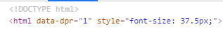
引入后,html标签显示这样

引入成功,既1rem = 37.5px(iphone6尺寸)
三、增加postcss-pxtorem配置
在package.json增加postcss设置
  "postcss": {
    "plugins": {
      "autoprefixer": {},
      "postcss-pxtorem": {
        "rootValue": 37.5,
        "propList": [
          "*"
        ]
      }
    }
  }
这里配置rootValue为37.5的话,就是1比1写法了。
比方写一个100px*200px的div,那么
div{
100px;height:100px;
}
就好了。会自己转化成rem适配,注意需要重启项目!!!
以上,over,谢谢阅读。