网格布局
jquery mobile提供一种多列布局功能,由于移动设备的屏幕大小原因,一般情况还是不要使用多列布局啦。
jquery mobile提供一种css样式规则来定义多列布局,对应css为ui-block,每列的样式是通过定义前缀+“-a”等方式对网格的列进行布局,a字母根据网格的列数而定。
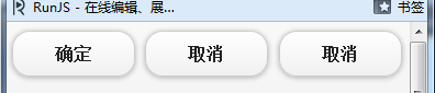
例如两列布局CSS为:ui-block-a与ui-block-b
<!DOCTYPE html>
<html xmlns="http://www.w3.org/1999/xhtml">
<head>
    <title></title>
    <meta name="viewport" content="width=device-width, initial-scale=1">
    <link id="jquerymobile_120" rel="stylesheet" type="text/css" class="library"
    href="/js/sandbox/jquery-mobile/jquery.mobile-1.2.0/jquery.mobile-1.2.0.css">
    <script id="jquery_182" type="text/javascript" class="library"
    src="/js/sandbox/jquery/jquery-1.8.2.min.js"></script>
    <script id="jquerymobile_120" type="text/javascript" class="library"
    src="/js/sandbox/jquery-mobile/jquery.mobile-1.2.0/jquery.mobile-1.2.0.min.js"></script>
</head>
<body>
    <div class="ui-grid-a">
        <div class="ui-block-a">
            <input type="button" value="确定" />
        </div>
        <div class="ui-block-b">
            <input type="button" value="取消" />
        </div>
    </div>
</body>
</html>

我们看见了他这些都是使用float布局的。
两列布局,需要指定外层div样式是ui-grid-a,ui-grid-a样式用于指定行列采用两列布局样式。
以上两个按钮各占屏幕的50%,采用data-line属性对按钮进行水平排列,按钮宽度根据实际文本而定。
ui-grid-a 两列
ui-grid-b 三列
ui-grid-c 四列
ui-grid-d 五列
我们来看一个三列网格布局:
<!DOCTYPE html>
<html xmlns="http://www.w3.org/1999/xhtml">
<head>
    <title></title>
    <meta name="viewport" content="width=device-width, initial-scale=1">
    <link id="jquerymobile_120" rel="stylesheet" type="text/css" class="library"
    href="/js/sandbox/jquery-mobile/jquery.mobile-1.2.0/jquery.mobile-1.2.0.css">
    <script id="jquery_182" type="text/javascript" class="library"
    src="/js/sandbox/jquery/jquery-1.8.2.min.js"></script>
    <script id="jquerymobile_120" type="text/javascript" class="library"
    src="/js/sandbox/jquery-mobile/jquery.mobile-1.2.0/jquery.mobile-1.2.0.min.js"></script>
</head>
<body>
    <div class="ui-grid-b">
        <div class="ui-block-a">
            <input type="button" value="确定" />
        </div>
        <div class="ui-block-b">
            <input type="button" value="取消" />
        </div>
        <div class="ui-block-c">
            <input type="button" value="取消" />
        </div>
    </div>
</body>
</html>
折叠功能
折叠块是移动端经常用到的效果,只要使用jquery mobile约定的编码规则并且利用HTML5的dataset特性,程序就能生成折叠快了。
其中data-role设置为collapsible,便可以创建一个可折叠的内容区,来个例子吧:
<!DOCTYPE html>
<html xmlns="http://www.w3.org/1999/xhtml">
<head>
    <title></title>
    <meta name="viewport" content="width=device-width, initial-scale=1">
    <link id="jquerymobile_120" rel="stylesheet" type="text/css" class="library"
    href="/js/sandbox/jquery-mobile/jquery.mobile-1.2.0/jquery.mobile-1.2.0.css">
    <script id="jquery_182" type="text/javascript" class="library"
    src="/js/sandbox/jquery/jquery-1.8.2.min.js"></script>
    <script id="jquerymobile_120" type="text/javascript" class="library"
    src="/js/sandbox/jquery-mobile/jquery.mobile-1.2.0/jquery.mobile-1.2.0.min.js"></script>
</head>
<body>
  <div data-role="collapsible">
    <h3>可折叠区域</h3>
    <p>刀狂剑痴叶小钗刀狂剑痴叶小钗刀狂剑痴叶小钗刀狂剑痴叶小钗刀狂剑痴叶小钗刀狂剑痴叶小钗</p>
  </div>
</body>
</html>

我们手机上的form表单其实都很漂亮了,但是我们的jquery mobile还是给他渲染了下下,是非常不错的。
我们来一个例子看看:form表单
<!DOCTYPE html>
<html xmlns="http://www.w3.org/1999/xhtml">
<head>
    <title></title>
    <meta name="viewport" content="width=device-width, initial-scale=1">
    <link id="jquerymobile_120" rel="stylesheet" type="text/css" class="library"
    href="/js/sandbox/jquery-mobile/jquery.mobile-1.2.0/jquery.mobile-1.2.0.css">
    <script id="jquery_182" type="text/javascript" class="library"
    src="/js/sandbox/jquery/jquery-1.8.2.min.js"></script>
    <script id="jquerymobile_120" type="text/javascript" class="library"
    src="/js/sandbox/jquery-mobile/jquery.mobile-1.2.0/jquery.mobile-1.2.0.min.js"></script>
</head>
<body>
    <label for="name">
        姓名</label>
    <input type="text" name="name" id="name" />
    <label for="password">
        密码</label>
    <input type="password" name="password" id="password" />
    <label for="content">
        密码</label>
    <textarea name="content" id="content"></textarea>
    <label for="number">
        年龄</label>
    <input type="number" name="number" id="number" />
    <label for="tel">
        手机</label>
    <input type="tel" name="tel" id="tel" />
    <label for="tel">
        email</label>
    <input type="email" name="email" id="email" />
    <label for="tel">
        url</label>
    <input type="url" name="url" id="url" />
    <label for="search">
        搜索</label>
    <input type="search" name="search" id="search" />
</body>
</html>

我这里喷一下《HTML5移动Web开发指南》这本书!
唐骏开写的,这家伙写的这本书不行,书中很多例子有问题。
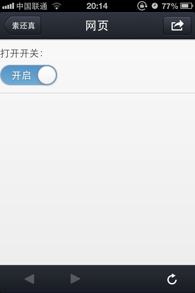
Toggle类型
<!DOCTYPE html>
<html xmlns="http://www.w3.org/1999/xhtml">
<head>
    <title></title>
    <meta name="viewport" content="width=device-width, initial-scale=1">
    <link id="jquerymobile_120" rel="stylesheet" type="text/css" class="library"
    href="/js/sandbox/jquery-mobile/jquery.mobile-1.2.0/jquery.mobile-1.2.0.css">
    <script id="jquery_182" type="text/javascript" class="library"
    src="/js/sandbox/jquery/jquery-1.8.2.min.js"></script>
    <script id="jquerymobile_120" type="text/javascript" class="library"
    src="/js/sandbox/jquery-mobile/jquery.mobile-1.2.0/jquery.mobile-1.2.0.min.js"></script>
</head>
<body>
    <div data-role="fieldcontain">
        <label for="slider">
            打开开关:</label>
        <select name="slider" id="slider" data-role="slider">
            <option value="off">关闭</option>
            <option value="on">开启</option>
        </select>
    </div>
</body>
</html>
单选按钮类型
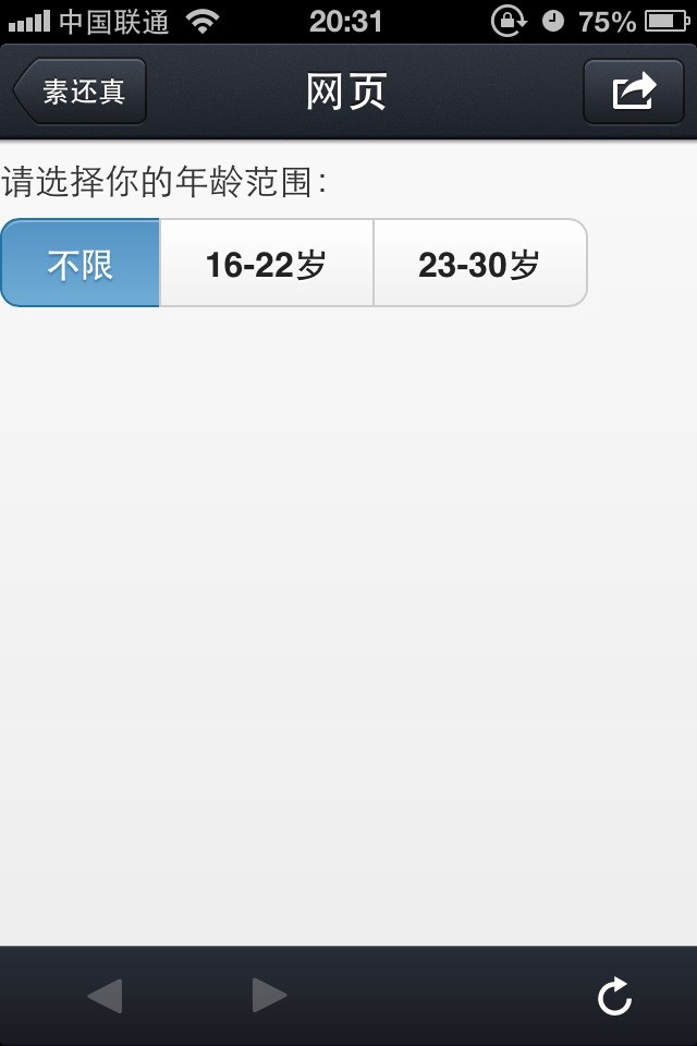
我们要创建一组单选按钮需要这样做:
<!DOCTYPE html>
<html xmlns="http://www.w3.org/1999/xhtml">
<head>
    <title></title>
    <meta name="viewport" content="width=device-width, initial-scale=1">
    <link id="jquerymobile_120" rel="stylesheet" type="text/css" class="library"
    href="/js/sandbox/jquery-mobile/jquery.mobile-1.2.0/jquery.mobile-1.2.0.css">
    <script id="jquery_182" type="text/javascript" class="library"
    src="/js/sandbox/jquery/jquery-1.8.2.min.js"></script>
    <script id="jquerymobile_120" type="text/javascript" class="library"
    src="/js/sandbox/jquery-mobile/jquery.mobile-1.2.0/jquery.mobile-1.2.0.min.js"></script>
</head>
<body>
    <fieldset data-role="controlgroup">
        <legend>请选择你的年龄范围:</legend>
        <input type="radio" name="radio1" id="radio1" value="any" checked="checked" />
        <label for="radio1">
            不限</label>
        <input type="radio" name="radio1" id="radio2" value="16-22" />
        <label for="radio2">
            16-22岁</label>
        <input type="radio" name="radio1" id="radio3" value="23-30" />
        <label for="radio3">
            23-30岁</label>
        <input type="radio" name="radio1" id="radio4" value="31-40" />
        <label for="radio4">
            31-40岁</label>
        <input type="radio" name="radio1" id="radio5" value="40" />
        <label for="radio5">
            40岁以上</label>
    </fieldset>
</body>
</html>

我们看到,他还是挺好看的哈。。。
我们先是竖排,我们设置一个横排的单选按钮看看:
<!DOCTYPE html>
<html xmlns="http://www.w3.org/1999/xhtml">
<head>
    <title></title>
    <meta name="viewport" content="width=device-width, initial-scale=1">
    <link id="jquerymobile_120" rel="stylesheet" type="text/css" class="library"
    href="/js/sandbox/jquery-mobile/jquery.mobile-1.2.0/jquery.mobile-1.2.0.css">
    <script id="jquery_182" type="text/javascript" class="library"
    src="/js/sandbox/jquery/jquery-1.8.2.min.js"></script>
    <script id="jquerymobile_120" type="text/javascript" class="library"
    src="/js/sandbox/jquery-mobile/jquery.mobile-1.2.0/jquery.mobile-1.2.0.min.js"></script>
</head>
<body>
    <fieldset data-role="controlgroup" data-type="horizontal">
        <legend>请选择你的年龄范围:</legend>
        <input type="radio" name="radio1" id="radio1" value="any" checked="checked" />
        <label for="radio1">
            不限</label>
        <input type="radio" name="radio1" id="radio2" value="16-22" />
        <label for="radio2">
            16-22岁</label>
        <input type="radio" name="radio1" id="radio3" value="23-30" />
        <label for="radio3">
            23-30岁</label>
    </fieldset>
</body>
</html>
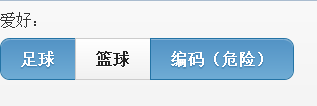
复选框
单选完了我们来看看复选框:
<!DOCTYPE html>
<html xmlns="http://www.w3.org/1999/xhtml">
<head>
    <title></title>
    <meta name="viewport" content="width=device-width, initial-scale=1">
    <link id="jquerymobile_120" rel="stylesheet" type="text/css" class="library"
    href="/js/sandbox/jquery-mobile/jquery.mobile-1.2.0/jquery.mobile-1.2.0.css">
    <script id="jquery_182" type="text/javascript" class="library"
    src="/js/sandbox/jquery/jquery-1.8.2.min.js"></script>
    <script id="jquerymobile_120" type="text/javascript" class="library"
    src="/js/sandbox/jquery-mobile/jquery.mobile-1.2.0/jquery.mobile-1.2.0.min.js"></script>
</head>
<body>
    <fieldset data-role="controlgroup" data-type="horizontal">
        <legend>爱好:</legend>
        <input type="checkbox" name="radio1" id="radio1" value="any" checked="checked" />
        <label for="radio1">
            足球</label>
        <input type="checkbox" name="radio1" id="radio2" value="16-22" />
        <label for="radio2">
           篮球</label>
        <input type="checkbox" name="radio1" id="radio3" value="23-30" />
        <label for="radio3">
            编码(危险)</label>
    </fieldset>
</body>
</html>
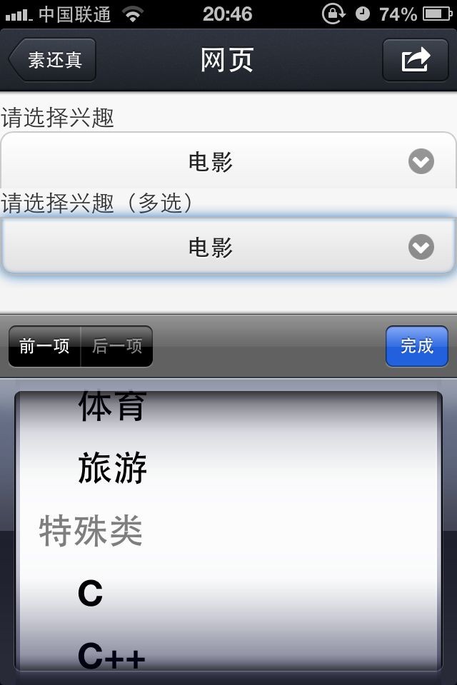
下拉菜单
<!DOCTYPE html>
<html xmlns="http://www.w3.org/1999/xhtml">
<head>
    <title></title>
    <meta name="viewport" content="width=device-width, initial-scale=1">
    <link id="jquerymobile_120" rel="stylesheet" type="text/css" class="library"
    href="/js/sandbox/jquery-mobile/jquery.mobile-1.2.0/jquery.mobile-1.2.0.css">
    <script id="jquery_182" type="text/javascript" class="library"
    src="/js/sandbox/jquery/jquery-1.8.2.min.js"></script>
    <script id="jquerymobile_120" type="text/javascript" class="library"
    src="/js/sandbox/jquery-mobile/jquery.mobile-1.2.0/jquery.mobile-1.2.0.min.js"></script>
</head>
<body>
    <div data-role="controlgroup">
        <label class="select">
            请选择兴趣
            <select>
                <option>电影</option>
                <option>体育</option>
                <option>旅游</option>
            </select>
        </label>

        <label class="select">
            请选择兴趣(多选)
            <select>
                <optgroup label="一般类">
                    <option>电影</option>
                    <option>体育</option>
                    <option>旅游</option>
                </optgroup>
                <optgroup label="特殊类">
                    <option>C</option>
                    <option>C++</option>
                    <option>Java</option>
                </optgroup>
            </select>
        </label>
    </div>
</body>
</html>
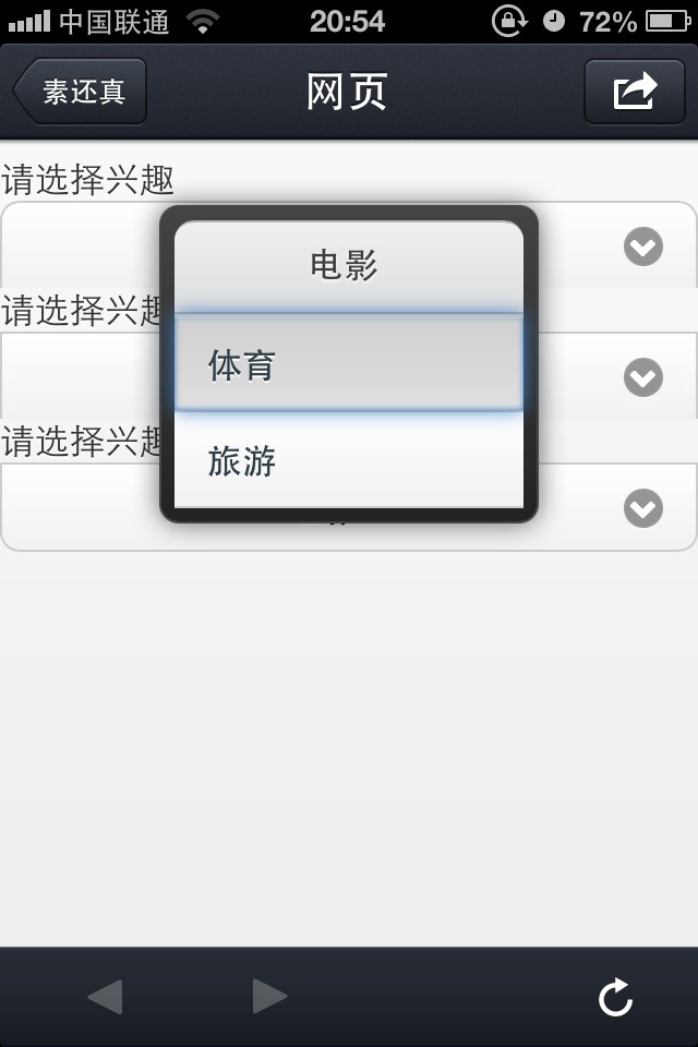
我们这里做一点改变,样式会发生变化:
<!DOCTYPE html>
<html xmlns="http://www.w3.org/1999/xhtml">
<head>
    <title></title>
    <meta name="viewport" content="width=device-width, initial-scale=1">
    <link id="jquerymobile_120" rel="stylesheet" type="text/css" class="library"
    href="/js/sandbox/jquery-mobile/jquery.mobile-1.2.0/jquery.mobile-1.2.0.css">
    <script id="jquery_182" type="text/javascript" class="library"
    src="/js/sandbox/jquery/jquery-1.8.2.min.js"></script>
    <script id="jquerymobile_120" type="text/javascript" class="library"
    src="/js/sandbox/jquery-mobile/jquery.mobile-1.2.0/jquery.mobile-1.2.0.min.js"></script>
</head>
<body>
    <div data-role="controlgroup">
      <label class="select">
            请选择兴趣
            <select data-native-menu="false">
                <option>电影</option>
                <option>体育</option>
                <option>旅游</option>
            </select>
        </label>

        <label class="select">
            请选择兴趣
            <select>
                <option>电影</option>
                <option>体育</option>
                <option>旅游</option>
            </select>
        </label>

        <label class="select">
            请选择兴趣(多选)
            <select>
                <optgroup label="一般类">
                    <option>电影</option>
                    <option>体育</option>
                    <option>旅游</option>
                </optgroup>
                <optgroup label="特殊类">
                    <option>C</option>
                    <option>C++</option>
                    <option>Java</option>
                </optgroup>
            </select>
        </label>
    </div>
</body>
</html>
今天篇幅够长了,我们下一篇再继续吧。