1、我们将5张图片又前后各增加一张,第一张前增加的是原本的第五张,第五张后增加的是原本的第一张,增加的原因无非是手指滑动的时候有轮播效果,这不像以前的轮播图,点击图标就能立刻将ul跳转到指定位置,手机滑动不行
2、当我们手指从第一张向右边方向滑动时,会出现第五张图片,在这个滑动效果结束之后我们跳转到倒数第二张,其实也是第五张;当我们手指从倒数第二张图片向左滑动时,会出现第一张,等这个滑动效果结束之后我们跳转到第二张图片,其实也是第一张图;这里我们必须借助transitionEnd事件
3、手指的滑动的动漫效果的transition事件最好小于定时器图片中的transition时间
4、保险起见,在手指滑动时,需要校验index值,以触发滑动事件的target来进行判断
5、为了在手指滑动的时候立刻响应,小图标在滑动的时候会根据变化了的index值立刻变化
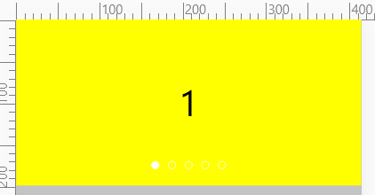
<!DOCTYPE html>
<html lang="en">
<head>
    <meta charset="UTF-8">
    <meta name="viewport" content="width=device-width, initial-scale=1.0">
    <title>Title</title>
    <style>
        * {
            padding: 0;
            margin: 0;
            box-sizing: border-box;
        }

        .clearfix::before, .clearfix::after {
            content: '';
            display: block;
            height: 0;
            line-height: 0;
            visibility: hidden;
            clear: both;
        }

        html, body {
            width: 100%;
            height: 100%;
            background-color: #c3c3c3;
        }

        .banner {
            width: 100%;
            position: relative;
            overflow: hidden;
        }

        .banner ul:nth-child(1) {
            list-style: none;
            width: 700%;
            transform: translateX(-14.28571%);
        }

        .banner ul:nth-child(1) li {
            float: left;
            width: 14.28571%;
            height: 200px;
        }

        .banner ul:nth-child(1) li a {
            width: 100%;
            height: 100%;
            text-decoration: none;
        }

        .banner ul:nth-child(1) li div {
            width: 100%;
            height: 100%;
            text-align: center;
            line-height: 200px;
            font-size: 40px;
            color: black;
        }

        .banner ul:nth-child(2) {
            list-style: none;
            position: absolute;
            bottom: 20px;
            left: 50%;
            margin-left: -55px;
        }

        .banner ul:nth-child(2) li {
            float: left;
            width: 10px;
            height: 10px;
            border-radius: 50%;
            border: 1px solid #fff;
            margin-left: 10px;
        }

        .yellow {
            background-color: yellow;
        }

        .pink {
            background-color: pink;
        }

        .current {
            background-color: #fff;
        }

        .blue {
            background-color: blue;
        }
    </style>
</head>
<body>
<div class="banner">
    <ul class="clearfix">
        <li>
            <a href="#">
                <div class="pink" biao=5>5-</div>
            </a>
        </li>
        <li>
            <a href="#">
                <div class="yellow" biao=1>1</div>
            </a>
        </li>
        <li>
            <a href="#">
                <div class="pink" biao=2>2</div>
            </a>
        </li>
        <li>
            <a href="#">
                <div class="yellow" biao=3>3</div>
            </a>
        </li>
        <li>
            <a href="#">
                <div class="blue" biao=4>4</div>
            </a>
        </li>
        <li>
            <a href="#">
                <div class="pink" biao=5>5</div>
            </a>
        </li>
        <li>
            <a href="#">
                <div class="yellow" biao=1>1-</div>
            </a>
        </li>
    </ul>
    <ul>
        <li class="current"></li>
        <li></li>
        <li></li>
        <li></li>
        <li></li>
    </ul>
</div>
<script>
    var banner = document.querySelector('.banner');
    var moveWidth = banner.offsetWidth;
    var ulLunBo = banner.querySelector('ul:nth-child(1)');
    var circleArr = banner.querySelectorAll('ul:nth-child(2) li');
    var moveDistance = 0;
    var index = 0;
    function animation() {
        ulLunBo.style.transition = 'all .6s';
        index++;
        moveDistance = -moveWidth * index;
        ulLunBo.style.transform = 'translateX(' + moveDistance + 'px)';
        console.log(index + '==' + moveDistance);

        //小圆点根据index发生变化

        for (var i = 0; i < circleArr.length; i++) {
            circleArr[i].className = '';
        }
        if (index > 5) {
            circleArr[0].className = 'current';
            return;
        }
        if (index < 1) {
            circleArr[5].className = 'current';
            return;
        }
        circleArr[index - 1].className = 'current';
    }

    var timer = setInterval(animation, 1000);
    ulLunBo.addEventListener('webkitTransitionEnd', function () {
        if (index > 5) {
            index = 1;
        } else if (index < 1) {
            index = 5;
        }
        circleArr[index - 1].className = 'current';
        ulLunBo.style.transition = '';
        moveDistance = -moveWidth * index;
        ulLunBo.style.transform = 'translateX(' + moveDistance + 'px)';
    });

    var startX = 0;
    var moveX = 0;
    var distance = 0;
    var freeMove = 0;
    ulLunBo.addEventListener('touchstart', function (e) {
        clearInterval(timer);
        distance = moveDistance;
        ulLunBo.style.transition = '';
        startX = e.touches[0].clientX;
    })
    ulLunBo.addEventListener('touchmove', function (e) {
        moveX = e.touches[0].clientX - startX;
        freeMove = distance + moveX;
        ulLunBo.style.transform = 'translateX(' + freeMove + 'px)';
    })
    //吸附效果是重点
    //1、当自由移动距离freeMove的绝对值与清除定时器前的moveDistance的绝对值进行比较的cha值进行判断
    //2、cha值小于moveWidth的一半在touchend的事件中需要归位到moveDistance的位置
    //3、cha值大于moveWidth的一半在touchend的事件中需要根据cha值的正负情况向左或者向右前进1个moveWidth
    //4、根据第三步,我们还需要将index的值进行改变,因为我们最终移动了ulLunBo的位置
    var triggerValue = null;
    ulLunBo.addEventListener('touchend', function (e) {
            ulLunBo.style.transition = 'all .3s';
            triggerValue = e.target.getAttribute('biao');
            var cha = Math.abs(freeMove) - Math.abs(moveDistance);
            if (cha >= moveWidth / 2) {
                //左边移动距离大于宽度的一半
                moveDistance -= moveWidth;
                index = parseInt(triggerValue) + 1;
            } else if (cha <= (-moveWidth / 2)) {
                //右边移动距离大于宽度的一半
                moveDistance += moveWidth;
                index = parseInt(triggerValue) - 1;
            } else {
                //向左向右移动距离小于宽度的一半
                moveDistance = moveDistance;
            }
            if (index > 5) {
                index = 1;
            } else if (index < 1) {
                index = 5;
            }
            for (var i = 0; i < circleArr.length; i++) {
                circleArr[i].className = '';
            }
            circleArr[index - 1].className = 'current';
            ulLunBo.style.transform = 'translateX(' + moveDistance + 'px)';
            timer = setInterval(animation, 1000);
        }
    );
</script>
</body>
</html>