1、子图设置
#在一个figure对象中添加一个子图
seaborn.pointplot(x=ccss.time, y=ccss.index1, capsize=.1)
fig = plt.gcf()
fig.add_axes([0, 0.2, 1, 0.2])
seaborn.distplot(ccss.index1, kde=False)
参数说明:matplotlib.figure.Figure.add-axes(
rect :代表插入子图对象大小的序列。[left, bottom, width, height]
projection :子图使用的坐标体系。['aitoff' 1 'hammer' | 'lambert' 1 'mollweide' I 'polar' 1 rectilinear']
polar : boolean,为True时等价于projection ='polar'

# 数组方式指定子图,subplot(224)表示2乘以2的网格的第4张图
fi ,axes=plt.subplots(2,2)
seaborn.boxenplot(y=ccss.index1,ax=axes[0,0])
plt.subplot(224)
plt.plot([11,8,5,2])
plt.show()
参数说明:matplotlib.pyplot.subplots(
nrows /ncols =1:图形网格的行/列数
sharex, sharey = False :在图组中是否共用行/列坐标轴
True or 'all':对应的单元格都将共用行/列坐标轴
False or 'none':各单元格独立设定行/列坐标轴'
row:同一行的单元格将共用行/列坐标轴、
col:同一列的单元格将共用行/列坐标轴
squeeze = True :是否尽量简化返回的Axes对象False时即使只有一个单元格,也返回二维数组
subplotkw : dict,未来调用add-subplot ()建立子图时需要传送的参数)

2、网格设置
fig, axes = plt.subplots(1, 2, sharey=True)
# 进一步的细节设定,top总高度的70%,wspace间距宽
plt.subplots_adjust(top=0.7, wspace=0.1)
seaborn.boxplot(y=ccss.index1a, ax=axes[0])
seaborn.boxplot(y=ccss.index1b, ax=axes[1])
# 文字的位置,xy表示位置,annotation_clip=Flase注解不要在背景框,size字体大小
plt.annotate('现状指数和预期指数的对比', xy=(0, 200), annotation_clip=False, size=16)
plt.show()
参数说明:matplotlib.pyplot.subplots_adjust(
left = 0.125 # the left side of the subplots of the figure
right =0.9 # the right side of the subplots of the fiqure
bottom = 0.1 # the bottom of the subplots of the fiqure
top = 9.9 # the top of the subplots of the fiqure
wspace = 0.2 # the amount of width reserved between subplots,
# as a fraction of the average axis wi.dth
hspace = 0.2 # the amount of height reserved between subplots.
# as a fraction of the average axis height

ax1 = plt.subplot2grid((4, 4), (0, 0), colspan=10)
ax2 = plt.subplot2grid((4, 4), (1, 1), rowspan=10)
plt.show()
参数说明:matplotlib.gridspec.GridSpec(
nrows/ncols :网格的行/列数
figure :指定网格将被放置的Figure对象
left/bottom/right/top :网格四边所对应的图形长宽比例
wspace/hspace :周边留空大小
width_ratios/height_ratios :各行/列的大小比例)
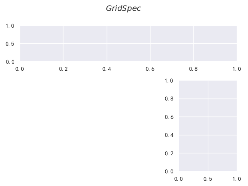
import matplotlib.gridspec as gridspec
# 整个图width_ratios宽比值为1:2,
gs = gridspec.GridSpec(2, 2, width_ratios=[1, 2], height_ratios=[4, 1])
ax11 = plt.subplot(gs[0])
ax21 = plt.subplot(gs[1])
ax3 = plt.subplot(gs[2])
plt.show()
参数说明:matplotlib.gridspec.GridSpec(
nrows/ncols :网格的行/列数
figure :指定网格将被放置的Figure对象
left/bottom/right/top :网格四边所对应的图形长宽比例
wspace/hspace :周边留空大小
width_ratios/height_ratios :各行/列的大小比例)

3、色彩设置
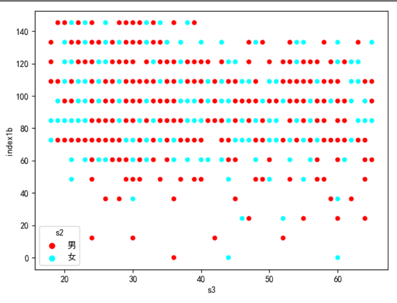
# 调用色板,直接使用英文
seaborn.scatterplot(ccss.s3,ccss.index1b,hue=ccss.s2,palette=["red",'blue'])
# 调用色板,使用RGB代码
seaborn.scatterplot(ccss.s3,ccss.index1b,hue=ccss.s2,palette=[(1,0,0),(0,1,1)])
# 调用色板,使用HTML代码
seaborn.scatterplot(ccss.s3,ccss.index1b,hue=ccss.s2,palette=["#ff0000",'#0000ff'])
# 分类色板 ,查看当前的色板
seaborn.palplot(seaborn.color_palette())
# 调节亮度、s调节饱和度
seaborn.palplot(seaborn.hls_palette(10,l=.8,s=.4))
参数说明:seaborn.color palette(
palette -None :希望使用的色板名称或者色彩序列, None时返回当前色板None, string, or sequence
n_colors : int, 色板中需要使用的颜色数量
desat : float,色彩饱和度)
![]()
4、样式设置
seaborn.set(context='poster',style='white',palette='dark')
参数说明:seaborn.set(
context = 'notebook', 设定plotting-context ()的有关参数
paper :纸质出版物常用大小
notebook :电脑屏幕常用大小,默认值
talk:公众演讲时常用大小
poster :展板常用大小
style ='darkgrid' :设定预设的主题,即axes-style ()的有关参数
palette = 'deep' : 即color-palette ()的有关参数
font ='sans-serif' :设定希望使用的字体
fontscale =1 :设定对字体的附加放大倍数
color_codes = True :为True时,使用seaborn的调色板字符设定
5、坐标轴设置
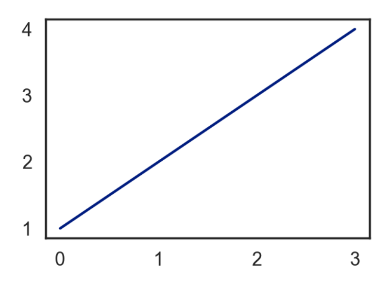
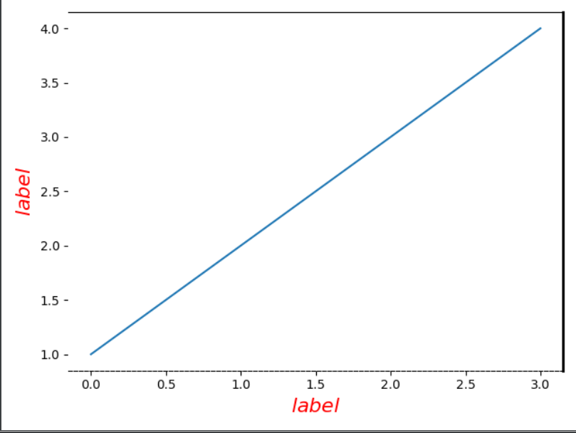
# 设置边框
plt.plot([1,2,3,4])
# 设置边框颜色
plt.gca().spines['left'].set_color('w')
# 设置边框线宽
plt.gca().spines['right'].set_lw(2)
# 设置线型
plt.gca().spines['bottom'].set_ls('--')
# 设置坐标轴标签,x轴 family:字体,weight:字体形式,size:字体大小
plt.xlabel('$label$',fontdict={'family':'serif',
           'color':'red','weight':'normal','size':16})
plt.ylabel('$label$',fontdict={'family':'serif',
           'color':'red','weight':'normal','size':16})
plt.show()
# x、y轴的刻度范围
plt.xlim(0,10)
plt.ylim(0,10)

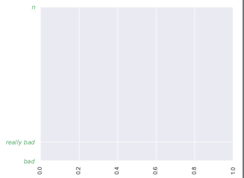
# 设置旋转方向为垂直的
plt.xticks(rotation='vertical')
# 在刻度尺上标上字符
plt.yticks([-2,-3,5],['$really bad$','$bad$','$n alpha $'], color='g')
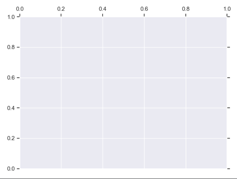
# 设置刻度的位置,top,bottom,both,default,none
plt.gca().xaxis.set_ticks_position('top')
plt.gca().yaxis.set_ticks_position('both')
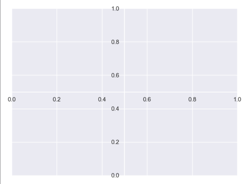
# 移动坐标轴位置
ax =plt.gca()
# x轴在0.5的位置
ax.spines['bottom'].set_position(('data',0.5))
ax.spines['left'].set_position(('data',0.5))
# 把左右设置为空白不显示
ax.spines['right'].set_color ('None')
ax.spines['top'].set_color  ('None')
移除外框:seaborn.despine()
参数说明:seaborn.despine(
fig = None,
ax = None,
top = True, right = True, left = False, bottom = False是否移 对应位置的spine (框架线)
offset = None : int or dict,希望将框线移动的绝对距离 -10 or {'left':-10}
trim = False :是否将框线限制在数轴的最大和最小值范围之内)
6、文字设置
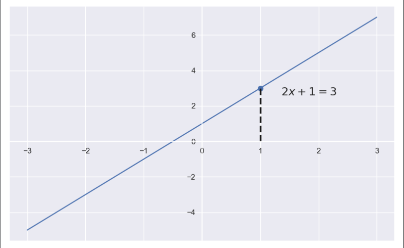
# 使用注解
import numpy as np
x = np.linspace(-3,3,50)
y = 2*x+1
plt.figure(num=1,figsize=(8,5))
plt.plot(x,y)
ax = plt.gca()
seaborn.despine()
ax.spines['bottom'].set_position(('data',0))
ax.spines['left'].set_position(('data',0))
# 绘制垂直线
plt.plot([1,1],[0,3],'k--',linewidth=2.5)
# 绘制一个点
plt.scatter([1],[3],s=50,color = 'b')
plt.annotate('$2x+1=3$',xy=(1,3),xycoords='data',xytext=(+30,-10),textcoords='offset points',fontsize =16)
plt.show()
参数说明:matplotlib.pyplot.annotate(
text:注解字符串。
xy:注解所对应的坐标点位置,
(x, y)格式。xytext :注解文字的起始点坐标位置,缺省时使用xy的值。
xycoords : xy坐标位置的起始坐标基准。
'figure points'/'figure pixels' Fig左下角起按points/pixelsi算。
'figure fraction' Figure左下角起按百分比计算。
'axes points'/'axes pixelstAxes左下角起按points/pixelsi算。
'axes fractiont'Axes左下角起按百分比计算。
'data' default,使用数据绘图时所用的坐标系。
'polar'(theta,r),极坐标格式。
textcoords : xytext坐标位置的起始坐标基准,缺省时使用xy的值。'offset points'/'offset pixelst基于xy值偏离points/pixels
arrowprops : dict,从xytext指向xy位置的箭头格式。不使用'arrowstyle'关键字时的设定方式:
width 箭头身体宽度, points
headwidth 箭头头部宽度, points
headlength 头部长度,
pointsshrink 箭头两端"回缩"的长度比例
annotation_clip :为True时,只有当坐标位于Axes内时才绘制注解。
# 添加文字,rotation旋转30度
plt.text(0.6,0.5,'$The tag 1$',size= 50,rotation =30,ha ='center',va ='center',bbox =dict(boxstyle= 'round',ec =(1,0.5,0.5),fc =(1,0.8,0.8)))

7、图例设置
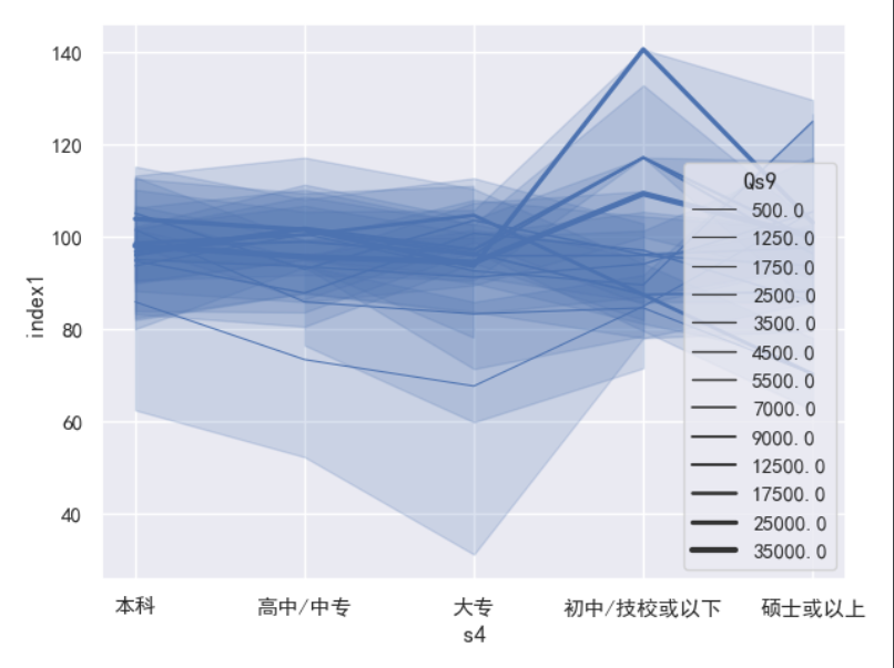
# seborn,显示完整的图例legend="full"
seaborn.lineplot("s4","index1",data=ccss,size="Qs9",legend="full")
plt.show()
参数说明:matplotlib.pyplot.legend(
handles :需要设置图例标签的图形元素列表
labels :相应图形元素的图例标签文字列表
loc = 'upper right' :图例的显示位置, int/string
'best' 0;'upper right' 1;'upper left' 2;'lower left' 3;'lower right' 4;'right' 5;'center left' 6;'center right'7;'lower center'8;'upper center'9;'center' 10
也可以按照2-tuple格式直接指定从左下角起的(x, y)坐标值
legend () #显示图例
legend (labels) #按默认元素顺序设定标签并显示图例
legend (handles, labels) #设定指定元素的标签并显示图例
8、双轴设置
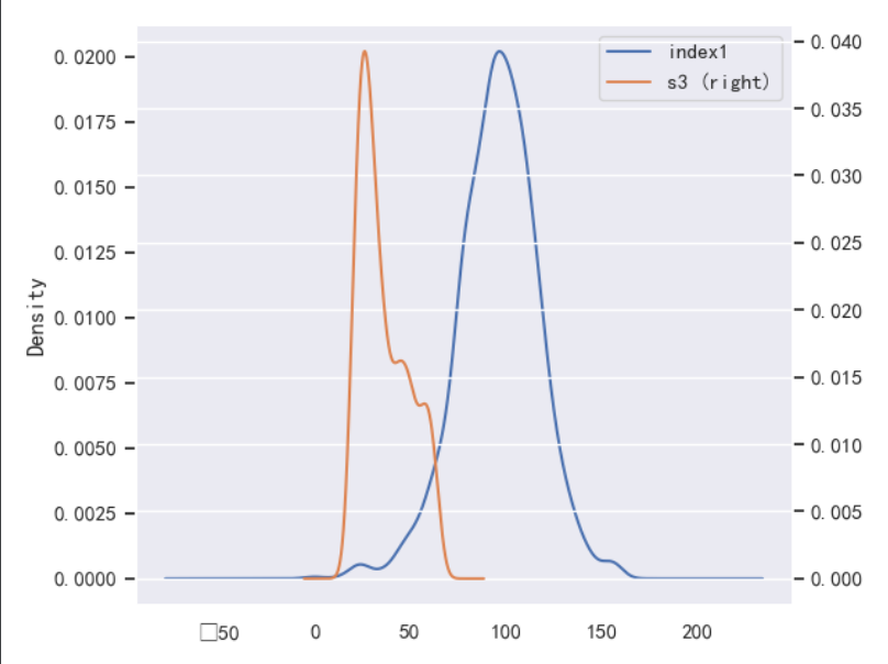
# 用pandas实现
ccss.plot.kde(y="index1",secondary_y=True)
# 设置第二y轴
ax2 = plt.gca().twinx()
seaborn.kdeplot(ccss.s3,legend=None,ax=ax2)
ax2.set_ylabel('$s2$')
9、行列面板设置
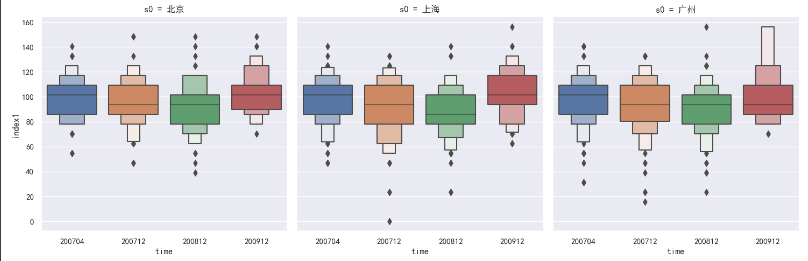
seaborn.catplot(x="time",y='index1',col='s0',data=ccss,kind='boxen')
参数说明:seaborn.catplot(
#0.9.0版之前为factorplot
x, y, hue : names of variables in data
data: DataFrame1
面板相关设定:
row, col:行/列面板对象名称
col_wrap:在指定的宽度折叠列面板至下一行,从而成为多行显示
row_order, col_order :行/列面板变量各类别的显示顺序
legend = True: bool, optional
legend_out = True :将图例绘制在设定的图形区域外
share{x,y} :是否共用行/列
kind :可以绘制的图形种类"point", "bar", "strip", "swarm", "box", "violin", or "boxen"
其余设定:
estimator :希望在每个类别中计算的统计量
ci: float or "sd" or None,希望绘制的可信区间宽度
n_boot :计算cI时的bootstrap抽样次数
units :用于确定抽样单元大小的变量
order, hue order: lists of strings, optional
size : scalar, optionalaspect: scalar, optional
orient: "y" 1 "h", optional
color: matplotlib color, optional
10、图形颜色填充
plt.fill_between([1, 2, 3, 4, 5], [5, 4, 3, 2, 1], [1, 3, 1, 3, 1], color='r')
fill = plt.fill([3, 1, 3, 1, 3], [1, 2, 3, 4, 5])
# 关掉所有的轴
plt.axis('off')
参数说明:matplotlib.pyplot.fill_between(
x :曲线的x坐标, array (length N)
y1:第一条曲线的y坐标, array (length N)
y2=0:第二条曲线的y坐标, array (length N)
where = None :绘制时是否包括所对应的区域, array of bool (length N)
interpolate = False :当使用where参数并且两曲线有交叉时有效当两条曲线比较接近时,要求计算精确的交叉位置并加以绘制
step :当各x的数值之间y应当是常数时,确定具体的常数取值方式
"pre": y值恒等于左侧的上一个x, y数据对应的y值
"post": y值恒等于右侧的下一个x, y数据对应的y值
"mid":取两侧y值的平均)