满屏的宽高布局,如果不用js话实现真的是太难了,今天做一个比较接近的样子记录一下,希望对那些还在苦苦追寻的人们有所帮助。
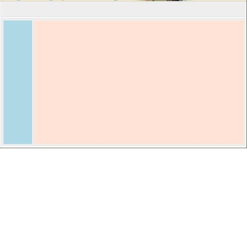
<!DOCTYPE html PUBLIC "-//W3C//DTD XHTML 1.0 Transitional//EN" "http://www.w3.org/TR/xhtml1/DTD/xhtml1-transitional.dtd">
<html>
<head>
<meta http-equiv="Content-Type" content="text/html; charset=utf-8">
<title></title>
<style>
* { margin:0; padding:0; }
html{height:100%;}
body{height:99%;margin:5px 5px 0}
a { text-decoration:none; color: #333; }

.clearfix:after {content:"."; display:block; height:0; visibility:hidden; clear:both; }
.clearfix { *zoom:1;}
.clear { clear:both; }

.left { float:left; }
.right { float:right; }

.header {height:10%; border:1px solid #ccc; background:#eee; margin-bottom:5px}
.warp   {height:87%; border:1px solid #ccc; background:#eee;}

.side     {height:98%;width:12%; }
.main   {height:98%;width:88%;}

.nav{margin:10px 15px 0px 10px;height:99%;width:98%; background:lightblue;}
.contain{margin:10px 0px 0px 15px;height:99%;width:98%; background:#FFE3D7;}
</style>
</head>
<body>
  <div class="header"></div>
  <div class="warp clearfix">
    <div class="side left">
     <div class="nav"></div>
    </div>
    <div class="main right">
      <div class="contain"></div>
    </div>
  </div>
</body>
</html>
现上个图片大家看看效果。