Android基本界面组件。Android基本界面组件的类图如下:

文本框(TextView)与编辑框(EditText)的功能和用法
TextView直接继承了View,它还是EditText、Button两个UI组件类的父类。TextView的作用就是在界面上显示文字。
从功能上来看,TextView其实就是一个文本编辑器,只是Android关闭了它的文字编辑功能。如果开发者想要定义一个可以编辑内容的文本框,则可以使用它的子类:EditText,EditText允许用户编辑文本框的内容。
TextView还派生了一个CheckedTextView,CheckedTextViw增加了一个checked状态,开发者可通过setChecked(boolean)和isChecked()方法来改变、访问该组件的checked状态。除此之外,该组件还可通过setCheckMarkDrawable()方法来设置它的勾选图标。
TextView和EditText具有很多相似之处,它们之间的最大区别在于TextView不允许用户编辑文本内容,而EditText则允许用户编辑文本内容。
实例:不同颜色、字体、带链接的文本
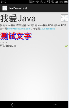
<LinearLayout xmlns:android="http://schemas.android.com/apk/res/android"
    android:orientation="vertical"
    android:layout_width="fill_parent"
    android:layout_height="fill_parent"
    >
    <!-- 设置字体为20pt,文本框结尾处绘制图片  -->
    <TextView
    android:layout_width="fill_parent"
    android:layout_height="wrap_content"
    android:text="我爱Java"
    android:textSize="20pt"
    android:drawableEnd="@drawable/ic_launcher"
    />
    <!-- 设置中间省略, 所有字母大写 -->
    <TextView
    android:layout_width="fill_parent"
    android:layout_height="wrap_content"
    android:singleLine="true"
    android:text="我爱Java我爱Java我爱Java我爱Java我爱Java我aaaJava"
    android:ellipsize="middle"
    android:textAllCaps="true"
    />
    <!-- 对邮件、电话增加链接 -->
    <TextView
    android:layout_width="fill_parent"
    android:layout_height="wrap_content"
    android:singleLine="true"
    android:text="邮件是kongyeeku@163.com,电话是02088888888"
    android:autoLink="email|phone"
    />
    <!-- 设置文字颜色 、大小,并使用阴影 -->
    <TextView
    android:layout_width="fill_parent"
    android:layout_height="wrap_content"
    android:text="测试文字"
    android:shadowColor="#0000ff"
    android:shadowDx="10.0"
    android:shadowDy="8.0"
    android:shadowRadius="3.0"
    android:textColor="#f00"
    android:textSize="18pt"
    />
    <!-- 测试密码框 -->
    <TextView android:id="@+id/passwd"
    android:layout_width="fill_parent"
    android:layout_height="wrap_content"
    android:text="@string/hello"
    android:password="true"
    />
    <!-- 测试CheckedTextView
    通过checkMark设置该文本框的勾选图标
     -->
    <CheckedTextView
    android:layout_width="fill_parent"
    android:layout_height="wrap_content"
    android:text="可勾选的文本"
    android:checkMark="@drawable/ok"
        />
</LinearLayout>
运行此Activity将运行出 图 2.17
实例:圆角边框、渐变背景的TextView
默认情况下,TextView是不带边框的,如果想为TextView添加边框,只能通过“曲线救国”的方式来实现——我们可以考虑为TextView设置一个背景Drawable,该Drawable是一个边框,这样就实现了带边框的TextView。
由于可以为TextView设置背景Drawable对象,因此可以在定义Drawable时不仅指定边框,还可以指定渐变背景,这样即可为TextView添加渐变背景和边框。
下面的界面布局文件中定义了两个TextView,界面布局文件的代码如下。
<LinearLayout xmlns:android="http://schemas.android.com/apk/res/android"
    android:orientation="vertical"
    android:layout_width="fill_parent"
    android:layout_height="fill_parent"
    >
<!-- 通过android:background指定背景 -->
<TextView
    android:layout_width="fill_parent"
    android:layout_height="wrap_content"
    android:text="带边框的文本"
    android:textSize="24pt"
    android:background="@drawable/bg_border"
    />
<!-- 通过android:drawableLeft绘制一张图片 -->
<TextView
    android:layout_width="fill_parent"
    android:layout_height="wrap_content"
    android:text="圆角边框、渐变背景的文本"
    android:textSize="24pt"
    android:background="@drawable/bg_border2"
    />
</LinearLayout>
上面的界面布局文件中定义了两个TextView,其中第一个指定了背景,第二个定义文本框时指定了圆角边框、渐变背景。第一个文本框所指定的背景是由XML文件定义的,将该文件放在drawable_mdi文件夹内,该XML文件也可当成Drawable使用。下面该XML文件的代码。
<?xml version="1.0" encoding="UTF-8"?>
<shape xmlns:android="http://schemas.android.com/apk/res/android">
    <!-- 设置背景色为透明色 -->
    <solid android:color="#0000"/>
    <!-- 设置红色边框 -->
    <stroke android:width="4px" android:color="#f00" />
</shape>
第二个文本框所指定的背景是由XML文件定义的,将该文件放在drawable_mdpi文件夹内,该XML文件也可当成Drawable使用。下面是该XML文件的代码。
<?xml version="1.0" encoding="UTF-8"?>
<shape xmlns:android="http://schemas.android.com/apk/res/android"
    android:shape="rectangle">
    <!-- 指定圆角矩形的4个圆角的半径 -->
       <corners android:topLeftRadius="20px"
    android:topRightRadius="5px"
    android:bottomRightRadius="20px"
    android:bottomLeftRadius="5px"/>
       <!-- 指定边框线条的宽度和颜色 -->
    <stroke android:width="4px" android:color="#f0f" />
    <!-- 指定使用渐变背景色,使用sweep类型的渐变
    颜色从红色→绿色→蓝色 -->
    <gradient android:startColor="#f00"
        android:centerColor="#0f0"
        android:endColor="#00f"
        android:type="sweep"/>
</shape>
使用Activity来显示上面定义的布局页面,可以看到如图2.18所示界面。

图2.18 圆角边框、渐变背景的文本
从图2.18不难看出,通过为TextView的android:background赋值,可以为文本框增加大量自定义的外观,这种控制方式非常灵活。
需要指出的是,表面上这里只是在介绍TextView,但由于TextView是EditText、Button等类的父类,因此此处介绍的对TextVIew控制的属性,同样适用于EditText与Button。