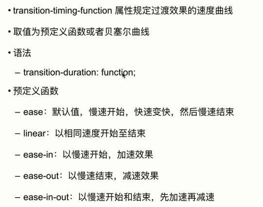
CSS3 过渡
版权声明:未经博主授权,内容严禁转载分享
什么是过渡
使得 CSS 的属性值在一段时间内平滑的过渡。
- 比如,鼠标悬停后,背景在 1s 之内,由白色平滑的过渡为红色。
指定 4 个要素
- 指定过渡属性,比如 background 、 color 等。
- 指定过渡所需要的时间。
- 指定过渡函数,即过渡的速度、方式等。
- 指定过渡延时时间,表示开始执行的时间。
触发过渡:
- 通过用户的行为触发,比如点击、悬浮等。

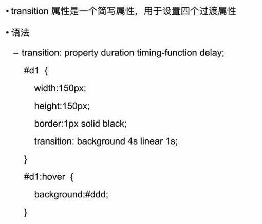
代码案例
<style media="screen">
  #d1{
    width: 150px;
    height: 150px;
    border: 1px solid black;
    /* 背景色过渡,3秒变换,线性过渡,一秒后开始 */
    transition: background 3s linear 1s;
  }

  /* 鼠标移上 */
  #d1:hover{
    background:red;
  }
</style>

<div id="d1"></div>

过渡的子属性
transition-property 属性规定应用过渡效果的 CSS 属性名称。
- 当指定的 CSS 属性改变时,过渡效果开始。
语法
- transition-property:none / all / property;
可以设置过渡属性
- 颜色属性
- 取值为数值的属性
- 转换属性
- 渐变属性
- visibility 属性
- 阴影属性
transition-duration:过渡时间。属性规定完成过渡效果需要花费的时间。
- 以秒或毫秒作单位。
语法
- transition-duration:s | ms ;
- 默认值是0,意味着不会有效果。
必须设置 transition-duration 属性,否则时长为0,就不会产生过渡效果。
案例代码
<style>
  #d1 {
    margin: auto;
    width: 100px;
    height: 100px;
    border: 1px solid #999999;

    transition:
      background 1s linear 100ms,
      border-radius 1s ease-in 200ms,
      width 1s linear 100ms,
      box-shadow 1s linear 100ms,
      transform 1s linear 100ms;

     }

     #d1:hover {
         background: red;
         width: 200px;
         border-radius: 20px;
         transform: rotate(45deg);
         box-shadow: 5px 5px 5px #999999;
     }
</style>

<div style="height: 200px"></div>
<div id="d1"></div>
结束!!!!
能看出这篇博客我有点er 小糊弄吗?尴尬!