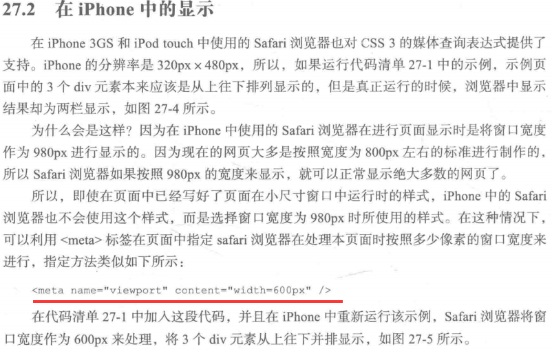

  1 <!DOCTYPE html>
  2 <html>
  3
  4 <head>
  5     <meta charset="UTF-8">
  6     <title></title>
  7     <style type="text/css">
  8         body {
  9             margin: 20px 0;
 10         }
 11
 12         #container {
 13             width: 960px;
 14             margin: auto;
 15         }
 16
 17         #wrapper {
 18             width: 740px;
 19             float: left;
 20         }
 21
 22         p {
 23             line-height: 600px;
 24             text-align: center;
 25             font-weight: bold;
 26             font-size: 2em;
 27             margin: 0 0 20px 0;
 28         }
 29
 30         #main {
 31             width: 520px;
 32             float: right;
 33             background: yellow;
 34         }
 35
 36         #sub01 {
 37             width: 200px;
 38             float: left;
 39             background: orange;
 40         }
 41
 42         #sub02 {
 43             width: 200px;
 44             float: right;
 45             background: green;
 46         }
 47         /*窗口宽度在1000px以上*/
 48
 49         @media screen and(min-1000px) {
 50             /*3栏显示*/
 51             #container {
 52                 width: 1000px;
 53             }
 54             #wrapper {
 55                 width: 780px;
 56                 float: left;
 57             }
 58             #main {
 59                 width: 560px;
 60                 float: right;
 61             }
 62             #sub01 {
 63                 width: 200px;
 64                 float: left;
 65             }
 66             #sub02 {
 67                 width: 200px;
 68                 float: right;
 69             }
 70         }
 71         /*窗口宽度在640px以上,999px以下*/
 72
 73         @media screen and (min-640px) and (max- 999px) {
 74             /*2栏显示*/
 75             #container {
 76                 width: 640px;
 77             }
 78             #wrapper {
 79                 width: 640px;
 80                 float: none;
 81             }
 82             p {
 83                 line-height: 400px;
 84             }
 85             #main {
 86                 width: 420px;
 87                 float: right;
 88             }
 89             #sub01 {
 90                 width: 200px;
 91                 float: left;
 92             }
 93             #sub02 {
 94                 width: 100%;
 95                 float: none;
 96                 clear: both;
 97                 line-height: 150px;
 98             }
 99         }
100
101         @media screen and (max-639px) {
102             /*1栏显示*/
103             #container {
104                 width: 100%;
105             }
106             #wrapper {
107                 width: 100%;
108                 float: none;
109             }
110             body {
111                 margin: 20px;
112             }
113             p {
114                 line-height: 300px;
115             }
116             #main {
117                 width: 100%;
118                 float: none;
119             }
120             #sub01 {
121                 width: 100%;
122                 float: none;
123                 line-height: 100px;
124             }
125             #sub02 {
126                 width: 100%;
127                 float: none;
128                 line-height: 100px;
129             }
130         }
131     </style>
132 </head>
133
134 <body>
135     <div id="container">
136         <div id="wrapper">
137             <p id="main">MAIN</p>
138             <p id="sub01">SUB 01</p>
139             <p id="sub02">SUB 02</p>
140         </div>
141
142     </div>
143
144 </body>
145
146 </html>