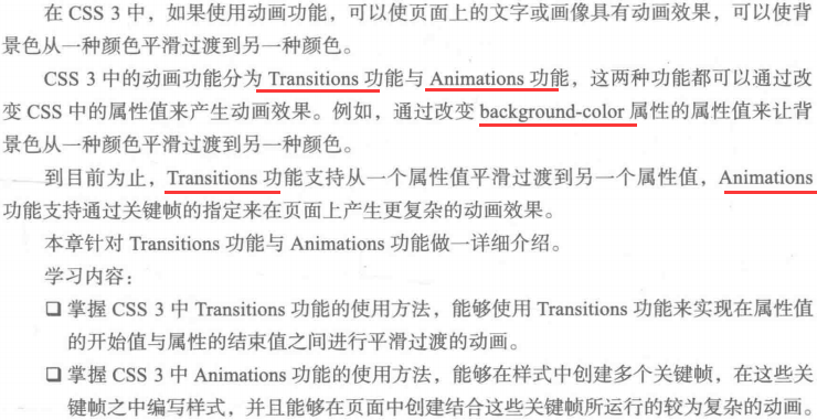
 1 <!DOCTYPE html>
 2 <html>
 3
 4 <head>
 5     <meta charset="UTF-8">
 6     <title></title>
 7     <style type="text/css">
 8         div{
 9             background-color: #ffff00;
10             transition: background-color 1s linear;
11         }
12         div:hover{
13             background-color: #00ffff;
14         }
15     </style>
16 </head>
17
18 <body>
19    <div>示例文字</div>
20
21 </body>
22
23 </html>

 1 <!DOCTYPE html>
 2 <html>
 3
 4 <head>
 5     <meta charset="UTF-8">
 6     <title></title>
 7     <style type="text/css">
 8         div {
 9             background-color: #ffff00;
10             color: #000000;
11             width: 300px;
12             transition: backgroud-color 1s linear, color 1s linear, width 1s linear;
13         }
14
15         div:hover {
16             background-color: #003366;
17             color: #ffffff;
18             width: 400px;
19         }
20     </style>
21 </head>
22
23 <body>
24     <div>示例文字</div>
25
26 </body>
27
28 </html>

 1 <!DOCTYPE html>
 2 <html>
 3
 4 <head>
 5     <meta charset="UTF-8">
 6     <title></title>
 7     <style type="text/css">
 8         div {
 9             position: absolute;
10             top: 70px;
11             left: 0;
12             transform: rotate(0deg);
13             transition: left 1s linear,transform 1s linear;
14         }
15
16         div:hover {
17             position: absolute;
18             left: 30px;
19             transform: rotate(720deg);
20         }
21     </style>
22 </head>
23
24 <body>
25     <div>示例文字</div>
26 </body>
27
28 </html>

 1 <!DOCTYPE html>
 2 <html>
 3
 4 <head>
 5     <meta charset="UTF-8">
 6     <title></title>
 7     <style type="text/css">
 8         div {
 9             background-color: red;
10         }
11         @keyframes mycolor{
12             0%{
13                 background-color: red;
14             }
15             40%{
16                 background-color: darkblue;
17             }
18             70%{
19                 background-color:yellow;
20             }
21             100%{
22                 background-color:red;
23             }
24         }
25         div:hover {
26             animation-name: mycolor;
27             animation-duration: 5s;
28             animation-timing-function: linear;
29         }
30     </style>
31 </head>
32
33 <body>
34     <div>示例文字</div>
35 </body>
36
37 </html>

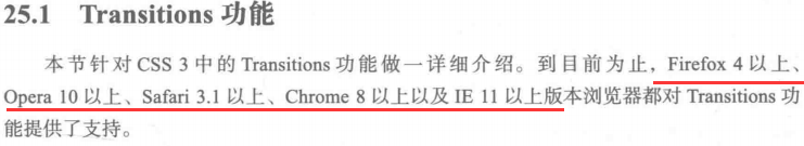
 1 <!DOCTYPE html>
 2 <html>
 3
 4 <head>
 5     <meta charset="UTF-8">
 6     <title></title>
 7     <style type="text/css">
 8         div {
 9             position: absolute;
10             background-color: yellow;
11             top: 100px;
12             width: 500px;
13         }
14         @keyframes mycolor{
15             0%{
16                 background-color: red;
17                 transform: rotate(0deg);
18             }
19             40%{
20                 background-color: darkblue;
21                 transform: rotate(30deg);
22             }
23             70%{
24                 background-color:yellow;
25                 transform: rotate(-30deg);
26             }
27             100%{
28                 background-color:red;
29                 transform: rotate(0deg);
30             }
31         }
32         div:hover {
33             animation-name: mycolor;
34             animation-duration: 5s;
35             animation-timing-function: linear;
36         }
37     </style>
38 </head>
39
40 <body>
41     <div>示例文字</div>
42 </body>
43
44 </html>
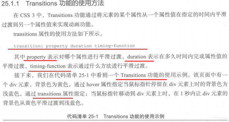
 1 <!DOCTYPE html>
 2 <html>
 3
 4 <head>
 5     <meta charset="UTF-8">
 6     <title></title>
 7     <style type="text/css">
 8
 9         @keyframes mycolor{
10             0%{
11                 width: 100px;
12                 height: 100px;
13             }
14
15             100%{
16                 width: 500px;
17                 height: 500px;
18             }
19         }
20         div {
21             background-color: red;
22             width: 500px;
23             height: 500px;
24             animation-name: mycolor;
25             animation-duration: 5s;
26             animation-timing-function: ease-out;
27         }
28     </style>
29 </head>
30
31 <body>
32     <div>示例文字</div>
33 </body>
34
35 </html>

 1 <!DOCTYPE html>
 2 <html>
 3
 4 <head>
 5     <meta charset="UTF-8">
 6     <title></title>
 7     <style type="text/css">
 8
 9         @keyframes fadein{
10             0%{
11                 opacity: 0;
12                 background-color: white;
13             }
14
15             100%{
16                 opacity: 1;
17                 background-color: white;
18             }
19         }
20         div {
21             animation-name: fadein;
22             animation-duration: 5s;
23             animation-timing-function: linear;
24             animation-iteration-count: 1;
25         }
26     </style>
27 </head>
28
29 <body>
30     <div>示例文字</div>
31 </body>
32
33 </html>