标签的border属性包含了4根边框,而每根边框的交界处是斜45度,不是水平垂直相交,如下图:

利用这种特性,可以把div标签的高宽设为0,border设为大于0的像素,这样border就变为了一个色块,通过 border-color: 颜色/transparent来控制四个方向上的颜色或者是不是显示,4个颜色/transparent分别控制上右下左,顺时针方向
1 <style>
2         div {
3             height: 0px;
4             width: 0px;
5             border-width:50px;
6             border-color: red red transparent red;
7             border-style: solid;
8         }
9     </style>
该代码让下方border消失,如果再让右边border消失,则会在在左上角形成一个边为50px的等腰三角形,再让左边消失,那就会在正上方形成一个更小的三角形:
 1 <!doctype html>
 2 <html>
 3 <head>
 4 <meta charset="utf-8">
 5 <title>无标题文档</title>
 6       <style>
 7         div {
 8             width:0px;
 9             height:0px;
10             border:50px solid;
11             /* 平分效果 */
12
13
14             /* 单个三角形 */
15             border-color:red transparent transparent transparent;
16         }
17     </style>
18 </head>
19
20 <body>
21     <div></div>
22 </body>
23 </html>
最终效果如图: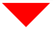
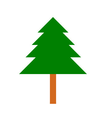
以下这段代码运行后可生成由四个大小不一的三角形组成的树木:
 1 <!doctype html>
 2 <html>
 3 <head>
 4 <meta charset="utf-8">
 5 <title>无标题文档</title>
 6     <style>
 7         #div {
 8             position:absolute;
 9             left: 400px;
10         }
11         .div1 {
12             height: 0px;
13             width: 0px;
14             border-width:50px;
15             border-color: transparent transparent green          transparent;
16             border-style: solid;
17         }
18         .div2 {
19             height: 0px;
20             width: 0px;
21             border-width:70px;
22             border-color: transparent transparent green transparent;
23             border-style: solid;
24             position: absolute;
25             left: -19px;
26             bottom: -40px
27         }
28         .div3 {
29             height: 0px;
30             width: 0px;
31             border-width:90px;
32             border-color: transparent transparent green transparent;
33             border-style: solid;
34             position: absolute;
35             left: -39px;
36             bottom: -80px
37         }
38         .div4 {
39             height: 0px;
40             width: 0px;
41             border-width:110px;
42             border-color: transparent transparent green transparent;
43             border-style: solid;
44             position: absolute;
45             left: -60px;
46             bottom: -134px
47         }
48         .div5 {
49             height: 200px;
50             width: 20px;
51             background-color: chocolate;
52             position: absolute;
53             bottom: -230px;
54             left: 40px;
55             z-index: -1;
56         }
57     </style>
58 </head>
59
60 <body>
61     <div id="div">
62         <div class="div1"></div>
63         <div class="div2"></div>
64         <div class="div3"></div>
65         <div class="div4"></div>
66         <div class="div5"></div>
67
68     </div>
69 </body>
70 </html>
最终效果: