flex:auto 将增长值与收缩值设置为1,基本大小为 auto 。
flex:none. 将增长值与收缩值设置为0,基本大小为 auto 。也就是固定大小。
增长:
基本大小 + 额外空间 *(增长系数 / 增长系数总和)
按比例划分额外空间,然后各自分配。
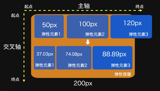
缩小:
基本大小 – 溢出大小 *(缩小系数 * 基本大小 / 各各缩小系数 * 自身大小 之和)
#container {

  display: flex;

  flex-wrap: nowrap;

}
flex-shrink: 1并非严格等比缩小,它还会考虑弹性元素本身的大小。
- 容器剩余宽度:-70px
- 缩小因子的分母:1*50 + 1*100 + 1*120 = 270 (1为各元素flex-shrink的值)
- 元素1的缩小因子:1*50/270
- 元素1的缩小宽度为缩小因子乘于容器剩余宽度:1*50/270 * (-70)
- 元素1最后则缩小为:50px + (1*50/270 *(-70)) = 37.03px
均匀增长(直接按设置的比例增长)
将基本大小设置为:0,那么收缩值就不在适用了。
flex:值;或 flex-shrink:0;flex-basis:0;
如:flex:1; flex:2; flex:3. 那么第二个为第一个的2倍宽度,第三个为第一个的3倍宽度。
<!DOCTYPE html>
<html lang="en">
<head>
    <meta charset="UTF-8">
    <title>Title</title>
    <style>
        * {
            margin: 0;
            padding: 0px;
        }
        .flexbox-row{
            margin: 50px auto;
            display: flex;
            flex-direction: row;
            width: 120px;
            height: 320px;
            border: 1px #ccc solid;
        }
        .box1{
            flex: 1;
            height: 50px;
        }
        .box2{
            flex: 2;
            height: 50px;
        }
        .box3 {
            flex: 1.5;
            height: 30px;
        }
    </style>
</head>
<body>

<div class="flexbox-row">
    <div class="box box1" style="background-color:coral;">A</div>
    <div class="box box2" style="background-color:lightblue;">B</div>
    <div class="box box3" style="background-color:khaki;">C</div>
</div>

</body>
</html>