HTML
<!-- 背景容器层 -->
<div class="container"></div>
<!-- 遮罩层 -->
<div class="mask"></div>
CSS
body{
padding: 0;
margin: 0;
}
.container,
.mask{
height: 400px;
100%;
position: absolute;
top: 0;
}
.container{
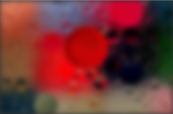
/* background: url(bg.png) no-repeat top/cover; */
background-image: url(bg.png);
background-repeat: no-repeat;
background-position: top;
background-size: cover;
/* 高斯模糊 */
filter: blur(10px); /* 容器四周出现灰色模糊带 */
z-index: -1;
}
.mask{
background: #333; /* 黑色背景 */
z-index: -2; /* 使遮罩层位于背景容器层下方,背景容器模糊带消失 */
}
测试
/* 给遮罩层加个top,使其和容器背景分开 */
.mask{
    top: 180px;
}
效果
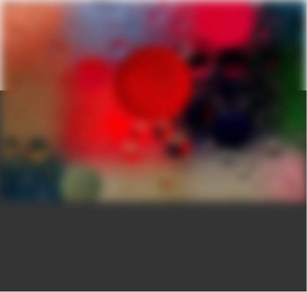
最终效果