全文摘抄自 https://developer.mozilla.org/zh-CN/docs/Web/CSS/box-sizing
专门抄一遍是因为,我想当然的以为标准盒子模型设置的宽高是包括padding的,但是实践中好像并不是这样的。
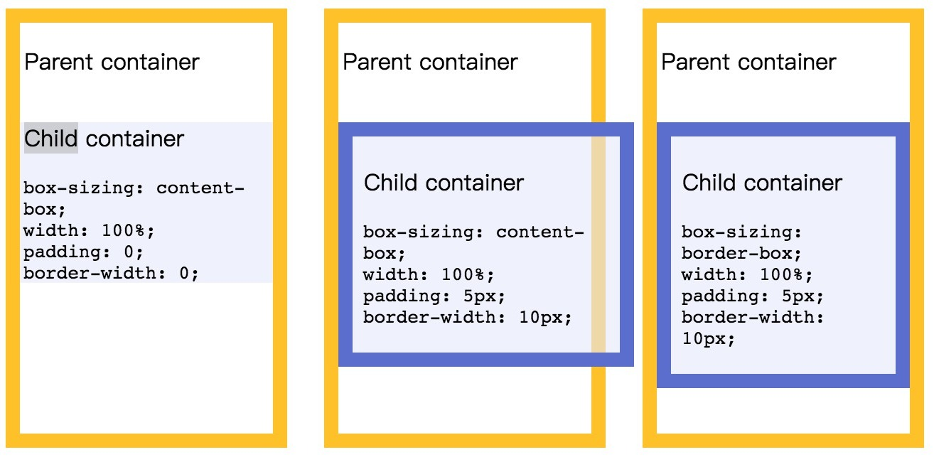
box-sizing 属性用于更改用于计算元素宽度和高度的默认的 CSS 盒子模型。可以使用此属性来模拟不正确支持CSS盒子模型规范的浏览器的行为。
/* 关键字 值 */
box-sizing: content-box;
box-sizing: border-box;

/* 全局 值 */
box-sizing: inherit;
box-sizing: initial;
box-sizing: unset;
content-box
默认值,标准盒子模型。 width 与 height 只包括内容的宽和高, 不包括边框(border),内边距(padding),外边距(margin)。
注意: 内边距, 边框 & 外边距 都在这个盒子的外部。
比如. 如果 .box { 350px}; 而且 {border: 10px solid black;} 那么在浏览器中的渲染的实际宽度将是370px;
尺寸计算公式:width = 内容的宽度,height = 内容的高度。宽度和高度都不包含内容的边框(border)和内边距(padding)。
border-box
width 和 height 属性包括内容,内边距和边框,但不包括外边距。
这是当文档处于 Quirks模式 时Internet Explorer使用的盒模型。
注意,填充和边框将在盒子内 , 例如, .box { 350px; border: 10px solid black;} 导致在浏览器中呈现的宽度为350px的盒子。
内容框不能为负,并且被分配到0,使得不可能使用border-box使元素消失。
这里的维度计算为:width = border + padding + 内容的 width,height = border + padding + 内容的 height。
一些专家甚至建议所有的Web开发者们将所有的元素的box-sizing都设为border-box。
*, *:before, *:after {
  /* Chrome 9-, Safari 5-, iOS 4.2-, Android 3-, Blackberry 7- */
  -webkit-box-sizing: border-box;

  /* Firefox (desktop or Android) 28- */
  -moz-box-sizing: border-box;

  /* Firefox 29+, IE 8+, Chrome 10+, Safari 5.1+, Opera 9.5+, iOS 5+, Opera Mini Anything, Blackberry 10+, Android 4+ */
  box-sizing: border-box;
}