css动画中的transform有4个方法,分别是translate平移、rotate旋转、scale缩放、skew斜切
- translate有2个参数,代表x轴和y轴, 只有1个参数时,只在x轴移动,y轴默认是0;transform: translate(10px,10px)
-ms-transform:translate(x,y); /*IE9*/
-moz-transform:translate(x,y); /*Firefox*/
-webkit-transform:translate(x,y); /*Safari和chrome*/
-o-transform:translate(x,y); /*Opera*/
- rotate(1800deg)参数值为正数顺时针旋转,值为负数逆时针旋转; transform:rotate(90deg)
- transform-origin:0 0 ; 设置旋转的中心点 ,默认是(0,0)
- scale(x,y) x轴和y轴缩放,第二个参数没有默认取第一个参数的值,scale(0.5)参数值小于1缩小,scale(1.5)参数值大于1放大; transform:scale(1.2)
- skew(x,y) 斜切 用法和rotate类似,在x轴和y轴同时进行角度扭曲,第二个参数没有时默认为0,不进行斜切;
- transition-property: none| all | property ; all表示所有属性都有过渡效果,property定义应用过渡效果的 CSS 属性名称列表,列表以逗号分隔
- transition-duration: time值;默认是0 没有动画效果,以秒或者毫秒计
- transform的4个方法叠加使用时,先做偏移,在做其他
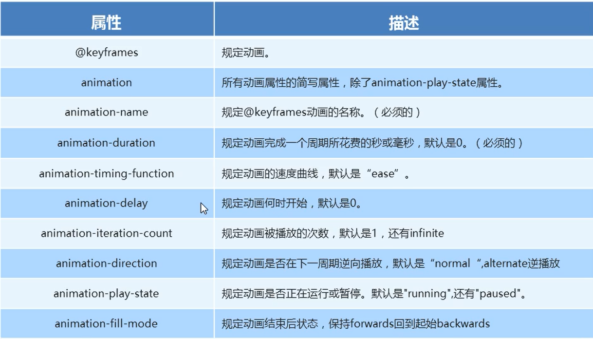
/* 动画起始 */
		@keyframes name{
			from{
				transform: translate(0,0);
			}
			to{transform: translate(1000px,0);}
		}
		div{
			/* 使用动画名字 */
			animation-name: name;
			/* 动画持续时间 */
			animation-duration: 5s;
			/* 运动曲线 */
			animation-timing-function: ease;
			/* 何时开始 */
			animation-delay: 2s;
			/* 重复次数  infinte无限*/
			animation-iteration-count: infinite;
			/* 反方向播放 */
			animation-direction: alternate;
			/* 设置结束状态 初始值为backwards*/
			animation-fill-mode: backwards;
			/* 规定动画是否运行或者暂停  paused是暂停动画*/
			animation-play-state: paused;
		}
简写:
animation:动画名称 持续时间 运动曲线 何时开始 播放次数 是否反方向 动画起始或结束时的状态
需要单写,配合鼠标点击移入移出方法使用animation-play-state: paused;