最近的项目中使用了ECharts插件做了几个图表,重点包括两类常见的图表类型:标准面积图以及基于时间坐标轴的折线图。
为了方便以后查看使用,写个例子以供参考。
一:ECharts的使用
定义一个宽800px,高600px的dom,引入echarts文件
<!DOCTYPE html>
<html lang="en">
<head>
    <meta charset="UTF-8">
    <title>Document</title>
</head>
<body>
    <div id="echart" style="800px;height:600px;">
    </div>
    <script type="text/javascript" src="js2.0/echarts-all.js"></script>
</body>
</html>
初始化echars图表,配置option里的内容


<script type="text/javascript">
        // 获取echart
        var myChart = echarts.init(document.getElementById('echart'));
        // Echart配置
        option = {
            tooltip : {
                trigger: 'axis'
            },
            toolbox: {
                show : false,
                feature : {
                    mark : {show: true},
                    dataView : {show: true, readOnly: false},
                    magicType : {show: true, type: ['line', 'bar', 'stack', 'tiled']},
                    restore : {show: true},
                    saveAsImage : {show: true}
                }
            },
            calculable : true,
            xAxis : [
                {
                    type : 'category',
                    boundaryGap : false,
                    axisLine: {
                        lineStyle: {color: '#f5f5f5'},
                    },
                    splitLine: {
                        lineStyle: {
                            color: '#f5f5f5'
                        }
                    },
                    data : ['03/21','03/22','03/23','03/24','03/25','03/26','03/27']
                }
            ],
            yAxis : [
                {
                    type : 'value',
                    splitLine: {
                        lineStyle: {
                            color: '#f5f5f5'
                        }
                    },
                    axisLine: {
                        lineStyle: {color: '#f5f5f5'},
                    },
                }
            ],
            series : [
                {
                    name:'总营销费用',
                    type:'line',
                    smooth:true,
                    itemStyle: {
                        normal:
                        {
                            color: '#4296fe',
                            lineStyle: {color: '#4296fe'},
                            areaStyle: {color: 'rgba(217,234,255,.7)',type: 'default'}
                        }
                    },
                    data:[20000, 40000, 81000, 42000, 68000, 15000, 21000]
                }
            ]
        };
    </script>
最后为echart对象加载数据
<script>
        /*Echart对象加载数据*/
        myChart.setOption(option);
</script>
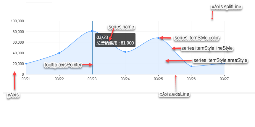
效果图如下

二:关于配置项option
echart官方属性配置项众多,未一一查看分析,只将自己此次所需的配置列出来,再下一次使用时能快速上手。
顺便推荐一个截图编辑工具snagit
三:时间坐标轴折线图
配置series.data,如以下例子,从2016-11-1日起为期30天的数据内容。
data: (function () {
var d = [];
var len = 0;
var now = new Date();
var value;
while (len++ < 30) {
d.push([
// len*1440 间隔1440分钟=1天
new Date(2016, 10, 0, 0, len * 1440),
(Math.random()*30).toFixed(2) - 0
]);
}
return d;
})()
注:折线图以及柱状图时数组长度等于xAxis.data的长度,处于一一对应关系。