方法一(使用指令)
1.指令(angular-ui-switch.js)
angular.module('uiSwitch', [])

app.directive('switch', function(){
  return {
    restrict: 'AE'
  , replace: true
  , transclude: true
  , template: function(element, attrs) {
      var html = '';
      html += '<span';
      html +=   ' class="switch' + (attrs.class ? ' ' + attrs.class : '') + '"';
      html +=   attrs.ngModel ? ' ng-click="' + attrs.disabled + ' ? ' + attrs.ngModel + ' : ' + attrs.ngModel + '=!' + attrs.ngModel + (attrs.ngChange ? '; ' + attrs.ngChange + '()"' : '"') : '';
      html +=   ' ng-class="{ checked:' + attrs.ngModel + ', disabled:' + attrs.disabled + ' }"';
      html +=   '>';
      html +=   '<small></small>';
      html +=   '<input type="checkbox"';
      html +=     attrs.id ? ' id="' + attrs.id + '"' : '';
      html +=     attrs.name ? ' name="' + attrs.name + '"' : '';
      html +=     attrs.ngModel ? ' ng-model="' + attrs.ngModel + '"' : '';
      html +=     ' style="display:none" />';
      html +=     '<span class="switch-text">'; /*adding new container for switch text*/
      html +=     attrs.on ? '<span class="on">'+attrs.on+'</span>' : ''; /*switch text on value set by user in directive html markup*/
      html +=     attrs.off ? '<span class="off">'+attrs.off + '</span>' : ' ';  /*switch text off value set by user in directive html markup*/
      html += '</span>';
      return html;
    }
  }
});
2.css(angular-ui-switch.css)
.switch {
  background: #fff;
  border: 1px solid #dfdfdf;
  position: relative;
  display: inline-block;
  box-sizing: content-box;
  overflow: visible;
   52px;
  height: 30px;
  padding: 0px;
  margin: 0px;
  border-radius: 20px;
  cursor: pointer;
  box-shadow: rgb(223, 223, 223) 0px 0px 0px 0px inset;
  transition: 0.3s ease-out all;
  -webkit-transition: 0.3s ease-out all;
  top: -1px;
}
/*adding a wide width for larger switch text*/
.switch.wide {
  80px;
}
.switch small {
  background: #fff;
  border-radius: 100%;
  box-shadow: 0 1px 3px rgba(0,0,0,0.4);
   30px;
  height: 30px;
  position: absolute;
  top: 0px;
  left: 0px;
  transition: 0.3s ease-out all;
  -webkit-transition: 0.3s ease-out all;
}
.switch.checked {
  background: rgb(100, 189, 99);
  border-color: rgb(100, 189, 99);
}
.switch.checked small {
  left: 22px;
}
/*wider switch text moves small further to the right*/
.switch.wide.checked small {
  left:52px;
}
/*styles for switch-text*/
.switch .switch-text {
  font-family:Arial, Helvetica, sans-serif;
  font-size:13px;
}

.switch .off {
  display:block;
  position: absolute;
  right: 10%;
  top: 25%;
  z-index: 0;
  color:#A9A9A9;
}

.switch .on {
  display:none;
   z-index: 0;
  color:#fff;
  position: absolute;
  top: 25%;
  left: 9%;
}

.switch.checked .off {
  display:none;
}

.switch.checked .on {
  display:block;

}

.switch.disabled {
  opacity: .50;
  cursor: not-allowed;
}
3.在apps.js中注入
var app = angular.module('app', ['uiSwitch'])
4.index.html引入相关文件
<link rel="stylesheet" href="../angular-ui-switch.css"/>
<script src="../angular.min.js"></script>
<script src="../angular-ui-switch.js"></script>
<script src="app.js"></script>
5.应用:
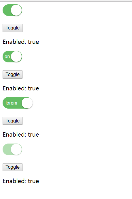
<form data-ng-controller="MyController">
    <switch name="enabled" ng-model="enabled" ng-change="changeCallback"></switch>
    <p>
        <button ng-click="enabled=!enabled">Toggle</button>
    </p>
    <p>
        Enabled: {{ enabled }}
    </p>
    <!--Examples of using switch text on/off values.  These values can be anything.  First example shows basic on/off-->

    <switch name="onOff" ng-model="onOff" on="on" off="off"></switch>
    <p>
        <button ng-click="onOff=!onOff">Toggle</button>
    </p>
    <p>
        Enabled: {{ onOff }}
    </p>

    <!--Examples of using the nonsense words lorem/ipsum in the on/off values.  Because these are wider, added an option "wide" class to allow for more room-->
    <switch name="yesNo" ng-model="yesNo" on="lorem" off="ipsum" class="wide"></switch>
    <p>
        <button ng-click="onOff=!onOff">Toggle</button>
    </p>
    <p>
        Enabled: {{ yesNo }}
    </p>

    <!--Examples of using switch disabled states. -->
    <switch name="disabled" ng-model="disabled" disabled="true"></switch>
    <p>
        <button ng-click="disabled=!disabled">Toggle</button>
    </p>
    <p>
        Enabled: {{ disabled }}
    </p>
</form>
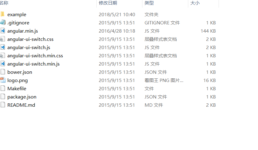
6.附录---目录结构
7.效果图:
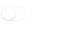
方法二(使用背景图和ng-class)
html
<span class="wrap" ng-class="{true:'on',false:'off'}[isOn]" ng-click="isOn = !isOn"></span>
css
.wrap{
    display:block;
    68px;
    height:40px;
    background-size: cover;
    cursor: pointer;
}
.on{
    background:url(../on.png) no-repeat;

}
.off{
    background:url(../off.png) no-repeat;
}
js
$scope.isOn = false;//默认为关闭状态
效果:
相关链接:
个人资料:
作者:smile.轉角
QQ:493177502