5、利用弹性布局 与 margin:
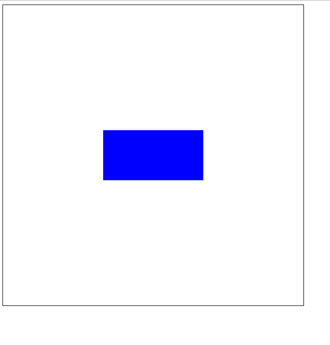
<style>
    .container{
        height: 600px;
        width: 600px;
        border:1px solid black;
        display: flex;
    }
    .box{
        width: 200px;
        height: 100px;
        background-color: blue;
        margin: auto;
    }
</style>
<div class="container">
    <div class="box"></div>
</div>
1,子div先充满父元素,在margin:auto,
2,先相对于父元素margin平移,再回拉法,
3,利用表单单元格td特有属性,vertical-align,使子div垂直居中,
再对子div设置水平居中.
4、弹性布局,通过定义伸缩容器的两个属性,justify-content主轴方向,align-items纵轴方向均为center
——————(补充)
个人比较喜欢第一种和第四种方法,既简单,又不用计算
<!DOCTYPE html>
<html>
<head lang="en">
    <meta charset="UTF-8">
    <title></title>
    <style>
        .d-1{
            width: 300px;
            height: 300px;
            position: relative;
            margin: 0 auto;
            border: 1px solid black;
        }
        .d-2{
            width: 200px;
            height: 200px;
            border: 1px solid red;
            position: absolute;
            left:0;top: 0;right: 0;bottom: 0;
            margin: auto;

        }
        .d-3{
            width: 100px;
            height: 100px;
            border: 1px solid blue;
            position: absolute;
            left:50%;top: 50%;
            margin-top: -50px;
            margin-left: -50px;
        }
        .d-4{
            width: 100px;
            height: 100px;
            border: 1px solid blue;

            /*让标签元素以表格单元格形式呈现,类似于td标签,主要是利用它的特殊属性:
            元素垂直居中对齐,但其会被float、position:absolute、
            所以尽量不要与其同用,设置了display:table-cell的元素对宽度高度敏感,
            对margin值无反应,所以页面上出现在了左边,我就不想再在外面加调了哈,
            但会响应padding属性,基本和td标签无异*/
            display: table-cell;
            vertical-align:middle;
        }
        .d-5{
            width: 50px;
            height: 50px;
            background: blue;
            margin:0 auto;
        }

    </style>
</head>
<body>
    <div class="d-1">
        <div class="d-2">
            <div class="d-3">

            </div>
        </div>
    </div>

    <div class="d-4">
        <div class="d-5"></div>
    </div>
</body>

</html>
运行结果:

4、弹性布局,通过定义伸缩容器的两个属性,justify-content主轴方向,align-items纵轴方向均为center
<style>
    .container{
        height: 600px;
        width: 600px;
        border:1px solid black;
        display: flex;
        justify-content: center;
        align-items: center;
    }
    .box{
        width: 200px;
        height: 100px;
        background-color: blue;
    }

</style>

<div class="container">
    <div class="box"></div>
</div>
运行结果: