最近写css遇到一些问题,所以准备写下来捋一下思路。
1.position=satic下看margin的使用。(top-right-bottom-left在这种case下无效)
1-1)margin
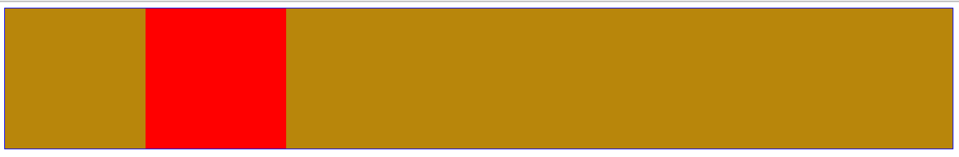
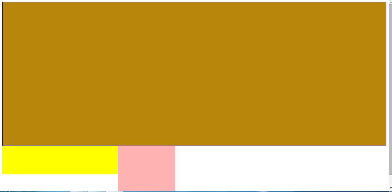
a,margin值为具体的px
<!DOCTYPE html>
<html>
<head lang="en">
    <meta charset="UTF-8">
    <title></title>
    <style>
        .container{
            border: 1px solid blue;
            padding-left: 100px;/*设置父元素的padding为了明显子元素的包含块区域*/
            background: darkgoldenrod;
        }
        .inner{
             200px;
            height: 200px;
            background: red;
            margin-left: 100px;/*相对于包含块移动,static的包含块为父元素的content边界以内。准确说是相对于元素自身移动
        }
    </style>
</head>
<body>
<div class="container">
    <div class="inner">
    </div>
</div>
</body>
</html>
结果如图,
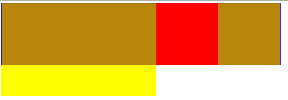
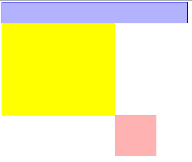
b,margin值为百分比
<!DOCTYPE html>
<html>
<head lang="en">
    <meta charset="UTF-8">
    <title></title>
    <style>
        .container{
             800px;
            border: 1px solid blue;
            padding-left: 100px;
            background: darkgoldenrod;
        }
        .inner{
             200px;
            height: 200px;
            background: red;
            margin-left: 50%;
        }
        .half{
             500px;
            height: 100px;
            background: yellow;
        }
    </style>
</head>
<body>
<div class="container">
    <div class="inner">
    </div>
</div>
<div class="half"></div>
</body>
</html>
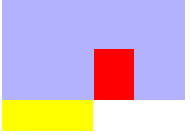
margin仍然是相对于包含块移动(因为包含块包裹着子元素,准确来说是相对于子元素本身移动),移动的值是父元素的宽度的百分比(如,50%),不是父元素这个盒子的宽度。
结果如下图,为了明显移动的情况,我在底部添加了一个宽度50%的div做对比。
2.position=relative.由于top和margin-top的百分比情况下容易导致问题,所以这里讨论时会同时看top和left两个边。
2-1)margin
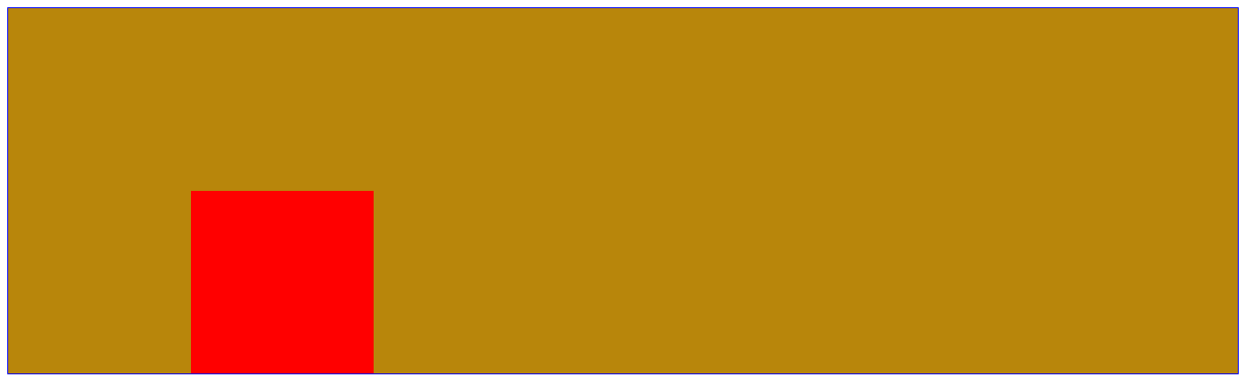
a,margin值为具体px
<!DOCTYPE html>
<html>
<head lang="en">
    <meta charset="UTF-8">
    <title></title>
    <style>
        .container{
            border: 1px solid blue;
            padding-left: 100px;
            padding-top: 100px;
            background: darkgoldenrod;
        }
        .inner{
            position: relative;
             200px;
            height: 200px;
            background: red;
            margin-left: 100px;//relative元素的包含块也是父元素的content边界以内区域
            margin-top: 100px;
        }
        /*.half{*/
        /* 50%;*/
        /*height: 100px;*/
        /*background: yellow;*/
        /*}*/
    </style>
</head>
<body>
<div class="container">
    <div class="inner">
    </div>
</div>
<!--<div class="half"></div>-->
</body>
</html>
结果如图,margin依然是相对于包含块做移动。准确来说是相对于元素自身移动。
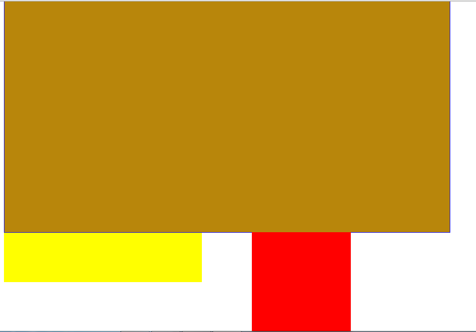
b,margin值为百分比
<!DOCTYPE html>
<html>
<head lang="en">
    <meta charset="UTF-8">
    <title></title>
    <style>
        .container{
             800px;
            height: 400px;
            border: 1px solid blue;
            padding-left: 100px;
            padding-top:100px ;
            background: darkgoldenrod;
        }
        .inner{
            position: relative;
             200px;
            height: 200px;
            background: red;
            margin-left: 50%;
            margin-top: 50%;//父元素height=width(400px)+padding-top(100px)=500px.marin-top相对于包含块使子元素向下移动margin-top(父元素宽度的50%,即400px)
        }
        .half{
             400px;
            height: 100px;
            background: yellow;
        }
    </style>
</head>
<body>
<div class="container">
    <div class="inner">
    </div>
</div>
<div class="half"></div>
</body>
</html>
结果如图,margin依然是以包含块左上角为原点移动(准确说是元素自身),不过margin-left/margin-top的值均是父元素宽度的百分比(尤其需要注意margin-top也是相对于父元素的宽度而不是高度,同理padding).不过也并不是绝对的,当设置了writing-mode为纵向书写时,比如-webkit-writing-mode: vertical-lr;此时按百分比书写的margin就会参照容器的高度来计算了
2-2)top-right-bottom-left
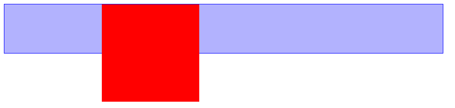
a,top和left为具体值(px)
<!DOCTYPE html>
<html>
<head lang="en">
    <meta charset="UTF-8">
    <title></title>
    <style>
        .container{
            /* 800px;*/
            height: 400px;
            border: 1px solid blue;
            padding-left: 100px;
            padding-top:100px ;
            background: darkgoldenrod;
        }
        .inner{
            position: relative;
             200px;
            height: 200px;
            background: red;
            top:400px;
            left: 300px;
            opacity: 0.3;

        }
        .half{
             400px;
            height: 100px;
            background: yellow;
        }
    </style>
</head>
<body>
<div class="container">
    <div class="inner">
    </div>
</div>
<div class="half"></div>
</body>
</html>
结果如图,注意这里为了显示明显,选的值都是比较特殊的。
top/left也是相对于包含块进行位移。
b,top和left为百分比
1)top/left值为百分比时,以包含块为参考进行移动,移动的值分别相对的是父元素的width和height(width和height指定的是父元素的content区域,即包含块),而不是父元素这个盒子。

2)top/bottom值为百分比时,需要保证父元素的height存在(具体的值或者设置了百分比),不然top/bottom就无效。
<!DOCTYPE html>
<html>
<head lang="en">
    <meta charset="UTF-8">
    <title></title>
    <style>
        .container{
             800px;
            /*height: 400px;*/  /*如果没有设置height,子元素的top就无效*/
            border: 1px solid blue;
            padding-left: 100px;
            padding-top:100px ;
            background: darkgoldenrod;
        }
        .inner{
            position: relative;
             200px;
            height: 200px;
            background: red;
            left: 50%;
            top:50%;  /*因为父元素没设置高度,所以无效*/


        }
        .half{
             500px;
            height: 100px;
            background: yellow;
        }
    </style>
</head>
<body>
<div class="container">
    <div class="inner">
    </div>
</div>
<div class="half"></div>
</body>
</html>
结果如下,由于父元素没有现式设置高,则top:50%设置无效。

3.position=absolute.
absolute元素的包含块是最近的已定位祖先元素的padding边界以内区域。
3-1)margin
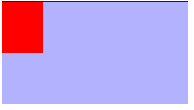
a.margin-top/margin-left为具体的值(px)
<!DOCTYPE html>
<html>
<head lang="en">
    <meta charset="UTF-8">
    <title></title>
    <style>
        .container{
            position: relative;
             800px;
            /*height: 400px;*/
            border: 1px solid blue;
            padding-left: 100px;
            padding-top:100px ;
            background: rgba(0,0,255,0.3);
        }
        .inner{
            position: absolute;
             200px;
            height: 200px;
            background: red;
            margin-left: 100px;
            margin-top: -100px;
        }
        .half{
             500px;
            height: 100px;
            background: yellow;
        }
    </style>
</head>
<body>
<div class="container">
    <div class="inner">
    </div>
</div>
<!--<div class="half"></div>-->
</body>
</html>
结果如图,margin相对于元素自身移动
b.margin-top/margin-left为百分比
<!DOCTYPE html>
<html>
<head lang="en">
    <meta charset="UTF-8">
    <title></title>
    <style>
        .container{
            position: relative;
             800px;
            /*height: 400px;*/
            border: 1px solid blue;
            padding-left: 100px;
            padding-top:100px ;
            background: rgba(0,0,255,0.3);
        }
        .inner{
            position: absolute;
             200px;
            height: 200px;
            background: red;
            margin-left: 50%;
            /*margin-top: -100px;*/
            opacity: 0.3;
        }
        .half{
             550px;
            height: 100px;
            background: yellow;
        }
    </style>
</head>
<body>
<div class="container">
    <div class="inner">
    </div>
</div>
<div class="half"></div>
</body>
</html>
结果如图,margin-top/margin-left值为百分比时,相对的是父元素的wdith+padding的百分比(即absolute元素的包含块---父元素的padding边界以内区域。上面我们测试static/relative元素时,相对的是父元素的width的百分比,即relative的包含块)。
同时margin-top/margin-bottom相对的是width+padding,而不是height+padding。
3-2)top-right-bottom-left
a.top/left为具体的值(px)
<!DOCTYPE html>
<html>
<head lang="en">
    <meta charset="UTF-8">
    <title></title>
    <style>
        .container{
            position: relative;
             800px;
            height: 400px;
            border: 1px solid blue;
            padding-left: 100px;
            padding-top:100px ;
            background: rgba(0,0,255,0.3);
        }
        .inner{
            position: absolute;
             200px;
            height: 250px;
            background: red;
            left:0px;
            top:0px;


        }
        .half{
             450px;
            height: 150px;
            background: yellow;
        }
    </style>
</head>
<body>
<div class="container">
    <div class="inner">
    </div>
</div>
<!--<div class="half"></div>-->
</body>
</html>
结果如图,top/left相对于包含块移动。
b.top/left为百分比
<!DOCTYPE html>
<html>
<head lang="en">
    <meta charset="UTF-8">
    <title></title>
    <style>
        .container{
            position: relative;
             800px;
            height: 400px;
            border: 1px solid blue;
            padding-left: 100px;
            padding-top:100px ;
            background: rgba(0,0,255,0.3);
        }
        .inner{
            position: absolute;
             200px;
            height: 250px;
            background: red;
            top: 50%;/*移动了250px*/
            /*left: 0;*/
            left: 50%;/*移动了450px*/

        }
        .half{
             450px;
            height: 150px;
            background: yellow;
        }
    </style>
</head>
<body>
<div class="container">
    <div class="inner">
    </div>
</div>
<div class="half"></div>
</body>
</html>
结果如图,相对于包含块移动。移动的值是相对于父元素的width+padding或height+padding(包含块)的百分比。
4.position=fixed.
4-1)margin
a.margin-top/margin-left为具体的值(px)
与absolute一样,不重复了。
b.margin-top/margin-left为百分比
<!DOCTYPE html>
<html>
<head lang="en">
    <meta charset="UTF-8">
    <title></title>
    <style>

        body{
            border: 1px solid red;
             50%;
            height: 200px;
        }
        div{
            position: fixed;
             200px;
            height: 100px;
            background: darkviolet;
            margin-left: 50%;
            margin-top:200px;//这里使用百分比比较复杂,所以用具体的值。
        }
    </style>
</head>
<body>
<div></div>
</body>
</html>
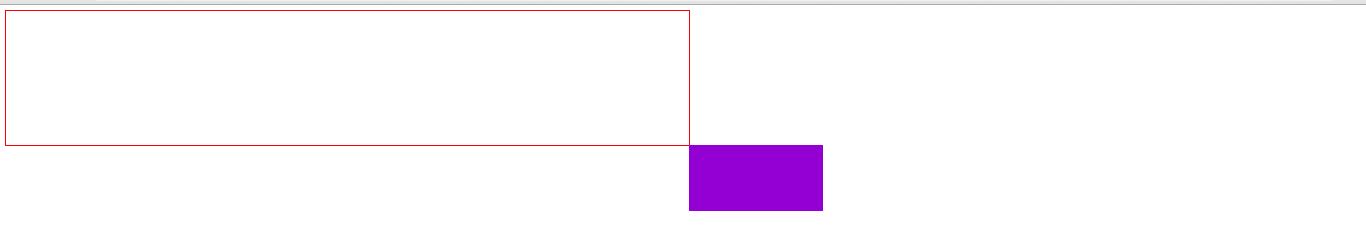
结果如图,以元素自身为参考移动。值是相对于窗口大小viewport的百分比。
4-2)top-right-bottom-left
a.top/left为具体的值(px)
于absolute差不多,不重复了。
b.top/left为百分比
<!DOCTYPE html>
<html>
<head lang="en">
    <meta charset="UTF-8">
    <title></title>
    <style>
        *{
            margin: 0;
            padding: 0;
        }
        body{
            border: 1px solid red;
             50%;
            height: 200px;
        }
        div{
            position: fixed;
             200px;
            height: 100px;
            background: darkviolet;
            top: 50%;
            left: 50%;
        }
    </style>
</head>
<body>
<div></div>
</body>
</html>
结果如图,相对于包含块(窗口)移动,值是相对于窗口大小viewport的百分比。

总结几条:
1)static/relative的包含块是父级元素的content区域(width和height决定)。
static/relative元素的 margin-left/margin-top/margin-right/margin-bottom,以元素自身为参考移动,值为百分比时,指的是包含块(width)的百分比,margin-top/margin-bottom相对的也是width而不是height。
static元素的top/left/bottom/right.以包含块为参考移动,值为百分比时,指的是包含块(width或height)的百分比。
2)absolute元素的包含块是最近的已定位祖先元素的padding边框以内区域。
它的 margin-left/margin-top/margin-right/margin-bottom,以元素自身为参考移动,值为百分比时,指的是包 含块(width+padding)的百分比,margin-top/margin-bottom相对的也是width+padding而不是垂直方向的height+padding.
它的top/left/bottom/right.以包含块为参考移动,值为百分比时,指的是包含块(width+padding或height+padding)的百分比。
3)fixed的包含块为窗口,大小为viewport.