兼容性

  • css常见问题
    • H5标签兼容(IE6下的问题)。
      <!DOCTYPE html>
      <html>
          <head>
              <meta charset="UTF-8">
              <title></title>
              <script type="text/javascript">
                  /*IE6不识别这些标签,所以要通过js动态创建标签;
                   *因为不识别,所以默认为自定义标签,自定义标签是内联元素,所以将其转换成块元素。
                   *若是有很多这些不识别的标签,每次都生成,效果不好。有一个js可以解决这个问题;
                   *html5shiv.js*/
                  document.createElement("header");
                  document.createElement("section");
                  document.createElement("footer");
              </script>
              <style>
                  header{
                      width:200px;
                      height:200px;
                      display: block;/*转换成块元素*/
                      background-color: red;
                  }
                  section{
                      width:150px;
                      height:150px;
                      display: block;
                      background-color: yellow;
                  }
                  footer{
                      width:100px;
                      height:100px;
                      display: block;
                      background-color: blue;
                  }
              </style>
          </head>
          <body>
              <header>header</header>
              <section>section</section>
              <footer>footer</footer>
          </body>
      </html>
      View Code
    • 元素浮动之后,能设置宽度的话就给元素加宽度.如果需要宽度是内容撑开,就给它里边的块元素加上浮动(IE6下的问题);
      <!DOCTYPE html>
      <html>
          <head>
              <meta charset="UTF-8">
              <title></title>
              <style>
                  .box{
                      width:400px;
                      border:1px solid black;
                      overflow: hidden;
                  }
                  .left{
                      float:left;
                      background-color: red
                  }
                  .right{
                      float:right;
                      background-color: blue
                  }
                  h2{
                      float:left;/*设置浮动*/
                      height:30px;
                      margin:30px;
                  }
              </style>
          </head>
          <body>
              <div class="box">
                  <div class="left">
                      <h2>left</h2>
                  </div>
                  <div class="right">
                      <h2>right</h2>
                  </div>
              </div>
          </body>
      </html>
      View Code
    • 第一块元素浮动,第二块元素加margin值等于第一块元素,在IE6下会有间隙问题(IE6下的问题);
      <!DOCTYPE html>
      <html>
          <head>
              <meta charset="UTF-8">
              <title></title>
              <style>
                  .box{
                      width:500px;
                  }
                  .left{
                      width:200px;
                      height:200px;
                      background-color: red;
                      float:left;
                  }
                  .right{
                      width:200px;
                      height:200px;
                      background-color: blue;
                      float:left;
                  }
              </style>
              <!--
                  解决方案:
                          1.不建议这样写:浮动元素脱离文档流,和没有浮动的元素在一行显示层级会不一样,导致在渲染解析时会出现问题。
                          2.用浮动解决:.right加上float:left;删除margin-left:200px;
              -->
          </head>
          <body>
              <div class="box">
                  <div class="left">
                      <h2>left</h2>
                  </div>
                  <div class="right">
                      <h2>right</h2>
                  </div>
              </div>
          </body>
      </html>
      View Code
    • IE6下子元素超出父级宽高,会把父级的宽高撑开(IE6下的问题);
      <!DOCTYPE html>
      <html>
          <head>
              <meta charset="UTF-8">
              <title></title>
              <style>
                  .box{
                      width:200px;
                      height: 200px;
                      border:10px solid #000;
                  }
                  .content{
                      width:400px;
                      height: 400px;
                      background-color: red;
                  }
              </style>
              <!--
                  解决方案:
                      不要让子元素的宽高超过父级
              -->
          </head>
          <body>
              <div class="box">
                  <div class="content"></div>
              </div>
          </body>
      </html>
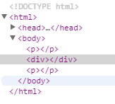
      View Code
    • p 包含块元素嵌套规则。
      <!DOCTYPE html>
      <html>
          <head>
              <meta charset="UTF-8">
              <title></title>
              <!--
                  这三个块元素不能在嵌套块元素:p td h标签
              -->
          </head>
          <body>
              <p><div></div></p>
          </body>
      </html>
      View Code

  • css兼容性问题

    • margin兼容性问题
      <!DOCTYPE html>
      <html>
          <head>
              <meta charset="UTF-8">
              <title></title>
              <style>
                  .box{
                      background-color: green;
                      overflow: hidden;
                      *zoom:1;
                  }
                  .item{
                      height:50px;
                      background-color: red;
                      margin-top: 50px;
                  }
                  .mt100{
                      margin-top: 100px;
                  }
              </style>
              <!--
                  1.margin-top传递:触发BFC,haslayout
                  2.上下margin叠加问题:尽量使用同一方向的margin,比如都设置top或bottom
              -->
          </head>
          <body>
              <div class="box">
                  <div class="item"></div>
                  <div class="item mt100"></div>
              </div>
          </body>
      </html>
      View Code
    • display:inline-block
      <!DOCTYPE html>
      <html>
          <head>
              <meta charset="UTF-8">
              <title></title>
              <style>
                  div{
                      width:100px;
                      height:100px;
                      background-color: red;
                      display: inline-block;
                  }
              </style>
              <!--
                   IE6、IE7不兼容display: inline-block;
                   解决方案为:
                       display: inline-block;
                       *display:inline;
                       * zoom:1;
              -->
          </head>
          <body>
              <div>div1</div>
              <div>div2</div>
              <div>div3</div>
          </body>
      </html>
      View Code
    • IE6 最小高度问题
      <!DOCTYPE html>
      <html>
          <head>
              <meta charset="UTF-8">
              <title></title>
              <style>
                  div{
                      height:1px;
                      background-color: red;
                      *overflow:hidden;
                  }
              </style>
              <!--
                  IE6下的最小高度到底为19像素;
                   在IE6下高度比设置的1像素要高一些。
                   解决方案是:加上*overflow:hidden;
              -->
          </head>
          <body>
              <div></div>
          </body>
      </html>
      View Code
    • IE6下双边距
      <!DOCTYPE html>
      <html>
          <head>
              <meta charset="UTF-8">
              <title></title>
              <style>
                  body{
                      margin:0;
                  }
                  .box{
                      width:750px;
                      border:1px solid #000;
                      overflow: hidden;
                  }
                  .item{
                      width:200px;
                      height:200px;
                      margin-left:50px;
                      background-color: red;
                      float:left;
                      *display: inline;
                  }
              </style>
              <!--
                  当元素浮动后再设置margin,就会产生双倍边距。
                  解决方案:针对IE6、IE7添加*display: inline;
              -->
          </head>
          <body>
              <div class="box">
                  <div class="item"></div>
                  <div class="item"></div>
                  <div class="item"></div>
              </div>
          </body>
      </html>
      View Code
    • li里元素都浮动 li 在IE6 7 下方会产生4px间隙问题

      <!DOCTYPE html>
      <html>
          <head>
              <meta charset="UTF-8">
              <title></title>
              <style>
                  .list{
                      margin:0;
                      padding:0;
                      list-style: none;
                      width:300px;
                  }
                  .list li{
                      height:30px;
                      line-height: 30px;
                      border:1px solid red;
                      *vertical-align: top;
                  }
                  .list li a{
                      float:left;
                  }
                  .list li span{
                      float:right;
                  }
              </style>
              <!--
                  解决方案:针对IE6、IE7添加*vertical-align: top;;
              -->
          </head>
          <body>
              <ul class="list">
                  <li>
                      <a href="javascript">左边</a>
                      <span>右边</span>
                  </li>
                  <li>
                      <a href="javascript">左边</a>
                      <span>右边</span>
                  </li>
                  <li>
                      <a href="javascript">左边</a>
                      <span>右边</span>
                  </li>
                  <li>
                      <a href="javascript">左边</a>
                      <span>右边</span>
                  </li>
                  <li>
                      <a href="javascript">左边</a>
                      <span>右边</span>
                  </li>
              </ul>
          </body>
      </html>
      View Code
    • 浮动元素之间注释,导致多复制一个文字问题
      <!DOCTYPE html>
      <html>
          <head>
              <meta charset="UTF-8">
              <title></title>
              <style>
                  .wrap{
                      width:400px;
                      
                  }
                  .left{
                      float:left;
                  }
                  .right{
                      float:right;
                      width:400px;
                  }
              </style>
              <!--
                  两个浮动元素中间有注释或者内联元素,并且和父级宽度相差不超过3px
                  解决方案:
                          1.两个浮动元素中间避免出现内联元素或者注释
                          2.与父级宽度相差3px或以上
              -->
          </head>
          <body>
              <div class="wrap">
                  <div class="left"></div>
                  <span></span><!--IE下文字溢出bug-->
                  <div class="right">&darr;这是多出来的一只猪</div>
              </div>
          </body>
      </html>
      View Code
    • IE6 7 父级元素的overflow:hidden 是包不住子级的relative

      <!DOCTYPE html>
      <html>
          <head>
              <meta charset="UTF-8">
              <title></title>
              <style>
                  .box{
                      width:200px;
                      height:200px;
                      background-color: red;
                      border:10px solid #000;
                      overflow: hidden;
                      *position: relative;
                  }
                  .content{
                      width:400px;
                      height:400px;
                      background-color: blue;
                      position: relative;
                  }
              </style>
              <!--
                  解决方案:针对IE6、IE7给父级元素添加*position: relative;使它和自己处在同一个环境下
              -->
          </head>
          <body>
              <div class="box">
                  <div class="content"></div>
              </div>
          </body>
      </html>
      View Code
    • IE6下绝对定位元素父级宽高是奇数,绝对定位元素的right和bottom值会有1px的偏差

      <!DOCTYPE html>
      <html>
          <head>
              <meta charset="UTF-8">
              <title></title>
              <style>
                  .box{
                      width:307px;
                      height:307px;
                      background-color: red;
                      position: relative;
                  }
                  .content{
                      width:100px;
                      height:100px;
                      background-color: blue;
                      position: absolute;
                      right:0;
                      bottom:0;
                  }
              </style>
              <!--
                  解决方案:避免父级宽高出现奇数
              -->
          </head>
          <body>
              <div class="box">
                  <div class="content"></div>
              </div>
          </body>
      </html>
      View Code
    • IE6下绝对定位元素和浮动元素并列绝对定位元素消失

      <!DOCTYPE html>
      <html>
          <head>
              <meta charset="UTF-8">
              <title></title>
              <style>
                  .box{
                      width:200px;
                      height:200px;
                      border:1px solid #000;
                      position: relative;
                  }
                  .item{
                      width:150px;
                      height:150px;
                      background-color: red;
                      float:left;
                      margin-left:50px;
                      display: inline;
                  }
                  .box span{
                      width:50px;
                      height:50px;
                      background-color: yellow;
                      position: absolute;
                      right:-10px;
                      top:-10px;
                  }
              </style>
              <!--
                  解决方案:浮动元素和绝对定位元素是同级的话定位元素就会消失,所以 咱们只要让他们两不处于同级就可以避免这个bug了。
              -->
          </head>
          <body>
              <div class="box">
                  <div class="item"></div>
                  <p><span></span></p>
              </div>
          </body>
      </html>
      View Code
    • IE6 下input的空隙

      <!DOCTYPE html>
      <html>
          <head>
              <meta charset="UTF-8">
              <title></title>
              <style>
                  .box{
                      width:200px;
                      border:1px solid #000;
                      background-color: red;
                  }
                  .box input{
                      border:0;
                      margin:0;
                      width:200px;
                      height:30px;
                      background-color: #fff;
                      *float:left;
                  }
              </style>
              <!--
                  解决方案:针对IE6、IE7给input添加*float:left;
              -->
          </head>
          <body>
              <div class="box">
                  <input type="text" />
              </div>
          </body>
      </html>
      View Code
    • IE6 下 输入类型表单控件背景问题

      <!DOCTYPE html>
      <html>
          <head>
              <meta charset="UTF-8">
              <title></title>
              <style>
                  input{
                      background: url("img/mail.png") no-repeat fixed;
                  }
              </style>
              <!--
                  解决方案:background-attachment:fixed;
              -->
          </head>
          <body>
              <input type="text" />
          </body>
      </html>
      View Code
  • css hack

    • hack 黑客? (原意:修改)  针对不同的浏览器写不同的CSS 样式的过程,就叫CSS hack!
      • 9 所有的IE10及之前

      • + * IE7及ie7以下的ie浏览器认识
      • _IE6及ie6的ie浏览器认识

  • PNG24 兼容性问题

    • IE6不支持png24 图片。
    • 解决方案:
      • JS插件(问题:不能处理body之上png24)    

        DD_belatedPNG.fix('xxx');

      • 原生滤镜  

        _background:none;_filter : progid:DXImageTransform.Microsoft.AlphaImageLoader(src="XX.png", sizingMethod="crop");

         
  • 样式优先级、提升样式优先级

    • 默认 < 类型 < class < id < style(行间) < !important
    • !important  提升样式优先级权重
原文地址:https://www.cnblogs.com/web-Knowledge/p/7099911.html