Bootstrap 的引入
bootstrap.css(head)- jquery 的 js 文件
bootstrap.js
网格布局
布局容器
.container 和 .container-fluid 是布局容器
“行(row)”必须包含在 .container (固定宽度)或 .container-fluid (100% 宽度)中,以便为其赋予合适的排列(aligment)和内补(padding)
行在水平方向创建一组 列(column),内容应当放置于列内,并且,只有列可以作为行的直接子元素
如果在一个 .row 内包含的列(column)大于12个,包含多余列(column)的元素将作为一个整体单元被另起一行排列
- 通过为“列(column)”设置 padding 属性,从而创建列与列之间的间隔(gutter)。
- 通过为 .row 元素设置负值 margin 从而抵消掉为 .container 元素设置的 padding,也就间接为“行(row)”所包含的“列(column)”抵消掉了padding。
- 负值的 margin就是下面的示例为什么是向外突出的原因。在栅格列中的内容排成一行。
- 栅格系统中的列是通过指定1到12的值来表示其跨越的范围。例如,三个等宽的列可以使用三个 .col-xs-4 来创建。
- 如果一“行(row)”中包含了的“列(column)”大于 12,多余的“列(column)”所在的元素将被作为一个整体另起一行排列。
- 栅格类适用于与屏幕宽度大于或等于分界点大小的设备 , 并且针对小屏幕设备覆盖栅格类。 因此,在元素上应用任何 .col-md-* 栅格类适用于与屏幕宽度大于或等于分界点大小的设备 , 并且针对小屏幕设备覆盖栅格类。 因此,在元素上应用任何 .col-lg-* 不存在, 也影响大屏幕设备。
栅格参数
栅格参数的前缀有:col-xs-(超小屏幕)、col-sm-(小屏幕)、col-md-(中等屏幕)、col-lg-(大屏幕)
槽宽约 30px,每列左右均有15px
- 超小屏幕(<768px):
- 小屏幕(>=760px):最大宽度750px,最大列宽约62px
- 中等屏幕(>=992px):最大宽度970px,最大列宽约81px
- 大屏幕(>=1200px):最大宽度1170px,最大列宽约97px
在超小屏幕上,总是水平排列
在其他屏幕上,开始是堆叠在一起的,当大于这些阈值时将会变为水平排列
流式布局容器
将最外面的布局元素 .container 修改为 .container-fluid,就可以将固定宽度的栅格布局转换为 100% 宽度的布局
列偏移
如:使用 .col-md-offset-* 类可以将列向右侧偏移
这些类实际是通过使用 * 选择器为当前元素增加了左侧的边距(margin)
嵌套列
为了使用内置的栅格系统将内容再次嵌套,可以通过添加一个新的 .row 元素和一系列 .col-sm-* 元素到已经存在的 .col-sm-* 元素内。
被嵌套的行(row)所包含的列(column)的个数不能超过12(其实,没有要求你必须占满12列)。
列排序
通过使用 .col-md-push-* 和 .col-md-pull-* 类就可以很容易的改变列(column)的顺序
排版
注:Bootstrap修改了原生HTML的一些标签的默认样式
标题
- HTML 中的所有标题标签,
<h1>到<h6>均可使用。另外,还提供了.h1到.h6类,为的是给内联(inline)属性的文本赋予标题的样式。 - 在标题内还可以包含
<small>标签或赋予.small类的元素,可以用来标记副标题
页面主体
Bootstrap 将全局 font-size 设置为 14px,line-height 设置为 1.428。
这些属性直接赋予 <body> 元素和所有段落元素。
另外,<p> (段落)元素还被设置了等于 1/2 行高(即 10px)的底部外边距(margin)。
中心内容
通过添加 .lead 类可以让段落突出显示
内联文本元素
<mark>:Marked text<del>:被删除的文本<s>:无用文本<ins>:插入文本<u>:带下划线的文本<small>:小号文本, 还可以为行内元素赋予.small类以代替任何<small>元素<strong>:着重文本<em>:斜体
小号文本:对于不需要强调的inline或block类型的文本,使用 <small> 标签包裹,其内的文本将被设置为父容器字体大小的 85%。标题元素中嵌套的 <small> 元素被设置不同的 font-size
在 HTML5 中可以放心使用
<b>和<i>标签。<b>用于高亮单词或短语,不带有任何着重的意味;而<i>标签主要用于发言、技术词汇等
对齐
看例子:
<p class="text-left">Left aligned text.</p>
<p class="text-center">Center aligned text.</p>
<p class="text-right">Right aligned text.</p>
<p class="text-justify">Justified text.</p>
<p class="text-nowrap">No wrap text.</p>
改变大小写
<p class="text-lowercase">Lowercased text.</p>
<p class="text-uppercase">Uppercased text.</p>
<p class="text-capitalize">Capitalized text.</p>
缩略语
当鼠标悬停在缩写和缩写词上时就会显示完整内容,Bootstrap 实现了对 HTML 的 <abbr> 元素的增强样式。
缩略语元素带有 title 属性,外观表现为带有较浅的虚线框,鼠标移至上面时会变成带有“问号”的指针。
如想看完整的内容可把鼠标悬停在缩略语上(对使用辅助技术的用户也可见), 但需要包含 title 属性。
基本缩略语:
<abbr title="attribute">attr</abbr>
首字母缩略语:
为缩略语添加 .initialism 类,可以让 font-size 变得稍微小些
<abbr title="HyperText Markup Language" class="initialism">HTML</abbr>
地址
让联系信息以最接近日常使用的格式呈现。在每行结尾添加
可以保留需要的样式
<address>
  <strong>Twitter, Inc.</strong><br>
  1355 Market Street, Suite 900<br>
  San Francisco, CA 94103<br>
  <abbr title="Phone">P:</abbr> (123) 456-7890
</address>

<address>
  <strong>Full Name</strong><br>
  <a href="mailto:#">first.last@example.com</a>
</address>
引用
默认样式的引用:将任何 HTML 元素包裹在 <blockquote> 中即可表现为引用样式。对于直接引用,我们建议用 <p> 标签
<blockquote>
  <p>Lorem ipsum dolor sit amet, consectetur adipiscing elit. Integer posuere erat a ante.</p>
</blockquote>
多种引用样式:
对于标准样式的 <blockquote>,可以通过几个简单的变体就能改变风格和内容
命名来源:添加 <footer> 用于标明引用来源。来源的名称可以包裹进 <cite> 标签中
<blockquote>
  <p>Lorem ipsum dolor sit amet, consectetur adipiscing elit. Integer posuere erat a ante.</p>
  <footer>Someone famous in <cite title="Source Title">Source Title</cite></footer>
</blockquote>
通过赋予 .blockquote-reverse 类可以让引用呈现内容右对齐的效果
<blockquote class="blockquote-reverse">
  ...
</blockquote>
列表
Bootstrap修改了默认的列表样式
无样式列表
移除了默认的 list-style 样式和左侧外边距的一组元素(只针对直接子元素)。
这是针对直接子元素的,也就是说,你需要对所有嵌套的列表都添加这个类才能具有同样的样式
<ul class="list-unstyled">
  <li>...</li>
</ul>
内联列表
通过设置 display: inline-block; 并添加少量的内补(padding),将所有元素放置于同一行
<ul class="list-inline">
  <li>...</li>
</ul>
水平排列的描述
.dl-horizontal 可以让 <dl> 内的短语及其描述排在一行。开始是像 <dl> 的默认样式堆叠在一起,随着导航条逐渐展开而排列在一行。
<dl class="dl-horizontal">
  <dt>...</dt>
  <dd>...</dd>
</dl>
自动截断
通过 text-overflow 属性,水平排列的描述列表将会截断左侧太长的短语。在较窄的视口(viewport)内,列表将变为默认堆叠排列的布局方式
代码
内联代码
通过 <code> 标签包裹内联样式的代码片段
For example, <code><section></code> should be wrapped as inline.
用户输入
通过 <kbd> 标签标记用户通过键盘输入的内容
To switch directories, type <kbd>cd</kbd> followed by the name of the directory.<br>
To edit settings, press <kbd><kbd>ctrl</kbd> + <kbd>,</kbd></kbd>
代码块
多行代码可以使用 <pre> 标签。为了正确的展示代码,注意将尖括号做转义处理。
<pre><p>Sample text here...</p></pre>
变量
通过 <var> 标签标记变量
<var>y</var> = <var>m</var><var>x</var> + <var>b</var>
程序输出
通过 <samp> 标签来标记程序输出的内容
<samp>This text is meant to be treated as sample output from a computer program.</samp>
表格
基本实例
为任意 <table> 标签添加 .table 类可以为其赋予基本的样式 — 少量的内补(padding)和水平方向的分隔线
条纹状表格
通过 .table-striped 类可以给 <tbody> 之内的每一行增加斑马条纹样式
注:条纹状表格是依赖
:nth-childCSS 选择器实现的,而这一功能不被 Internet Explorer 8 支持
带边框的表格
添加 .table-bordered 类为表格和其中的每个单元格增加边框
鼠标悬停
通过添加 .table-hover 类可以让 <tbody> 中的每一行对鼠标悬停状态作出响应
紧缩表格
通过添加 .table-condensed 类可以让表格更加紧凑,单元格中的内补(padding)均会减半
状态类
.active:鼠标悬停在行或单元格上时所设置的颜色.success:标识成功或积极的动作.info:标识普通的提示信息或动作.warning:标识警告或需要用户注意.danger:标识危险或潜在的带来负面影响的动作
可以加在tr上,也可以加在td上
<!-- On rows -->
<tr class="active">...</tr>
<tr class="success">...</tr>
<tr class="warning">...</tr>
<tr class="danger">...</tr>
<tr class="info">...</tr>

<!-- On cells (`td` or `th`) -->
<tr>
  <td class="active">...</td>
  <td class="success">...</td>
  <td class="warning">...</td>
  <td class="danger">...</td>
  <td class="info">...</td>
</tr>
响应式表格
将任何 .table 元素包裹在 .table-responsive 元素内,即可创建响应式表格,其会在小屏幕设备上(小于768px)水平滚动。当屏幕大于 768px 宽度时,水平滚动条消失
垂直方向的内容截断:
响应式表格使用了 overflow-y: hidden 属性,这样就能将超出表格底部和顶部的内容截断。特别是,也可以截断下拉菜单和其他第三方组件。
Firefox 和 fieldset 元素Firefox 和 fieldset 元素
Firefox 浏览器对 fieldset 元素设置了一些影响 width 属性的样式,导致响应式表格出现问题。可以使用下面提供的针对 Firefox 的 hack 代码解决,但是以下代码并未集成在 Bootstrap 中:
@-moz-document url-prefix() { fieldset { display: table-cell; } }
例子:
<div class="table-responsive">
  <table class="table">
    ...
  </table>
</div>
表单
基本实例
单独的表单控件会被自动赋予一些全局样式
所有设置了 .form-control 类的 <input>、<textarea> 和 <select> 元素都将被默认设置宽度属性为 100%;
将 label 元素和前面提到的控件包裹在 .form-group 中可以获得最好的排列
<form>
  <div class="form-group">
    <label for="exampleInputEmail1">Email address</label>
    <input type="email" class="form-control" id="exampleInputEmail1" placeholder="Email">
  </div>
  <div class="form-group">
    <label for="exampleInputPassword1">Password</label>
    <input type="password" class="form-control" id="exampleInputPassword1" placeholder="Password">
  </div>
  <div class="form-group">
    <label for="exampleInputFile">File input</label>
    <input type="file" id="exampleInputFile">
    <p class="help-block">Example block-level help text here.</p>
  </div>
  <div class="checkbox">
    <label>
      <input type="checkbox"> Check me out
    </label>
  </div>
  <button type="submit" class="btn btn-default">Submit</button>
</form>
不要将表单组直接和输入框组混合使用。建议将输入框组嵌套到表单组中使用
内联表单
为 <form> 元素添加 .form-inline 类可使其内容左对齐并且表现为 inline-block 级别的控件。只适用于视口(viewport)至少在 768px 宽度时(视口宽度再小的话就会使表单折叠)
可能需要手动设置宽度:在 Bootstrap 中,输入框和单选/多选框控件默认被设置为 100%; 宽度。在内联表单,我们将这些元素的宽度设置为 auto;,因此,多个控件可以排列在同一行。根据你的布局需求,可能需要一些额外的定制化组件
一定要添加 label 标签:如果你没有为每个输入控件设置 label 标签,屏幕阅读器将无法正确识别。对于这些内联表单,你可以通过为 label 设置 .sr-only 类将其隐藏。还有一些辅助技术提供label标签的替代方案,比如 aria-label、aria-labelledby 或 title 属性。如果这些都不存在,屏幕阅读器可能会采取使用 placeholder 属性,如果存在的话,使用占位符来替代其他的标记,但要注意,这种方法是不妥当的。
<form class="form-inline">
  <div class="form-group">
    <label for="exampleInputName2">Name</label>
    <input type="text" class="form-control" id="exampleInputName2" placeholder="Jane Doe">
  </div>
  <div class="form-group">
    <label for="exampleInputEmail2">Email</label>
    <input type="email" class="form-control" id="exampleInputEmail2" placeholder="jane.doe@example.com">
  </div>
  <button type="submit" class="btn btn-default">Send invitation</button>
</form>
<form class="form-inline">
  <div class="form-group">
    <label class="sr-only" for="exampleInputEmail3">Email address</label>
    <input type="email" class="form-control" id="exampleInputEmail3" placeholder="Email">
  </div>
  <div class="form-group">
    <label class="sr-only" for="exampleInputPassword3">Password</label>
    <input type="password" class="form-control" id="exampleInputPassword3" placeholder="Password">
  </div>
  <div class="checkbox">
    <label>
      <input type="checkbox"> Remember me
    </label>
  </div>
  <button type="submit" class="btn btn-default">Sign in</button>
</form>
<form class="form-inline">
  <div class="form-group">
    <label class="sr-only" for="exampleInputAmount">Amount (in dollars)</label>
    <div class="input-group">
      <div class="input-group-addon">$</div>
      <input type="text" class="form-control" id="exampleInputAmount" placeholder="Amount">
      <div class="input-group-addon">.00</div>
    </div>
  </div>
  <button type="submit" class="btn btn-primary">Transfer cash</button>
</form>
水平排列的表单
通过为表单添加 .form-horizontal 类,并联合使用 Bootstrap 预置的栅格类,可以将 label 标签和控件组水平并排布局。这样做将改变 .form-group 的行为,使其表现为栅格系统中的行(row),因此就无需再额外添加 .row 了
<form class="form-horizontal">
  <div class="form-group">
    <label for="inputEmail3" class="col-sm-2 control-label">Email</label>
    <div class="col-sm-10">
      <input type="email" class="form-control" id="inputEmail3" placeholder="Email">
    </div>
  </div>
  <div class="form-group">
    <label for="inputPassword3" class="col-sm-2 control-label">Password</label>
    <div class="col-sm-10">
      <input type="password" class="form-control" id="inputPassword3" placeholder="Password">
    </div>
  </div>
  <div class="form-group">
    <div class="col-sm-offset-2 col-sm-10">
      <div class="checkbox">
        <label>
          <input type="checkbox"> Remember me
        </label>
      </div>
    </div>
  </div>
  <div class="form-group">
    <div class="col-sm-offset-2 col-sm-10">
      <button type="submit" class="btn btn-default">Sign in</button>
    </div>
  </div>
</form>
被支持的控件
输入框
包括大部分表单控件、文本输入域控件,还支持所有 HTML5 类型的输入控件: text、password、datetime、datetime-local、date、month、time、week、number、email、url、search、tel 和 color
必须添加类型声明:只有正确设置了 type 属性的输入控件才能被赋予正确的样式
<input type="text" class="form-control" placeholder="Text input">
···

### 文本域

支持多行文本的表单控件。可根据需要改变 rows 属性

```html
<textarea class="form-control" rows="3"></textarea>
多选框和单选框
多选框(checkbox)用于选择列表中的一个或多个选项,而单选框(radio)用于从多个选项中只选择一个
Disabled checkboxes and radios are supported, but to provide a "not-allowed" cursor on hover of the parent
<label>, you'll need to add the .disabled class to the parent .radio, .radio-inline, .checkbox, or .checkbox-inline.
默认外观
<div class="checkbox">
<label>
<input type="checkbox" value="">
Option one is this and that—be sure to include why it's great
</label>
</div>
<div class="checkbox disabled">
<label>
<input type="checkbox" value="" disabled>
Option two is disabled
</label>
</div>
<div class="radio">
<label>
<input type="radio" name="optionsRadios" id="optionsRadios1" value="option1" checked>
Option one is this and that—be sure to include why it's great
</label>
</div>
<div class="radio">
<label>
<input type="radio" name="optionsRadios" id="optionsRadios2" value="option2">
Option two can be something else and selecting it will deselect option one
</label>
</div>
<div class="radio disabled">
<label>
<input type="radio" name="optionsRadios" id="optionsRadios3" value="option3" disabled>
Option three is disabled
</label>
</div>
内联单选和多选框
通过将 .checkbox-inline 或 .radio-inline 类应用到一系列的多选框(checkbox)或单选框(radio)控件上,可以使这些控件排列在一行。
<label class="checkbox-inline">
  <input type="checkbox" id="inlineCheckbox1" value="option1"> 1
</label>
<label class="checkbox-inline">
  <input type="checkbox" id="inlineCheckbox2" value="option2"> 2
</label>
<label class="checkbox-inline">
  <input type="checkbox" id="inlineCheckbox3" value="option3"> 3
</label>

<label class="radio-inline">
  <input type="radio" name="inlineRadioOptions" id="inlineRadio1" value="option1"> 1
</label>
<label class="radio-inline">
  <input type="radio" name="inlineRadioOptions" id="inlineRadio2" value="option2"> 2
</label>
<label class="radio-inline">
  <input type="radio" name="inlineRadioOptions" id="inlineRadio3" value="option3"> 3
</label>
不带label文本的Checkbox 和 radio
如果需要 <label> 内没有文字,输入框(input)正是你所期望的。 目前只适用于非内联的 checkbox 和 radio。 请记住,仍然需要为使用辅助技术的用户提供某种形式的 label(例如,使用 aria-label)
<div class="checkbox">
  <label>
    <input type="checkbox" id="blankCheckbox" value="option1" aria-label="...">
  </label>
</div>
<div class="radio">
  <label>
    <input type="radio" name="blankRadio" id="blankRadio1" value="option1" aria-label="...">
  </label>
</div>
下拉列表(select)
注意,很多原生选择菜单 - 即在 Safari 和 Chrome 中 - 的圆角是无法通过修改 border-radius 属性来改变的
<select class="form-control">
  <option>1</option>
  <option>2</option>
  <option>3</option>
  <option>4</option>
  <option>5</option>
</select>
对于标记了 multiple 属性的 <select> 控件来说,默认显示多选项
<select multiple class="form-control">
  <option>1</option>
  <option>2</option>
  <option>3</option>
  <option>4</option>
  <option>5</option>
</select>
静态控件
如果需要在表单中将一行纯文本和 label 元素放置于同一行,为 <p> 元素添加 .form-control-static 类即可
<form class="form-horizontal">
  <div class="form-group">
    <label class="col-sm-2 control-label">Email</label>
    <div class="col-sm-10">
      <p class="form-control-static">email@example.com</p>
    </div>
  </div>
  <div class="form-group">
    <label for="inputPassword" class="col-sm-2 control-label">Password</label>
    <div class="col-sm-10">
      <input type="password" class="form-control" id="inputPassword" placeholder="Password">
    </div>
  </div>
</form>
<form class="form-inline">
  <div class="form-group">
    <label class="sr-only">Email</label>
    <p class="form-control-static">email@example.com</p>
  </div>
  <div class="form-group">
    <label for="inputPassword2" class="sr-only">Password</label>
    <input type="password" class="form-control" id="inputPassword2" placeholder="Password">
  </div>
  <button type="submit" class="btn btn-default">Confirm identity</button>
</form>
焦点状态
我们将某些表单控件的默认 outline 样式移除,然后对 :focus 状态赋予 box-shadow 属性
禁用状态
为输入框设置 disabled 属性可以禁止其与用户有任何交互(焦点、输入等)。被禁用的输入框颜色更浅,并且还添加了 not-allowed 鼠标状态
<input class="form-control" id="disabledInput" type="text" placeholder="Disabled input here..." disabled>
为 <fieldset> 设置 disabled 属性,可以禁用 <fieldset> 中包含的所有控件
<a> 标签的链接功能不受影响
<form>
  <fieldset disabled>
    <div class="form-group">
      <label for="disabledTextInput">Disabled input</label>
      <input type="text" id="disabledTextInput" class="form-control" placeholder="Disabled input">
    </div>
    <div class="form-group">
      <label for="disabledSelect">Disabled select menu</label>
      <select id="disabledSelect" class="form-control">
        <option>Disabled select</option>
      </select>
    </div>
    <div class="checkbox">
      <label>
        <input type="checkbox"> Can't check this
      </label>
    </div>
    <button type="submit" class="btn btn-primary">Submit</button>
  </fieldset>
</form>
只读状态
为输入框设置 readonly 属性可以禁止用户修改输入框中的内容。处于只读状态的输入框颜色更浅(就像被禁用的输入框一样),但是仍然保留标准的鼠标状态
<input class="form-control" type="text" placeholder="Readonly input here…" readonly>
Help text
<label class="sr-only" for="inputHelpBlock">Input with help text</label>
<input type="text" id="inputHelpBlock" class="form-control" aria-describedby="helpBlock">
...
<span id="helpBlock" class="help-block">A block of help text that breaks onto a new line and may extend beyond one line.</span>
校验状态
Bootstrap 对表单控件的校验状态,如 error、warning 和 success 状态,都定义了样式。使用时,添加 .has-warning、.has-error 或 .has-success 类到这些控件的父元素即可。
任何包含在此元素之内的 .control-label、.form-control 和 .help-block 元素都将接受这些校验状态的样式
<div class="form-group has-success">
  <label class="control-label" for="inputSuccess1">Input with success</label>
  <input type="text" class="form-control" id="inputSuccess1" aria-describedby="helpBlock2">
  <span id="helpBlock2" class="help-block">A block of help text that breaks onto a new line and may extend beyond one line.</span>
</div>
<div class="form-group has-warning">
  <label class="control-label" for="inputWarning1">Input with warning</label>
  <input type="text" class="form-control" id="inputWarning1">
</div>
<div class="form-group has-error">
  <label class="control-label" for="inputError1">Input with error</label>
  <input type="text" class="form-control" id="inputError1">
</div>
<div class="has-success">
  <div class="checkbox">
    <label>
      <input type="checkbox" id="checkboxSuccess" value="option1">
      Checkbox with success
    </label>
  </div>
</div>
<div class="has-warning">
  <div class="checkbox">
    <label>
      <input type="checkbox" id="checkboxWarning" value="option1">
      Checkbox with warning
    </label>
  </div>
</div>
<div class="has-error">
  <div class="checkbox">
    <label>
      <input type="checkbox" id="checkboxError" value="option1">
      Checkbox with error
    </label>
  </div>
</div>
添加额外的图标
你还可以针对校验状态为输入框添加额外的图标。只需设置相应的 .has-feedback 类并添加正确的图标即可
https://v3.bootcss.com/css/#forms-control-validation
控件尺寸
高度尺寸
<input class="form-control input-lg" type="text" placeholder=".input-lg">
<input class="form-control" type="text" placeholder="Default input">
<input class="form-control input-sm" type="text" placeholder=".input-sm">

<select class="form-control input-lg">...</select>
<select class="form-control">...</select>
<select class="form-control input-sm">...</select>
水平排列的表单组的尺寸
<form class="form-horizontal">
  <div class="form-group form-group-lg">
    <label class="col-sm-2 control-label" for="formGroupInputLarge">Large label</label>
    <div class="col-sm-10">
      <input class="form-control" type="text" id="formGroupInputLarge" placeholder="Large input">
    </div>
  </div>
  <div class="form-group form-group-sm">
    <label class="col-sm-2 control-label" for="formGroupInputSmall">Small label</label>
    <div class="col-sm-10">
      <input class="form-control" type="text" id="formGroupInputSmall" placeholder="Small input">
    </div>
  </div>
</form>
调整列尺寸
用栅格系统中的列(column)包裹输入框或其任何父元素,都可很容易的为其设置宽度
<div class="row">
  <div class="col-xs-2">
    <input type="text" class="form-control" placeholder=".col-xs-2">
  </div>
  <div class="col-xs-3">
    <input type="text" class="form-control" placeholder=".col-xs-3">
  </div>
  <div class="col-xs-4">
    <input type="text" class="form-control" placeholder=".col-xs-4">
  </div>
</div>
按钮
可作为按钮使用的标签或元素
为 <a>、<button> 或 <input> 元素添加按钮类(button class)即可使用 Bootstrap 提供的样式
<a class="btn btn-default" href="#" role="button">Link</a>
<button class="btn btn-default" type="submit">Button</button>
<input class="btn btn-default" type="button" value="Input">
<input class="btn btn-default" type="submit" value="Submit">
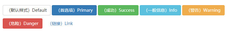
预定义样式
<!-- Standard button -->
<button type="button" class="btn btn-default">(默认样式)Default</button>

<!-- Provides extra visual weight and identifies the primary action in a set of buttons -->
<button type="button" class="btn btn-primary">(首选项)Primary</button>

<!-- Indicates a successful or positive action -->
<button type="button" class="btn btn-success">(成功)Success</button>

<!-- Contextual button for informational alert messages -->
<button type="button" class="btn btn-info">(一般信息)Info</button>

<!-- Indicates caution should be taken with this action -->
<button type="button" class="btn btn-warning">(警告)Warning</button>

<!-- Indicates a dangerous or potentially negative action -->
<button type="button" class="btn btn-danger">(危险)Danger</button>

<!-- Deemphasize a button by making it look like a link while maintaining button behavior -->
<button type="button" class="btn btn-link">(链接)Link</button>
尺寸
使用 .btn-lg、.btn-sm 或 .btn-xs 就可以获得不同尺寸的按钮
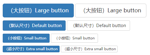
<p>
  <button type="button" class="btn btn-primary btn-lg">(大按钮)Large button</button>
  <button type="button" class="btn btn-default btn-lg">(大按钮)Large button</button>
</p>
<p>
  <button type="button" class="btn btn-primary">(默认尺寸)Default button</button>
  <button type="button" class="btn btn-default">(默认尺寸)Default button</button>
</p>
<p>
  <button type="button" class="btn btn-primary btn-sm">(小按钮)Small button</button>
  <button type="button" class="btn btn-default btn-sm">(小按钮)Small button</button>
</p>
<p>
  <button type="button" class="btn btn-primary btn-xs">(超小尺寸)Extra small button</button>
  <button type="button" class="btn btn-default btn-xs">(超小尺寸)Extra small button</button>
</p>
通过给按钮添加 .btn-block 类可以将其拉伸至父元素100%的宽度,而且按钮也变为了块级(block)元素
<button type="button" class="btn btn-primary btn-lg btn-block">(块级元素)Block level button</button>
<button type="button" class="btn btn-default btn-lg btn-block">(块级元素)Block level button</button>
激活状态
当按钮处于激活状态时,其表现为被按压下去(底色更深、边框夜色更深、向内投射阴影)。
对于 <button> 元素,是通过 :active 状态实现的。
对于 <a> 元素,是通过 .active 类实现的。
然而,你还可以将 .active 应用到 <button> 上(包含 aria-pressed="true" 属性)),并通过编程的方式使其处于激活状态
button元素
由于 :active 是伪状态,因此无需额外添加,但是在需要让其表现出同样外观的时候可以添加 .active 类
<button type="button" class="btn btn-primary btn-lg active">Primary button</button>
<button type="button" class="btn btn-default btn-lg active">Button</button>
链接 <a> 元素
可以为基于 <a> 元素创建的按钮添加 .active 类
<a href="#" class="btn btn-primary btn-lg active" role="button">Primary link</a>
<a href="#" class="btn btn-default btn-lg active" role="button">Link</a>
禁用状态
通过为按钮的背景设置 opacity 属性就可以呈现出无法点击的效果
button元素
为 <button> 元素添加 disabled 属性,使其表现出禁用状态
<button type="button" class="btn btn-lg btn-primary" disabled="disabled">Primary button</button>
<button type="button" class="btn btn-default btn-lg" disabled="disabled">Button</button>
链接 <a> 元素
为基于 <a> 元素创建的按钮添加 .disabled 类
<a href="#" class="btn btn-primary btn-lg disabled" role="button">Primary link</a>
<a href="#" class="btn btn-default btn-lg disabled" role="button">Link</a>
我们把 .disabled 作为工具类使用,就像 .active 类一样,因此不需要增加前缀