import numpy as np
import matplotlib.pyplot as plt
import pandas as pd
arr1 = np.random.rand(10)# 一维数组
arr2 = np.random.rand(10, 2)# 二维数组
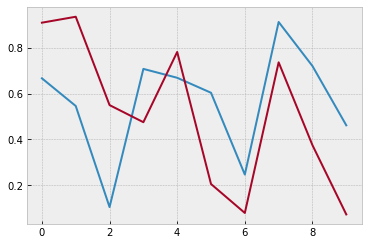
plt.plot(arr2)
# plot可以没有横坐标,纵坐标为数组中的数据,横坐标对应着索引
plt.show()
# 一维数组就是一条线,二维数组就是两条线
魔法方法
# %matplotlib inline
# Spell it as two words, rather than three
# %matplotlib notebook
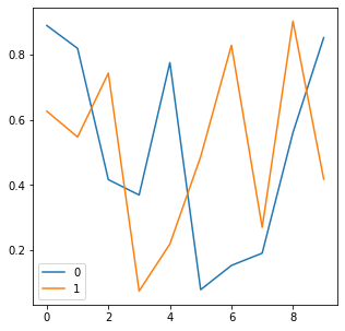
df = pd.DataFrame(np.random.rand(10, 2))
fig = df.plot(figsize=(5, 5))
# pandas内置了plot
# df是二维数据所以图中有两条线
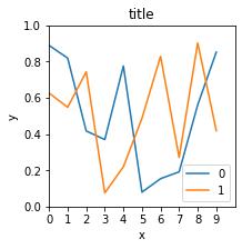
fig = df.plot(figsize=(3, 3))
plt.title( " title " )
plt.xlabel( " x " )
plt.ylabel( " y " )
# plt跟在图的后面就能发挥作用,而不在于图是由pandas画的还是有matplotlib
# 其他命令
plt.xlim([0, 10])
plt.ylim([0, 1.0])
plt.xticks(range( 10))# 刻度
plt.yticks([0, 0.2, 0.4, 0.6, 0.8, 1.0])
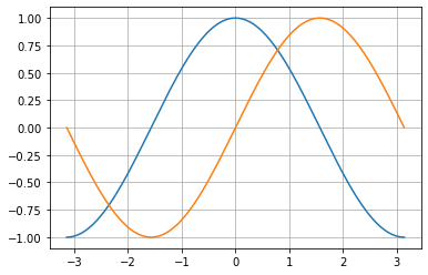
x = np.linspace(-np.pi, np.pi, 256, endpoint=True)
c, s = np.cos(x), np.sin(x)
plt.plot(x, c)
plt.plot(x, s)
plt.grid()
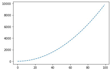
plt.plot([i**2 for i in range(100)],
linestyle =" -- " )
# marker参数
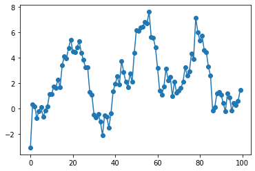
s = pd.Series(np.random.randn(100).cumsum())
# randn有符号的-1-1之间的小数,模拟股价的走势
s.plot(marker=" o " )
# color参数
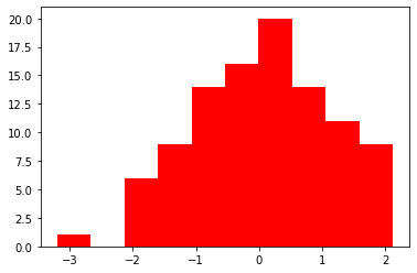
plt.hist(np.random.randn(100), color=" r " )
# 风格
import matplotlib.style as psl
psl.available
psl.use( " bmh " )
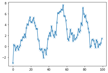
# 图标注释
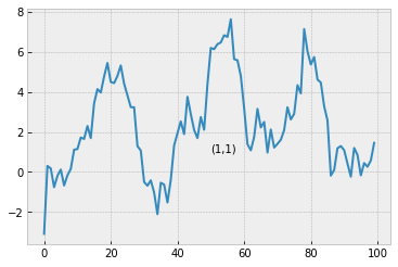
s.plot()# 画图
plt.text(50, 1, " (1,1) " )
# 注释 横坐标,纵坐标,字符串
# 图标输出
s.plot()
plt.savefig(r " C:UsersMr_waDesktoppic.png " )
# 注意前面的r,否则报错
# 子图
# 创建图
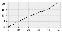
fig1 = plt.figure(num=1, figsize=(4, 2))
plt.plot(np.random.rand( 50).cumsum(), " k-- " )
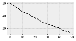
fig2 = plt.figure(num=2, figsize=(4, 2))
plt.plot( 50 - np.random.rand(50).cumsum(), " k-- " )
fig1 = plt.figure(num=1, figsize=(4, 2))
plt.plot(np.random.rand( 50).cumsum(), " k-- " )
fig2 = plt.figure(num=1, figsize=(4, 2))
plt.plot( 50 - np.random.rand(50).cumsum(), " k-- " )
# 创建子图 方式一
fig = plt.figure(figsize=(6, 4))
# 新建2*2表格,(2,2,1)表示2*2 第一个位置
# 先占位,后画图
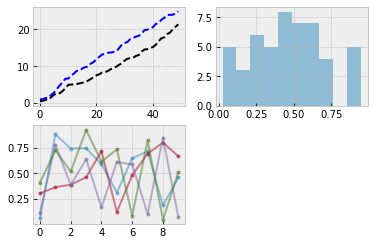
ax1 = fig.add_subplot(2, 2, 1)
ax1.plot(np.random.rand( 50).cumsum(), " k-- " )
ax1.plot(np.random.rand( 50).cumsum(), " b-- " )
# 第二个位置
ax2 = fig.add_subplot(2, 2, 2)
ax2.hist(np.random.rand( 50), alpha=0.5)
# 第三个位置
ax3 = fig.add_subplot(2, 2, 3)
df = pd.DataFrame(np.random.rand(10, 4), columns=[" a " ," b " ," c " ," d " ])
ax3.plot(df, alpha =0.5, marker=" . " )
# 创建子图 方式二
# 同时新建画布和矩阵
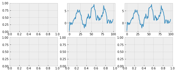
fig,axes = plt.subplots(2, 3, figsize=(10, 4))
# 在第一行第二个画布上画图
ax = axes[0, 1]
ax.plot(s)
axes[0, 2].plot(s)
# 新建时间序列
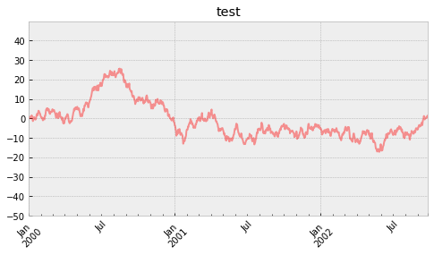
ts = pd.Series(np.random.randn(1000), index=pd.date_range(" 1/1/2000 " , periods=1000))
ts = ts.cumsum()
ts.plot(kind =" line " ,
label =" hehe " ,
color =" r " ,
alpha =0.4,
use_index =True,
rot =45,
grid =True,
ylim =[-50, 50],
yticks =list(range(-50, 50, 10)),
figsize =(8, 4),
title =" test " ,
)
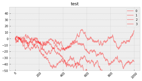
df = pd.DataFrame(np.random.randn(1000, 4))
df = df.cumsum()
df.plot(kind =" line " ,
label =" hehe " ,
color =" r " ,
alpha =0.4,
use_index =True,
rot =45,
grid =True,
ylim =[-50, 50],
yticks =list(range(-50, 50, 10)),
figsize =(8, 4),
title =" test " ,)
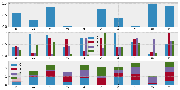
# 柱状图
fig,axes = plt.subplots(3, 1, figsize=(10, 5))
s = pd.Series(np.random.rand(10))
df = pd.DataFrame(np.random.rand(10, 4))
# 单系列柱状图
s.plot(kind=" bar " , ax=axes[0])
# 多系列柱状图
df.plot(kind=" bar " , ax=axes[1])
# 多系列堆叠图
df.plot(kind=" bar " , stacked=True, ax=axes[2])
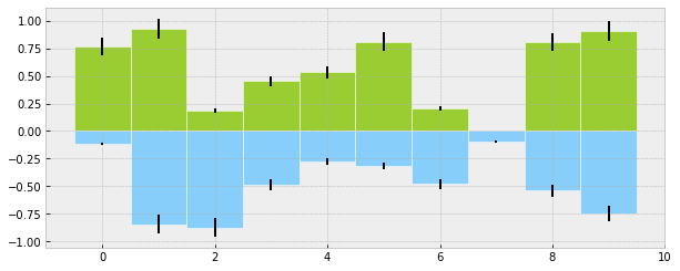
# 柱状图的第二种画法plt.bar()
plt.figure(figsize =(10, 4))
x = np.arange(10)
y1 = np.random.rand(10)
y2 = -np.random.rand(10)
plt.bar(x, y1, width =1, facecolor=" yellowgreen " , edgecolor=" white " , yerr=y1 * 0.1)
plt.bar(x, y2, width =1, facecolor=" lightskyblue " , edgecolor=" white " , yerr=y2 * 0.1)
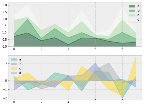
# 面积图、填图、饼图
# 新建画布和矩阵
fig, axes = plt.subplots(2,1,figsize=(8,6))
# 准备数据
df1 = pd.DataFrame(np.random.rand(10,4), columns=[" a " ," b " ," c " ," d " ])
df2 = pd.DataFrame(np.random.randn(10,4), columns=[" a " ," b " ," c " ," d " ])
# 画图方式1——pandas
df1.plot.area(colormap=" Greens_r " ,alpha=0.5,ax=axes[0]) # 数据df1在第一个位置画图
df2.plot.area(stacked=False,colormap=" Set2 " ,alpha=0.5,ax=axes[1]) # 数据df2在第二个位置画图
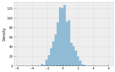
# 直方图+密度图
s = pd.Series(np.random.randn(1000))
s.hist(bins =20,
histtype =" bar " ,
align =" mid " ,
orientation =" vertical " ,
alpha =0.5,
)
# bins 决定了箱子的数量
# histtype=step/stepfilled/bar
# orientation=vertical/horizontal
# 密度图
s.plot(kind=" kde " , style=" k-- " ,)
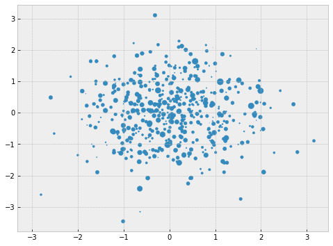
# 散点图
plt.figure(figsize =(8,6))
x = np.random.randn(1000)
y = np.random.randn(1000)
plt.scatter(x,y,marker =" . " ,
s = np.random.randn(1000)*100,
cmap = " Reds " )
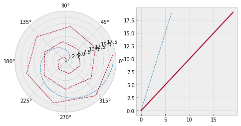
# 极坐标
# 创建数据
s = pd.Series(np.arange(20))
theta = np.arange(0,2*np.pi,0.02)
# 新建画布
fig = plt.figure(figsize=(8,4))
# 创建矩阵
ax1 = plt.subplot(1,2,1,projection=" polar " )
ax2 = plt.subplot(1,2,2)
# 画图
ax1.plot(theta, theta*3,linestyle=" -- " ,lw=1)
ax1.plot(s, linestyle =" -- " ,lw=1)
ax2.plot(theta, theta *3, linestyle=" -- " ,lw=1)
ax2.plot(s)
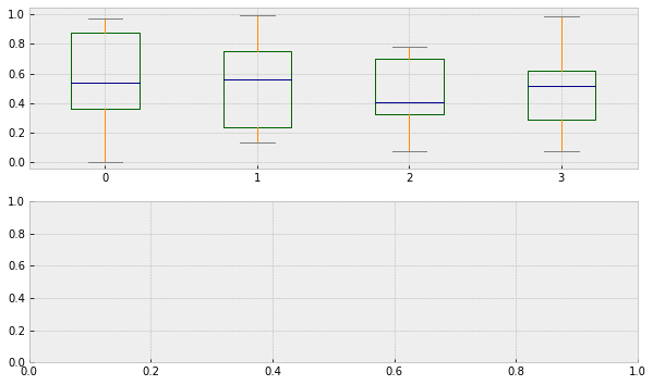
# 箱型图
# 创建画布和矩阵
fig, axes = plt.subplots(2,1,figsize=(10,6))
# 设置颜色
color = dict(boxes=" DarkGreen " , whiskers=" DarkOrange " , medians=" DarkBlue " ,caps=" Gray " )
# 数据
df
# 画图
df.plot.box(ax = axes[0],color=color)
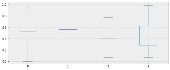
# 箱型图的第二种画法
plt.figure(figsize =(10,4))
df.boxplot()
# 表格样式创建 DataFrame.style
# 按元素处理样式:style.applymap()
def color_neg_red(val):
if val < 0.5:
color = " red "
else :
color = " black "
return (" color:%s " %color)
# 改变表格的样式:使小于0.5的数字为红色,大于0.5的为黑色
df.style.applymap(color_neg_red)