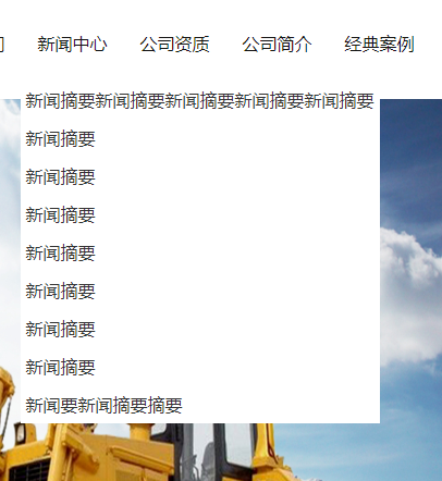
css实现父级元素根据子级元素内容自适应宽度

实现效果:

代码:

               <ul class="sub">
                                <li>
                                    <a href="">新闻摘要新闻摘要新闻摘要新闻摘要新闻摘要</a>
                                    <a href="">新闻摘要</a>
                                    <a href="">新闻摘要</a>
                                    <a href="">新闻摘要</a>
                                    <a href="">新闻摘要</a>
                                    <a href="">新闻摘要</a>
                                    <a href="">新闻摘要</a>
                                    <a href="">新闻摘要</a>
                                    <a href="">新闻要新闻摘要摘要</a>
                                </li>
                            </ul>
 li{
              display: block;
              a{
                text-align: center;
                // width: 98px;
                height:35px; 
                line-height:35px;
                color: #333;
                display: table;
                white-space: nowrap;
                &:hover {
                  color: #ff0000;
                }
              }
            }

   父级元素:

 display: block;


子集元素:
white-space: nowrap;禁止换行
display: table;
原文地址:https://www.cnblogs.com/wangyuxue/p/13384181.html