点一下,让它动起来。
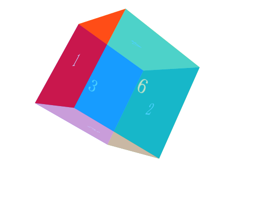
<!DOCTYPE html>
<html>
<head lang="en">
    <meta charset="UTF-8">
    <title></title>
    <style>
        *{margin:0;padding:0;list-style: none;}
        #box{
             200px;
            height: 200px;
            margin: 100px auto;
            transform-style: preserve-3d;
            /*transform: perspective(800px) rotateY(-60deg) translateX(30px);*/
            transform: perspective(800px) rotateY(-60deg) rotateX(30deg);
            transition: all 5s ease;
        }
        #box div{
             100%;
            height: 100%;
            position: absolute;
            line-height: 200px;
            text-align: center;
            color: #fff;
            font-size: 40px;
            opacity: 0.7;
        }
        #box .box1{
            background: red;
            transform: translateZ(100px);
        }
        #box .box2{
            background: green;
            transform: translateZ(-100px);
        }
        #box .box3{
            background: blue;
            transform: translateX(-100px) rotateY(90deg);
        }
        #box .box4{
            background: yellow;
            transform: translateY(-100px) rotateX(90deg);
        }
        #box .box5{
            background: pink;
            transform: translateY(100px) rotateX(90deg);
        }
        #box .box6{
            background: deepskyblue;
            transform: translateX(100px) rotateY(90deg);
        }
        #box:active{
            /*transform: perspective(800px) rotateY(-360deg) translateX(360px) ;*/
            transform: perspective(400px) rotateY(-3600deg) rotateX(3600deg) ;
        }
    </style>
</head>
<body>
<div id="box">
    <div class="box1">1</div>
    <div class="box2">2</div>
    <div class="box3">3</div>
    <div class="box4">4</div>
    <div class="box5">5</div>
    <div class="box6">6</div>
</div>
</body>
</html>